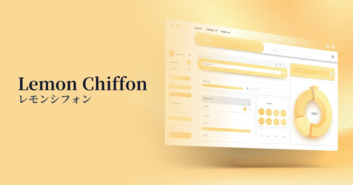
| English name | Lemon Chiffon |
|---|---|
| Katakana | Lemon Chiffon |
| HEX | #FFF8E1 |
| RGB | 255, 248, 225 |
| Design Theme | Pastel & Macaron Colors |
Why is it a trend? (Background and reasons)
Moving beyond the recent trend of minimalist design, there's a growing desire for more warmth and humanity in digital spaces. Lemon Chiffon is a color that offers a gentle and bright feel that resonates with users' hearts. It also pairs well with approachable and positive visual expressions that are conscious of "Instagrammable" content, and has been adopted by many brands.
Furthermore, it is deeply connected to Y2K fashion, which is gaining popularity among Generation Z, and the "Korean cafe style" design aesthetic unified by soft tones. Its ability to evoke a sense of nostalgia while maintaining a fresh impression without becoming outdated matches current design trends.
Amidst growing attention to wellness and self-care, which emphasize physical and mental health, the calm and comforting atmosphere of lemon chiffon provides users with a sense of reassurance. In today's stressful society, it is also gaining popularity as a color that meets the need to soothe the mind through digital experiences.
The psychological effects of design and UX
Lemon chiffon evokes positive emotions such as happiness, optimism, and hope. While its bright yellow hue is reminiscent of sunlight, its subdued saturation prevents it from being overly stimulating, instead conveying a sense of gentleness and approachability.
In UI/UX design, this color can help alleviate user apprehension and allow them to use the service in a relaxed state. For example, using this color in the first view of a site a user visits for the first time can help them intuitively feel that "this is a safe and comfortable place."
It's also effective in situations where you want to attract attention but don't want to use warning colors. Because it has a mild effect of drawing the eye, it's suitable for buttons and banners that encourage positive actions from users. However, since it's a very bright color, careful consideration must be given to the contrast ratio with the text.
Visibility testing (UI component example)
Practical usage (best practices)
When used as the background color for the entire site, it creates a sense of spaciousness and brightness, enveloping the entire content in a soft atmosphere. It is especially ideal for sites where friendliness and a sense of security are important, such as organic products, baby products, and lifestyle blogs.
In UI designs that utilize dark mode, incorporating lemon chiffon as an accent color makes its brightness stand out, creating a sophisticated impression. By using this color to highlight important notifications or selected menus, it's possible to achieve both visibility and a stylish design.
When used for CTA buttons on landing pages (LPs), it gives users a positive impression of "proceeding" and contributes to an increase in click-through rates. Compared to strong colors like red or orange, it is less overwhelming and encourages a user-friendly choice.
It's also effective when used as the background color for card UIs or specific sections in information-heavy dashboards and service websites. It gently yet clearly indicates content divisions, helping to organize and present information effectively.
Recommended color scheme suggestions
Steel Blue (#4682B4)
When combined with a calming steel blue, the brightness of lemon chiffon stands out, creating an impression of reliability and sophistication. This color scheme is recommended for accents on business websites or for modern portfolio sites.
Sage Green (#B2AC88)
The natural-feeling sage green is a perfect match for the organic feel of lemon chiffon. It can create a comfortable and reassuring atmosphere on websites for wellness-related services or natural cosmetics brands.
Rosy Brown (#BC8F8F)
By combining it with a warm rosy brown, the overall impression becomes soft, slightly more mature, and feminine. It's perfect for conveying an elegant and comfortable atmosphere on fashion e-commerce sites or cafe websites.