| English name | Jade Green |
|---|---|
| Katakana | Jade Green |
| HEX | #C8E6C9 |
| RGB | 200, 230, 201 |
| Design Theme | Pastel & Macaron Colors |
Why is it a trend? (Background and reasons)
In recent years, web design has emphasized creating a comfortable user experience that alleviates "digital fatigue" caused by prolonged use of digital devices. Gentle, nature-inspired colors like jade green are gaining attention as a color that meets this need, providing users with a sense of peace and relaxation through their screens.
Furthermore, the growing social concern for sustainability and wellness is a major reason why this color is trending. It is being adopted in many designs as an ideal color to express a clean and healthy brand image, such as organic products, environmentally conscious services, and healthcare apps.
While minimalist and clean UIs are becoming mainstream, Jade Green avoids becoming too sterile, adding a human touch of warmth and gentleness to the design. Its use, especially in information-heavy SaaS dashboards and settings screens, reduces the user's visual burden and contributes to creating a stress-free interface.
The psychological effects of design and UX
Jade green is a soft, gentle green color reminiscent of jade, giving viewers an impression of calmness, peace, and harmony. It has a psychological effect of easing user tension and promoting relaxation, making websites and apps more comfortable for extended use.
The color green also carries positive connotations such as "safety," "approval," and "movement." In UI design, using it for success notifications and completion messages can intuitively convey a sense of security and positive feedback to users.
Because it is a color that strongly evokes nature and plants, it is also associated with keywords such as "health," "growth," and "regeneration." By utilizing this characteristic, it is possible to effectively express the worldview of brands that have concepts such as wellness, eco, and natural.
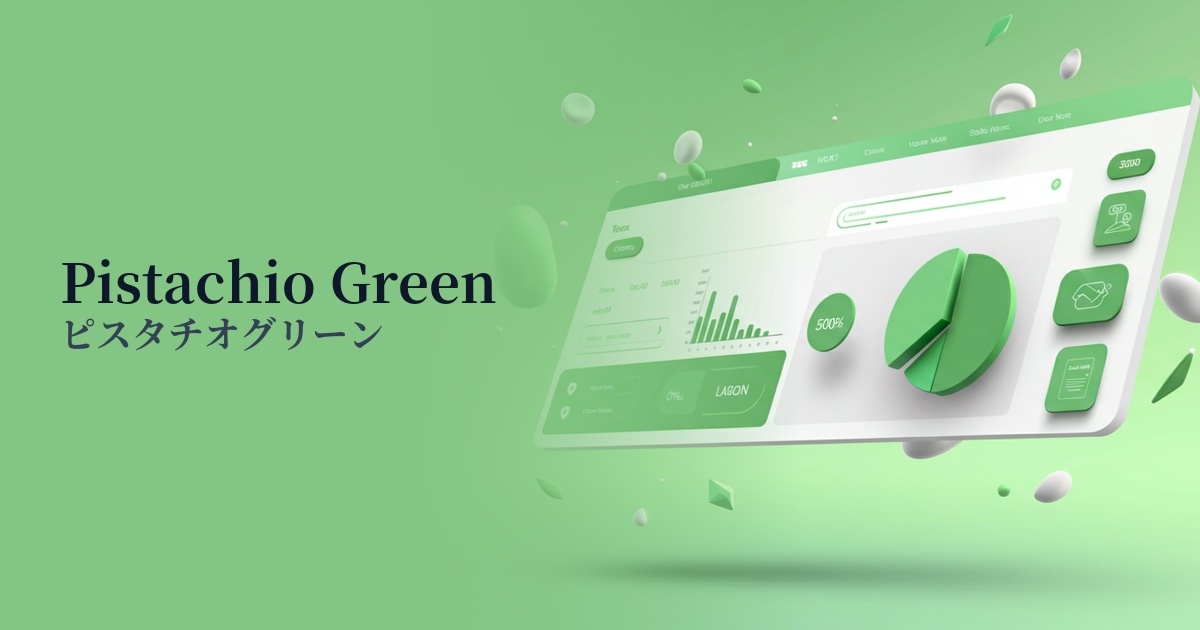
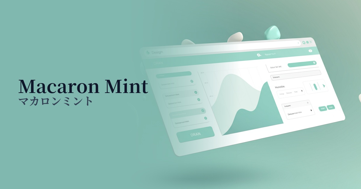
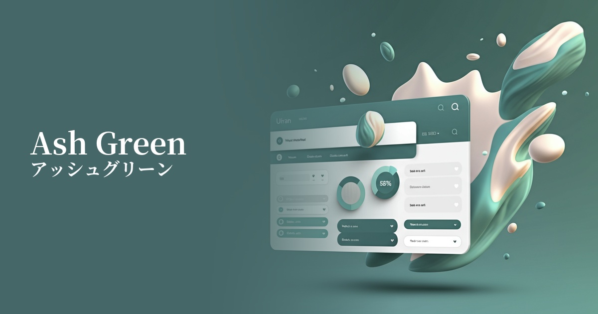
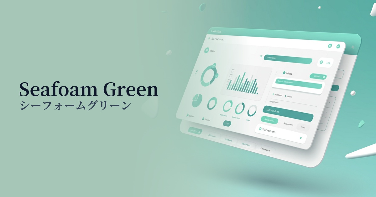
Visibility testing (UI component example)
Practical usage (best practices)
When used as the background color for the entire site or specific sections, it enhances the content while creating a calm and clean space. Its light tone brings a soft atmosphere to the design without compromising readability.
It's also effective to use it as an accent color for CTA buttons, links, and important notifications (such as success messages). While it's not as assertive as red or orange, it gently attracts the user's attention within a clean layout and guides them to the next action.
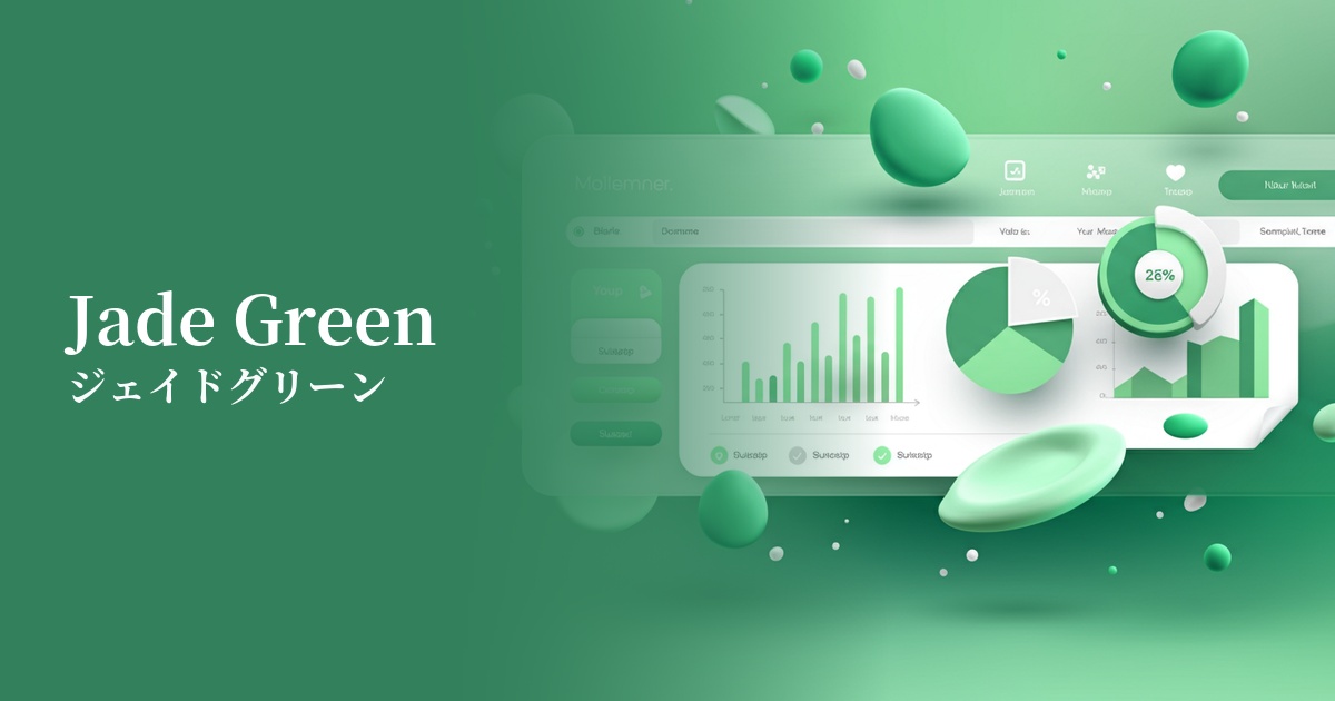
In dashboards and management screens where information tends to be densely packed, using this color as the background color or sidebar color for card UIs reduces visual clutter and makes it easier to organize information. This makes it easier for users to find the information they need, leading to an improved user experience (UX).
Incorporating it as the main color in illustrations and icons can add a friendly and gentle feel to the overall design. It's especially well-suited for services that prioritize communication with users.
Recommended color scheme suggestions
Ivory (#FFFFF0)
The natural feel of jade green is gently enhanced by the warmth of ivory. This combination creates a comfortable and natural space, perfect for organic product or lifestyle websites.
Slate Gray (#708090)
When combined with a calming slate gray, the lightness of jade green is enhanced with intelligence and trustworthiness. It's ideal for applications where you want to convey a clean and sophisticated impression, such as SaaS UIs and corporate websites.
Coral (#FF7F50)
Adding coral, a color close to its complementary shade, as an accent makes the entire design more vibrant and cheerful. Using it in elements like CTA buttons to encourage user action creates a positive and fun atmosphere.