| English name | Dusty Lavender |
|---|---|
| Katakana | Dusty Lavender |
| HEX | #C1B5D0 |
| RGB | 193, 181, 208 |
| Design Theme | Muted colors & earth tones |
Why is it a trend? (Background and reasons)
In recent years, muted colors and earth tones have become a major trend in web design, providing users with a sense of security and comfort. Dusty lavender, in particular, is attracting attention as a color that gives a sophisticated impression.
As more users experience "digital fatigue" due to excessive information and vibrant colors, muted, low-saturation colors like dusty lavender have the advantage of being less strenuous on the eyes and less tiring to look at for extended periods. This allows for a more comfortable user experience that makes it easier to concentrate on content.
Furthermore, in today's world where values such as sustainability and harmony with nature are highly valued, dusty lavender exudes a natural atmosphere that is not overly artificial. This color, which is elegant yet somehow evokes a sense of nostalgia and warmth, can complement many brand stories.
The psychological effects of design and UX
Dusty lavender combines the inherent psychological effects of lavender, such as "healing" and "relaxation," with a grayish, muted tone that creates a strong impression of "calmness," "elegance," and "sophistication."
This color softens the mystical and creative imagery associated with vibrant purple, creating a calmer and more thoughtful atmosphere. It is particularly effective on corporate websites and portfolio sites where you want to convey a sense of security and trust to users.
Furthermore, the neutral, not-too-sweet color palette is easily accepted by a wide range of target audiences, regardless of gender. This helps build an inclusive brand image for products and services that aim for gender-neutral design.
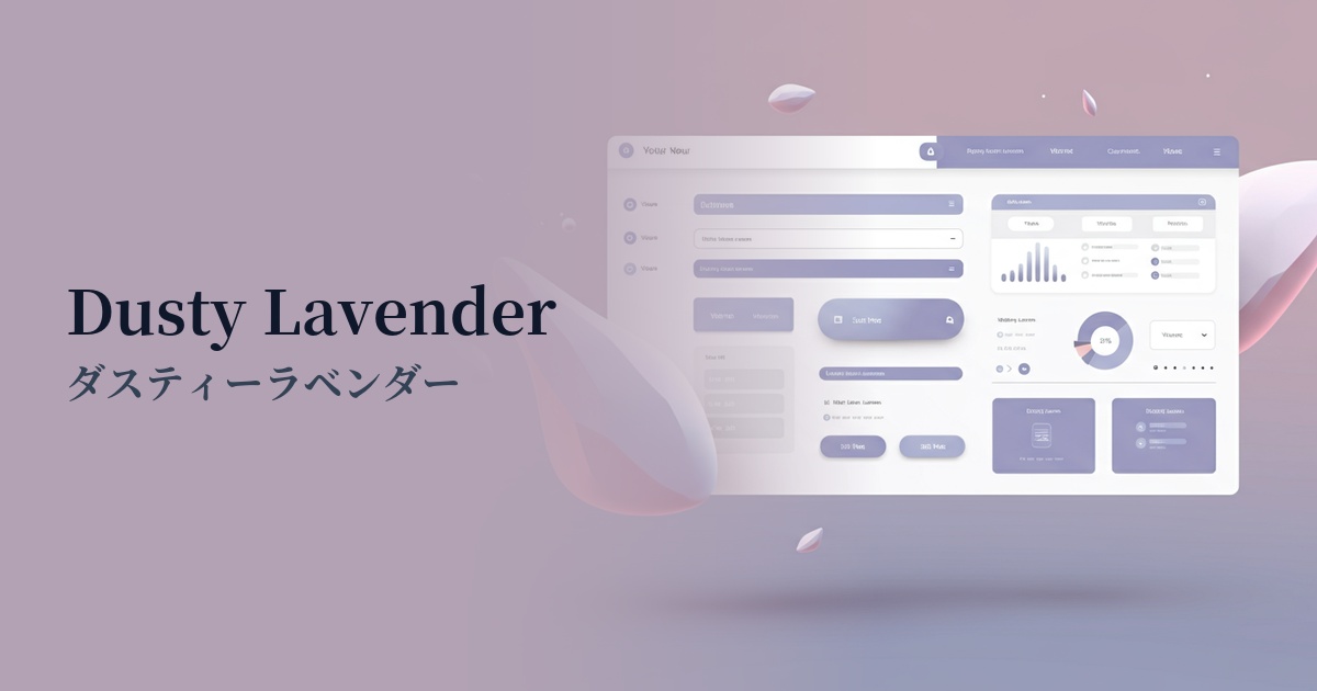
Visibility testing (UI component example)
Practical usage (best practices)
Using it extensively as the main background color creates a sense of calm and unity throughout the entire site. Especially for blogs and media sites with a lot of text content, it allows you to create a sophisticated aesthetic while maintaining readability.
It's also effective to use it as an accent color for CTA (Call To Action) buttons and important UI elements. On light backgrounds such as white or cream, dusty lavender gently attracts the user's attention without being jarring.
By using it in sidebars and headers on screens where users spend a long time, such as SaaS dashboards and member pages, it can be expected to reduce visual stress and help maintain concentration.
When used as the background for product images on e-commerce sites, or as the key color for wellness and beauty brand websites, it enhances the appeal of the products while conveying an elegant and high-quality brand image.
Recommended color scheme suggestions
Charcoal (#36454F)
When combined with charcoal gray, it creates a very modern and sophisticated impression. It tightens the soft atmosphere of dusty lavender, creating a sense of reliability and luxury. It is ideal for SaaS UIs and minimalist corporate websites.
Antique White (#FAEBD7)
By combining it with warm antique white, you can create a natural and comfortable space. It maximizes the calming effects of dusty lavender, making it perfect for lifestyle brands and wellness-related websites.
Gold (#FFD700)
Adding gold accents instantly elevates the look, creating a luxurious and elegant atmosphere. The sophisticated elegance of dusty lavender and the gleam of gold create a synergistic effect, making it ideal for brands that prioritize luxury, such as cosmetics and jewelry.