| English name | Light Gallery |
|---|---|
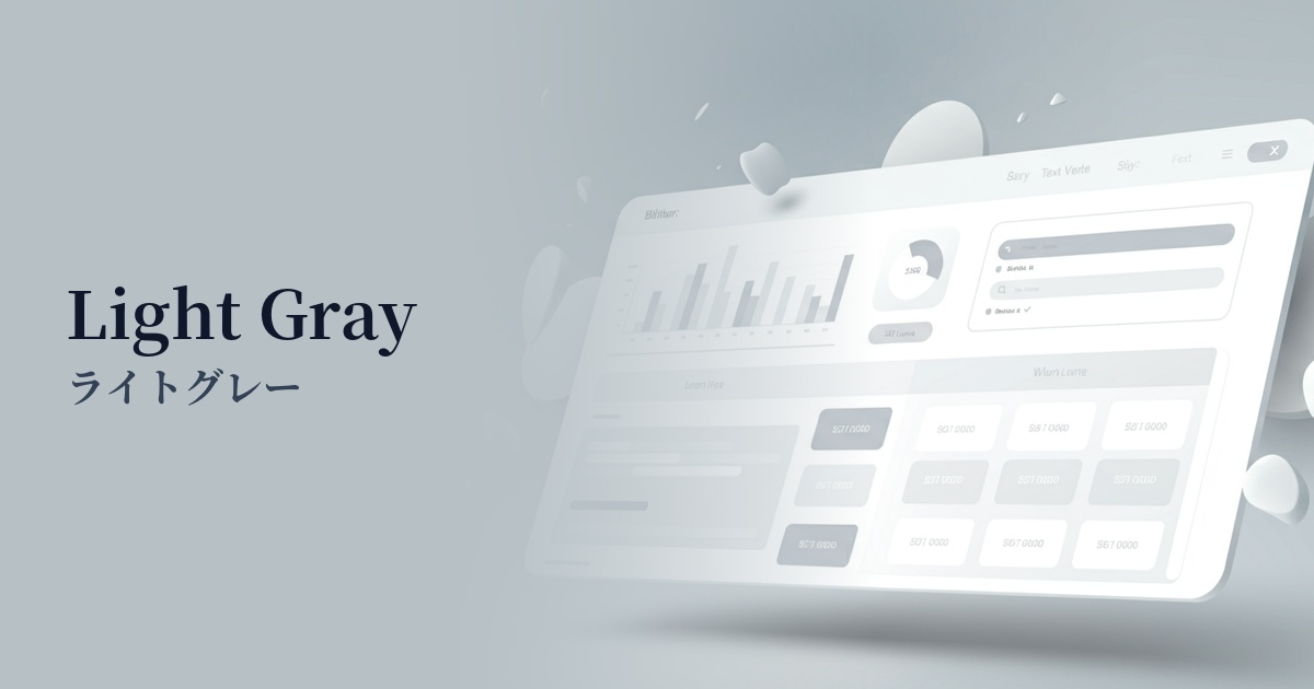
| Katakana | Light gray |
| HEX | #E6E6E6 |
| RGB | 230, 230, 230 |
| Design Theme | Neutral & Minimal Background Colors |
Why is it a trend? (Background and reasons)
The recent trends in minimalism and clean design in web design have boosted the popularity of light gray. As simple designs that strip away ornamentation become mainstream in order to draw users' attention to the content itself, this exquisite neutral color, which is neither as strong as white nor as heavy as black, is being chosen as the ideal background color.
Furthermore, the UX (User Experience) aspect is also important. In today's world, where high-resolution displays are widespread, a pure white background can sometimes feel dazzling and strain the user's eyes during prolonged viewing. Light gray softens the amount of light and is expected to reduce visual fatigue, so it is often preferred for information-heavy websites and web applications.
The image of "sophistication," "modernity," and "reliability" associated with light gray is also a factor behind this trend. This aligns with the aesthetic sensibilities seen in high-quality gadgets and minimalist architectural design. It is particularly effective when technology companies, SaaS companies, and creators' portfolio sites want to build an intelligent and clean brand image.
Finally, its overwhelming versatility is another reason. Light gray doesn't clash with other colors; rather, it enhances them. It functions as a canvas that expands the designer's creativity, whether it's highlighting vivid accent colors or creating delicate tones when combined with other neutral colors.
The psychological effects of design and UX
Light gray conveys a quiet and calming impression, providing users with a sense of psychological stability and security. Because it gives the impression of well-organized information, it is particularly effective in situations where credibility is paramount, such as corporate websites and news sites.
The achromatic color gray evokes a clean, sophisticated, and modern image. Its urban and stylish vibe helps enhance brand value on fashion, technology, and design-related websites.
Because it is a neutral color with little emotional emphasis, it has the effect of focusing the user's attention on the content itself. It is the perfect background to highlight the main information, such as photos, text, and illustrations, and convey their appeal to the fullest.
Like the color of a suit in a business setting, it conveys a formal and professional impression. Using it on B2B service, financial, or legal websites supports a solid and trustworthy corporate image.
Visibility testing (UI component example)
Practical usage (best practices)
Using light gray as the background color for the entire website creates a calm and modern space. In particular, setting the main content area to white (#FFFFFF) and the overall background to light gray creates a visual hierarchy, making it easier for users to focus on the content.
It's also effective to use it as the background color for individual UI components such as card-style UIs, form input fields, table headers, and inactive buttons. It subtly indicates boundaries between elements and helps make the overall interface structure intuitively understandable.
When using light gray as a background, it is essential to give sufficient consideration to text readability, or accessibility. For a background of #E6E6E6, use dark gray or black with a density of at least #595959 or higher, and be sure to meet the WCAG contrast ratio standard (4.5:1 or higher at AA level).
It's an excellent way to highlight vibrant brand colors and CTA (call to action) buttons. The accent color, placed against a calm light gray background, attracts user attention even more effectively, leading to increased click-through rates.
Recommended color scheme suggestions
Navy Blue (#000080)
The modern and calm atmosphere of light gray is complemented by the intelligence and trustworthiness of navy blue. This combination is ideal for corporate websites and SaaS UI designs where you want to convey a professional and stable impression.
Coral (#FF7F50)
By adding a warm coral accent to a neutral light gray, a friendly and vibrant impression is created. This is effective in encouraging positive feelings in users on lifestyle blogs and e-commerce sites.
Sage Green (#B2AC88)
Light gray and sage green are both natural and calming colors. This combination is ideal for organic product and wellness-related websites, creating a minimalist space that provides users with a sense of relaxation and security.