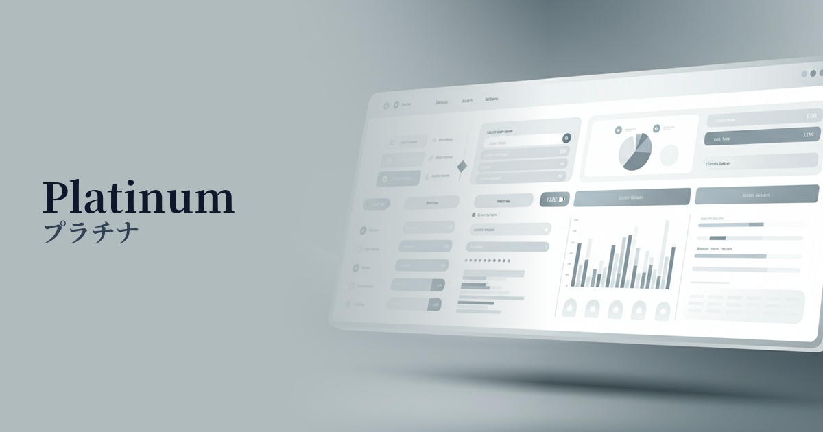
| English name | Plaligum |
|---|---|
| Katakana | platinum |
| HEX | #E4E6E8 |
| RGB | 228, 230, 232 |
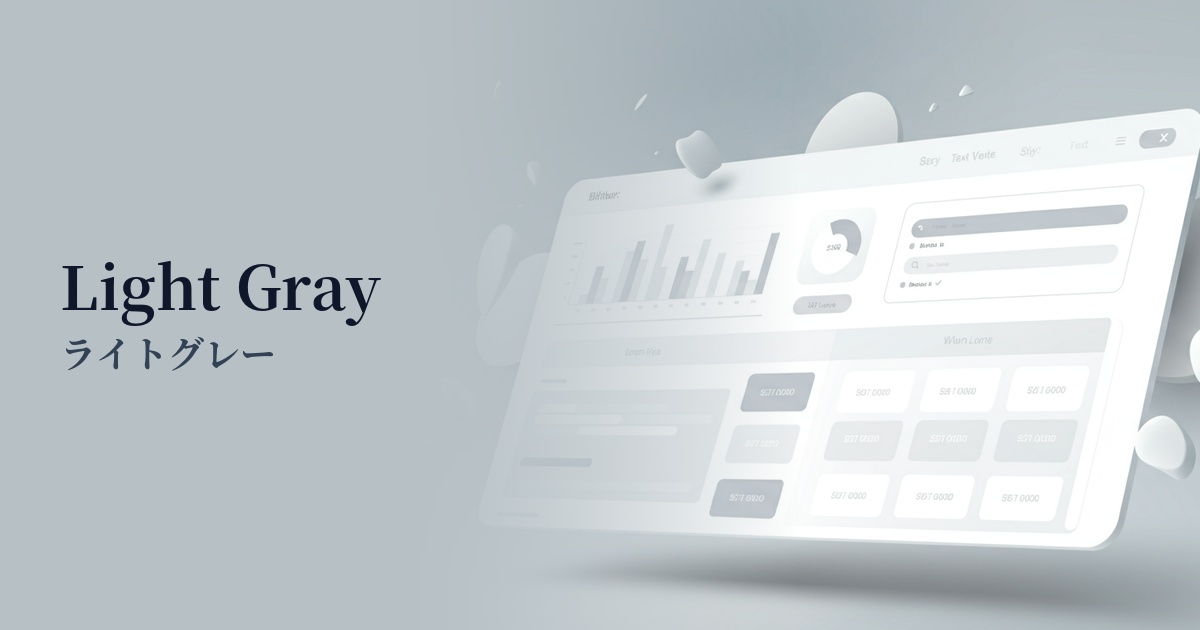
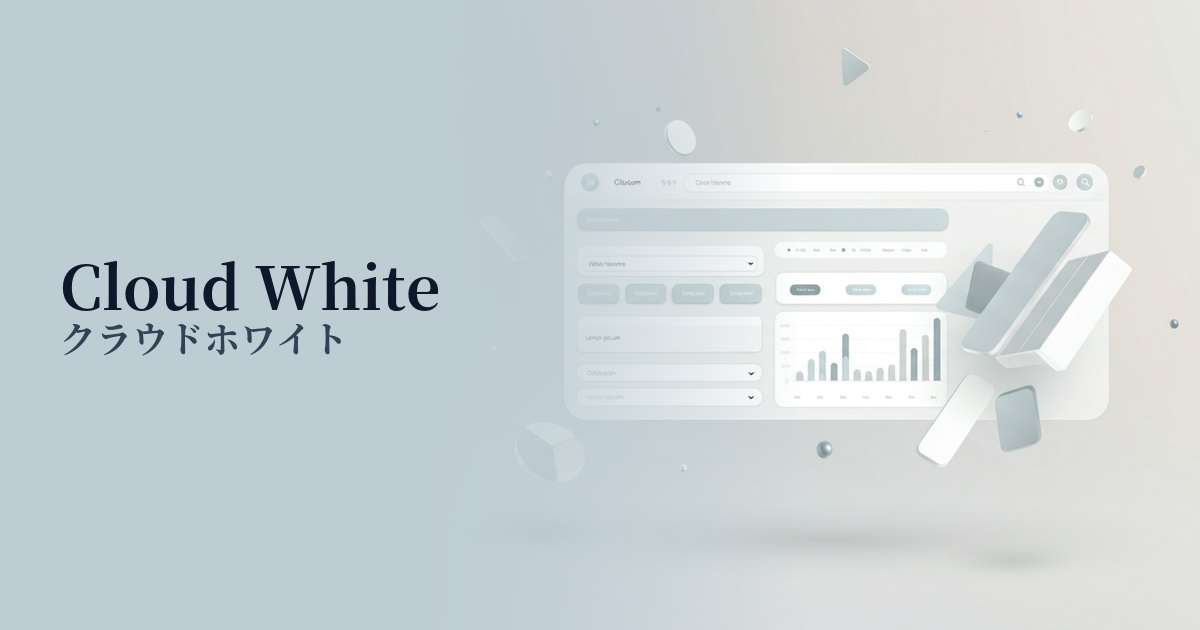
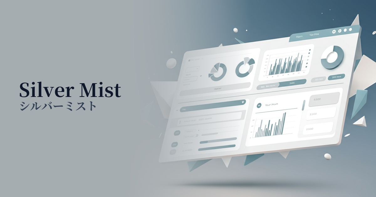
| Design Theme | Neutral & Minimal Background Colors |
Why is it a trend? (Background and reasons)
In recent years, minimalism has become the mainstream in web design, focusing on organizing information and concentrating on the content itself. Neutral colors like platinum are a perfect fit for this trend because they give a clean and calm impression. This color, which is slightly grayish than pure white, creates a sophisticated atmosphere and a modern feel, bringing tranquility and order to many designs.
Furthermore, platinum is not merely "achromatic"; it also evokes a sense of luxury and affinity with technology. This is because the image of rarity and value associated with the precious metal platinum is reflected in its color. For this reason, it is particularly favored in situations where a balance between reliability and a sense of the future is desired, such as in the UI of SaaS products or the corporate websites of companies dealing with cutting-edge technologies.
The psychological effects of design and UX
Platinum conveys an impression of sophistication, composure, and intelligence to users. Its understated design doesn't distract from the content, helping users focus on the information. This characteristic is particularly effective in dashboards handling complex information and article pages designed for careful reading.
From a UI/UX perspective, compared to pure white (#FFFFFF), it can be expected to slightly reduce screen glare. This reduces eye strain during prolonged use, leading to a more comfortable browsing experience. It can also serve as a foundation for user-friendly designs that take accessibility into consideration.
This color evokes a sense of calm and stability, and therefore also has a psychological effect of "trust." It helps build an honest and reliable brand image for websites where gaining user trust is essential, such as financial services, medical information sites, and B2B platforms.
Visibility testing (UI component example)
Practical usage (best practices)
Using it as the background color for the entire website most effectively expresses a minimalist and clean aesthetic. When combined with sufficient white space (negative space), it makes content and photos stand out, resulting in a sophisticated layout.
Ideal for dashboard backgrounds in SaaS applications and analytics tools. It enhances the vibrancy of data visualizations (graphs and charts) while reducing visual strain on users who spend long periods of time using the interface.
When used as the background color for a card-type UI, it neatly organizes and displays each information block. It also works well with shadows, giving elements depth and a three-dimensional feel, improving the usability of the interface.
It's also effective to use it in auxiliary areas such as headers, footers, and sidebars to highlight the main content. It creates a gentle boundary between these areas and the content area while maintaining an overall consistent tone.
Recommended color scheme suggestions
Dodger Blue (#1E90FF)
This color scheme features a calm platinum background accented with vibrant Dodger Blue. It conveys both reliability and innovation, clearly guiding user actions, especially in SaaS UIs and on technology company websites.
Rosy Brown (#BC8F8F)
This combination blends the cool impression of platinum with the soft warmth of rosy brown. It creates an elegant and comfortable atmosphere, bringing sophistication to lifestyle brands, cosmetics, and fashion e-commerce sites.
Charcoal (#36454F)
By using platinum as a bright base color and charcoal for text and UI elements, extremely high readability is ensured. It creates a modern and refined impression, resulting in a stable design for websites of all genres.