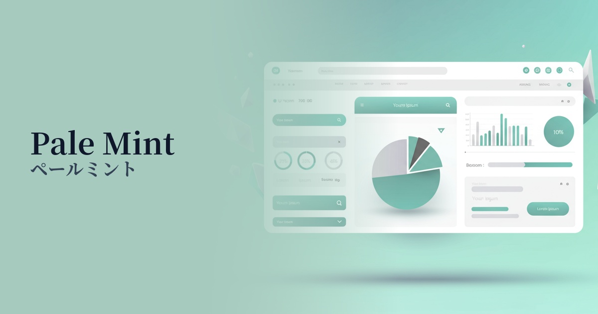
| English name | Pale Mint |
|---|---|
| Katakana | Pale mint |
| HEX | #E6F5F0 |
| RGB | 230, 245, 240 |
| Design Theme | Neutral & Minimal Background Colors |
Why is it a trend? (Background and reasons)
In recent years, a minimalist approach that puts the content first has become mainstream in web design. Pale mint is a perfect fit for this trend, offering warmth and individuality that is more subtle than pure white or gray, without being overpowering.
As more users experience digital fatigue, themes such as "wellness" and "sustainability," which offer peace of mind, are gaining importance. The natural and clean image of pale mint is ideal for visually representing these concepts and is being adopted by many healthcare, lifestyle, and eco-related services.
Furthermore, with the spread of dark mode, there has been a growing demand for eye-friendly background colors even in light mode. Pale mint is gaining value as a background color because it maintains high brightness while reducing glare, providing a comfortable user experience even during prolonged viewing.
The psychological effects of design and UX
Pale mint evokes positive psychological effects in viewers, such as a sense of cleanliness, calmness, and refreshment. The combination of mint's freshness and the gentleness of pale tones creates a sense of security for users, making them more receptive to information in a relaxed state.
In UI/UX design, this color can be expected to enhance trustworthiness. In particular, when used in fields where accuracy and integrity are crucial, such as finance, healthcare, and education, it helps to intuitively convey the reliability of the service.
Furthermore, it functions as a color that expresses the harmony between advanced technology and nature. It is highly effective in building a brand image that is future-oriented yet possesses a human warmth, such as in the areas of clean energy and smart homes.
Visibility testing (UI component example)
Practical usage (best practices)
The most effective use is as the background color for the entire website. By making the content area white (#FFFFFF) and using pale mint as the background around it, a visual hierarchy is created, naturally guiding the viewer's eye to the main content.
It is also suitable for information-heavy interfaces such as SaaS dashboards and settings screens. By using alternating background colors for each section, information is organized, making it easier for users to find the function they are looking for.
Combining bold accent colors can create visual interest and visual impact in your designs. For example, placing vibrant coral or navy buttons against a pale mint background can increase visibility and encourage clicks.
However, it's best to avoid using this color alone for CTA buttons. Its low saturation means it might get lost among other elements. If you do use it as a button, it's important to ensure sufficient contrast by combining it with darker text or icons.
Recommended color scheme suggestions
Charcoal (#36454F)
The lightness of pale mint, combined with the depth of charcoal gray, tightens the overall design. This combination is ideal for corporate websites and portfolio sites where you want to convey reliability and sophistication. When used as text color, it also offers excellent readability.
Coral (#FF7F50)
By adding a touch of warm coral to a refreshing pale mint, you can create a friendly and positive atmosphere. This color scheme is recommended for lifestyle media and user-centric service designs.
Slate Gray (#708090)
Pale mint and slate gray are both calming tones that create a unified and clean impression. They are suitable for modern and minimalist UI designs, and truly shine in the interfaces of technology services and SaaS applications.