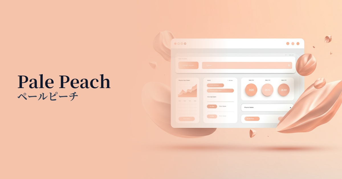
| English name | Pale Peach |
|---|---|
| Katakana | Pale peach |
| HEX | #FFEAD9 |
| RGB | 255, 234, 217 |
| Design Theme | Neutral & Minimal Background Colors |
Why is it a trend? (Background and reasons)
In recent years, web design has seen a shift from pure white (#FFFFFF) to warm, neutral colors becoming the mainstream background color. Pale peach is a prime example of this trend. Maintaining the sophistication of minimalism while conveying a sense of humanity and gentleness, this color aligns with the concept of "digital wellness," which aims to reduce the visual burden on users.
Pale peach, reminiscent of skin tone and soft light, gives users an unconscious sense of comfort and familiarity. Because of these characteristics, it is particularly favored by brands that emphasize comfort and naturalness, such as organic cosmetics, lifestyle products, and wellness-related services.
Furthermore, because this color is not too overpowering, it functions as a great supporting element that naturally enhances the main content (text and photos). By using it in information-heavy blogs, e-commerce sites, or SaaS management screens that are used for extended periods, you can create an environment where users are less likely to get tired and can concentrate more easily on the content.
The psychological effects of design and UX
Pale peach psychologically evokes feelings of "gentleness," "warmth," and "calmness." The youthfulness and happiness associated with peaches, combined with the delicacy and elegance of pale tones, create a friendly yet sophisticated atmosphere.
In UI/UX design, this color is expected to have the effect of easing user tension and allowing them to use the service in a relaxed state. Because it has no aggressive impression whatsoever, it helps to give users a sense of security and foster trust in the brand.
When used as a background color, it softly envelops the entire screen, reducing visual noise. This allows users to process information more smoothly and concentrate better on tasks. It's a color that forms the foundation of a positive and pleasant user experience.
Visibility testing (UI component example)
Practical usage (best practices)
The most effective way to use it is as the background color for an entire website or app. It's particularly effective in blogs, portfolios, and lifestyle media where text and images are dominant, as it gently enhances the content.
Placing a white card-shaped UI on a pale peach background creates soft shadows, resulting in a clean yet warm sense of depth. This technique works exceptionally well with minimalist layouts.
By incorporating accent colors such as dark green, navy, and charcoal gray, you can create a sense of contrast and definition throughout the design. Use these colors for CTA buttons and important links, and make them stand out against a pale peach background.
Soft gradients combined with white or ivory tones create a beautiful, natural-looking light effect when used as a background for hero areas or sections. They are ideal as an introductory element that gently draws the user's attention.
When used in interfaces where information tends to be densely packed, such as SaaS dashboards and settings screens, it can soften the impersonal impression and give users the impression that it is a user-friendly tool.
Recommended color scheme suggestions
Slate Gray (#708090)
The warmth of pale peach is complemented by the sophisticated and calming impression of slate gray. This modern and elegant combination is ideal for corporate websites where trustworthiness is essential, or for refined portfolios.
Sage Green (#8F9779)
The combination of earth tones provides users with a sense of security and relaxation. It's perfect for expressing a natural and healthy worldview on e-commerce sites for organic products or wellness-related services.
Coral (#FF7F50)
By using pale peach as a background and energetic coral as an accent, this design achieves both approachability and vibrancy. It can be used for CTA buttons and important information to effectively capture the user's attention.