Web Color Scheme Trends | Body Text Color Codes, Psychological Effects, and Practical Examples
 Web design
| English name | Voice Text |
|---|---|
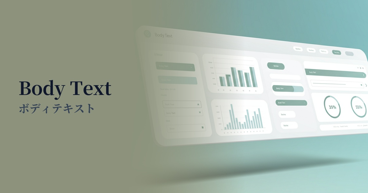
| Katakana | Body text |
| HEX | #374151 |
| RGB | 55, 65, 81 |
| Design Theme | UI System & Alert Colors |
Why is it a trend? (Background and reasons)
In the world of web design, pure black (#000000) has long been considered the basic color for text. However, it has become known that too much contrast with a white background can strain the user's eyes when reading long texts. To reduce this visual fatigue and provide a more comfortable reading experience, slightly softer dark grays like #374151 are becoming mainstream.
This trend is closely linked to the growing concern for accessibility. Ensuring sufficient contrast while avoiding excessive stimulation aligns with the spirit of WCAG (Web Content Accessibility Guidelines). Furthermore, amidst the preference for minimalist designs that focus on the content itself, the versatility of this color as a "quiet color" that conveys information accurately without being overly assertive is being re-evaluated.
The psychological effects of design and UX
Reliability and Stability: Dark gray, close to black, conveys a sense of calm and reliability to users. Using it on corporate websites or information-heavy media sites can enhance the credibility of the content.
Sophisticated impression: This color, which is not pure black but has a subtle bluish tint, creates a modern and refined atmosphere. When combined with a minimalist and clean design, it gives an even more urban impression.
Readability and Concentration: Optimized contrast with the background allows users to naturally focus on the text content. This UX benefit of reduced eye strain during long reading sessions is extremely important for blogs and news websites.
Visibility testing (UI component example)
Practical usage (best practices)
Its most basic use is for the body text of websites and applications. It offers the best readability, especially when combined with white (#FFFFFF) or off-white backgrounds.
Using it consistently across basic text elements that make up the UI, such as button labels, form field names, and navigation menus, brings a sense of unity and stability to the entire interface.
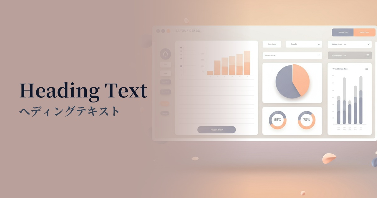
Using this color for headings and a slightly lighter gray (e.g., #6B7280) for lead paragraphs and supplementary information allows you to visually organize the hierarchical structure of information in an easy-to-understand way.
It's also ideal for supplementary text on a website, such as footers and copyright notices. It effectively conveys information without interfering with the main content.
Recommended color scheme suggestions
Cornflower Blue (#6495ED)
We combined trustworthy body text with a calm and intellectual-sounding blue. This color scheme, used in link text and UI accents, provides users with a sense of security while intuitively conveying the presence of interactive elements.
Linen (#FAF0E6)
Using linen as a background, which is slightly warmer than pure white, reduces eye strain and creates a more relaxing reading environment. This combination is recommended for websites with a natural and cozy atmosphere.
Gainsboro (#DCDCDC)
By combining the main text color with a lighter shade of gray, you can clearly represent the hierarchy of information. Using this for captions, supplementary information, and UI dividers gives the design depth and a well-organized feel.