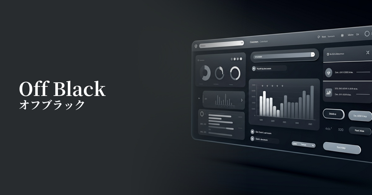
| English name | Heading Text |
|---|---|
| Katakana | Heading text |
| HEX | #1F2937 |
| RGB | 31, 41, 55 |
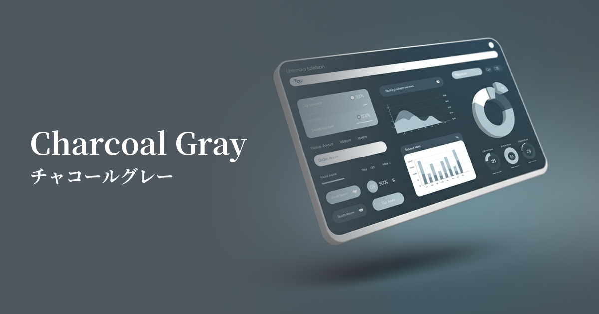
| Design Theme | UI System & Alert Colors |
Why is it a trend? (Background and reasons)
In recent years, minimalism and clean interfaces have become the mainstream in web design. Within this context, off-black colors like "heading text (#1F2937)" are highly valued, as they soften the strong presence of pure black (#000000) and create a more refined impression. They are also easy on the eyes and less tiring to use for extended periods.
Another major reason is the growing interest in web accessibility. This color provides a very high contrast ratio against a white background, easily meeting the standards of WCAG (Web Content Accessibility Guidelines). This allows for designs that are comfortable for everyone to access, including users with visual impairments.
With the rise of a content-first approach, readability and clarity have become paramount, over mere embellishment. Heading text is being re-evaluated as a fundamental element, crucial for effectively conveying information and creating an environment where users can focus on the content.
The psychological effects of design and UX
Because this color is very close to black, it conveys an impression of trustworthiness, stability, and authority. Using it on company websites, news media, or blogs dealing with specialized information can enhance the persuasiveness of the content.
Because it is slightly softer than pure black, it is less oppressive and creates a modern and sophisticated atmosphere. When combined with a minimalist layout, it can build an intelligent and calm brand image.
From a UI/UX perspective, its greatest strength is its high visibility. The combination of a bright background color makes the text stand out, allowing users to easily recognize information without stress. This is a crucial factor in reducing user bounce rates and increasing engagement.
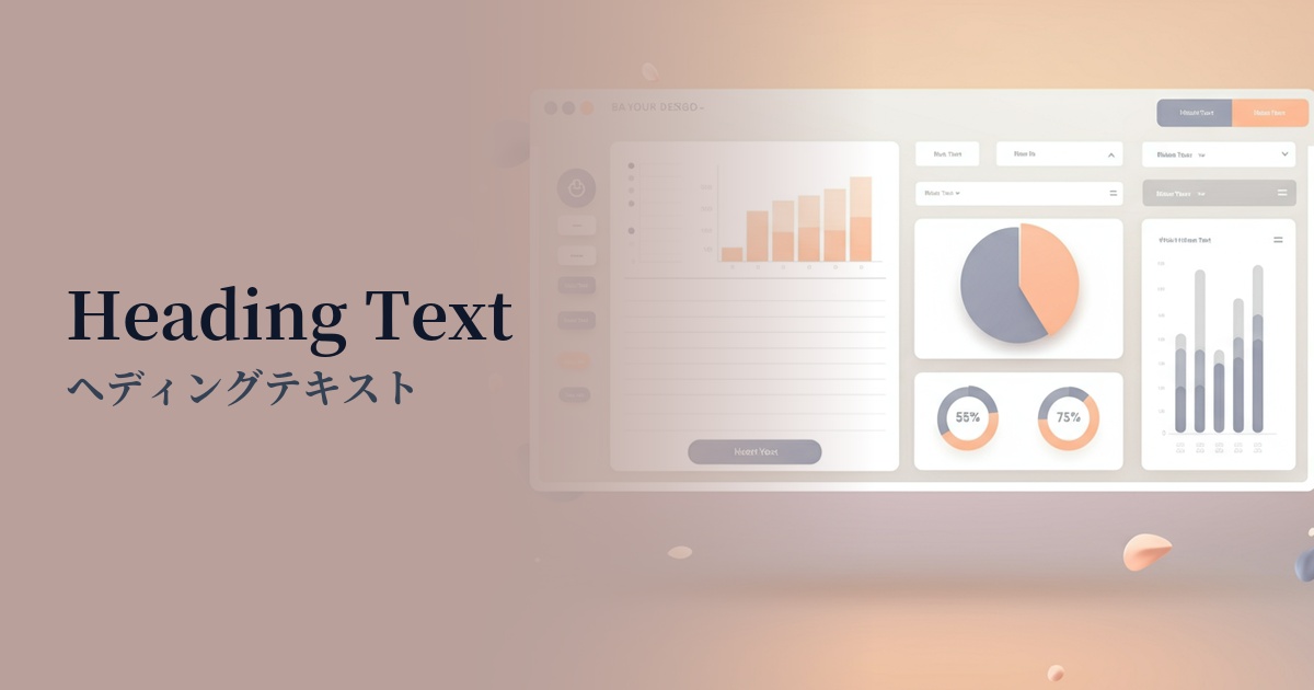
Visibility testing (UI component example)
Practical usage (best practices)
The most basic use is in article and page titles, and section headings (H1, H2, H3 tags). When combined with the slightly lighter gray used in the main body text (e.g., #4B5563), the hierarchical structure of the information becomes clear, making it easier for users to grasp the entire content.
It is also effective when used for long body text. Because it puts less strain on the eyes compared to pure black, it improves the readability of content that users read carefully, such as blog posts and documents.
It's also ideal as a background color for dark mode. By using this color as the background and a slightly grayish white (e.g., #E5E7EB) for the text, you can design a UI that is easy on the eyes and has a sophisticated feel.
Using this color as the background for key UI components such as headers, footers, and sidebars clearly defines the boundaries with the main content area, resulting in a more cohesive overall layout. This allows users to intuitively understand the site structure.
Recommended color scheme suggestions
Antique White (#FAEBD7)
By combining it with a warm white background, this color scheme maximizes text readability while softening a cold impression. It's an ideal color scheme for clean, easy-to-read, and trustworthy content websites.
Cornflower Blue (#6495ED)
This color scheme combines calm heading text with a vibrant, sophisticated cornflower blue accent. It's recommended for SaaS UI and landing page buttons where you want to convey both reliability and cutting-edgeness.
Dove Gray (#6D6D6D)
By using a slightly lighter gray for the main text and supplementary information, a hierarchy is created within the information. Using #1F2937 for headings and keeping the overall look monochrome gives a sophisticated and minimalist impression.