
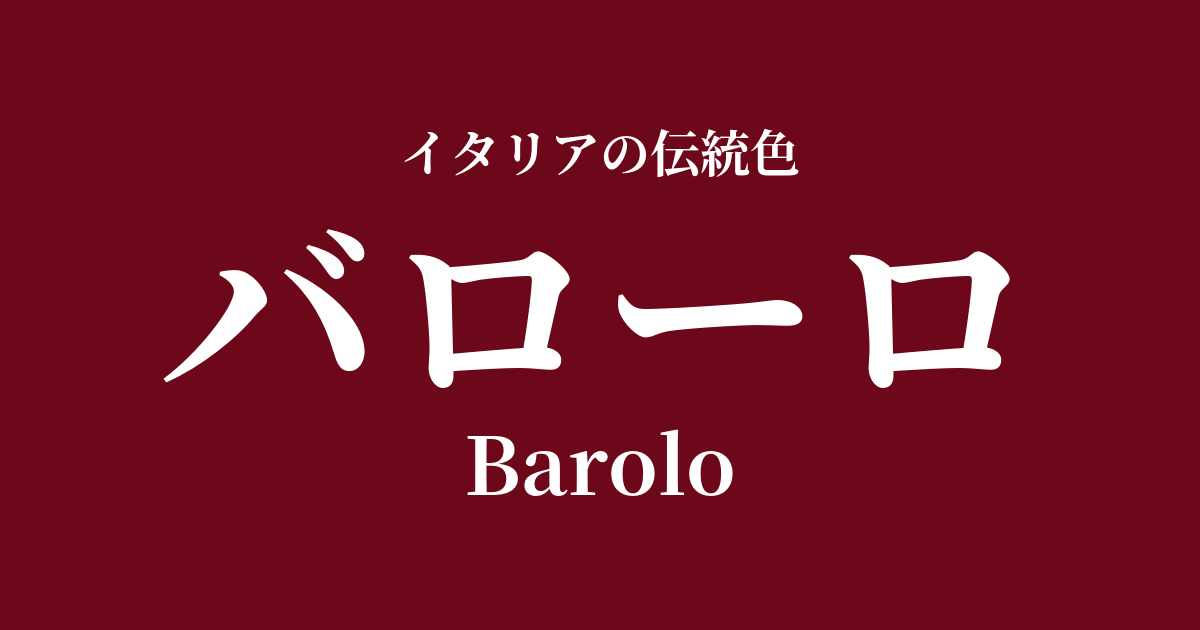
| Italian original name | Barolo |
|---|---|
| Japanese notation | Barolo |
| HEX | #6D071A |
| RGB | 109, 7, 26 |
What is Barolo? Origin and Etymology
Barolo is a deep, garnet-red color named after one of Italy's most prestigious red wines. As its name suggests, the inspiration for this color comes from Barolo, a red wine from the Piedmont region that is praised as "the king of wines and the wine of kings."
This wine is made from the Nebbiolo grape variety and undergoes long barrel aging, resulting in a complex and rich aroma and flavor. From its vibrant ruby color in its youth, it transforms over time into a calm, deep hue with garnet and brick-red hues. The name Barolo, as a color name, perfectly captures the exquisite hue that this wine displays in the glass when it reaches its peak drinking stage—a color so intense that it barely lets light through, yet still conveying a sense of transparency.
Historical background of Barolo
The noble image associated with the color of Barolo is deeply intertwined with the wine's history. In the mid-19th century, thanks to the efforts of Prime Minister Camillo Cavour, a key figure in the Italian unification movement (Risorgimento), and the Marquise of Barolo, Giulia Colbert Falletti, the wines of this region, which had previously been predominantly sweet, were transformed into the great dry wines we know today.
This reform made Barolo a wine that graced the tables of the House of Savoy, and with the birth of the Kingdom of Italy, it established itself as the nation's representative wine. Its history of being loved by royalty and nobility has given Barolo's color authority, tradition, and narrative, giving it a deeper meaning than just a color.
Barolo in Italian Culture and Art
The color of Barolo is inseparable from Italy's rich culture, especially its world of gastronomy. It can be said to symbolize the culinary culture itself, enjoyed with rich-flavored dishes such as "Brasato al Barolo," a regional dish of beef stewed in red wine from Piedmont, truffle dishes, and aged cheeses. Simply incorporating this color into tablecloths and napkins instantly creates a rich and warm atmosphere for dinner.
In the world of fashion, Barolo is favored as a color for luxury materials such as velvet, cashmere, and leather. Its deep hue enhances classic elegance and sophisticated adult charm, making it particularly popular in autumn and winter collections. In interior design, it is used as an accent color to give a sense of weight and tranquility to a space, appearing on wallpaper, curtains, and sofas, and bringing a refined atmosphere to studies and lounges.
Color scheme preview
This is to check the readability of the text when this color is used as the background.
Barolo color scheme proposal
Grigio Perla (#E0DED8)
The richness of Barolo is softened by the sophisticated light gray, creating a modern and elegant contrast. This color scheme is perfect for creating a calm and urban space.
Auro (#E6A129)
The deep red and shimmering gold create a traditional and opulent impression reminiscent of royalty and nobility. This glamorous combination is perfect for special spaces and designs that want to emphasize luxury.
Terra di Siena (#A0522D)
The warm, earthy tones enhance the image of Barolo's soil and vineyards. It creates a natural, comfortable, and tranquil atmosphere reminiscent of a bountiful autumn.
Practical Scenes
Barolo, with its elegance and substantial character, is effective in situations where you want to bring a sense of sophistication to a space or product.
In interior design, velvet can be used as an accent wall in a living room or study, or incorporated into sofas, cushions, or heavy drapery curtains, adding depth and tranquility to the space. Its appeal is even more pronounced in dimly lit spaces.
In fashion, incorporating sophisticated and elegant elements not only into statement pieces like coats, jackets, and dresses, but also into accessories such as bags, shoes, and ties, can give an overall outfit a refined and sophisticated look.
In web and graphic design, using this color as a key color for websites of high-end restaurants, wineries, or historic brands can effectively convey trustworthiness and tradition. When using it as a background color, it's recommended to combine it with white, off-white, or light gray to ensure text readability.