
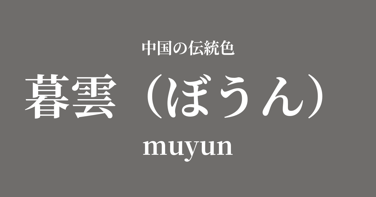
| Color name | twilight clouds |
|---|---|
| reading | Boun |
| pinyin | muyun |
| HEX | #6F6D6B |
| RGB | 111, 109, 107 |
What does "Kureun" mean? Origin and etymology.
"Boun" (暮雲), as the name suggests, is a poetic color name that describes the color of clouds at dusk.
As the sun sinks below the horizon and the sky changes its appearance moment by moment from crimson to deep indigo, the clouds lose their light and take on a quiet shadow. The colors of twilight clouds capture this gentle yet slightly melancholic scene that signals the end of the day with delicate sensitivity.
It's not just a simple gray; it's interwoven with complex emotions such as tranquility, introspection, and nostalgia for the passage of time. It's a color that embodies the ancient Chinese aesthetic of finding beauty in the changing seasons and expressing it in words.
Historical background of "Yume"
The word "kureun" itself has appeared in literary works such as Chinese poetry since ancient times and has been used to describe the scenery of twilight. However, it is difficult to pinpoint exactly when it became established as a specific color name.
The aesthetic appreciation for this color is thought to have been particularly cultivated from the Song dynasty onward, when ink painting reached its peak. The literati of that time attempted to express the colors and spirituality of all things solely through the shades and blurring of ink. In this context, the subtle gradations of the twilight sky and clouds were an ideal subject to stimulate their artistic curiosity and sensibilities.
Rather than being a formal color established by the royal court, it is said to have been an aesthetic color name cultivated among literary figures such as poets and painters through their deep insight into and empathy for nature. They may have associated this color with their own inner landscapes and philosophies of life, going beyond mere descriptions of scenery.
Twilight in Chinese Art and Crafts
The color of twilight clouds is most deeply connected to the world of ink painting. In the concept of "five shades of ink," where colors are expressed solely through variations in ink density, nuanced grays like twilight clouds were indispensable for depicting distant mountain ranges, twilight skies, and shadows cast on water. In landscape painting in particular, using this color brought a sense of tranquility and profound spatiality to the image.
In the field of ceramics, we can find traces of twilight in the subdued gray hues seen in the celadon and Jun ware glazes of the Song dynasty. The exquisite beauty of "kiln transformation," the unpredictable color changes produced by natural fire and clay, is reminiscent of the ever-changing sky at dusk.
In the realm of fashion culture, it is said that these subdued and understated colors were favored by literati and intellectuals who disliked ostentation and valued inner richness. These twilight-colored garments, made from simple fabrics like hemp and cotton, quietly spoke volumes about the wearer's intelligence and refinement.
Higurashigo Seki, where is it, Yanhae envoy Shuu?
Color scheme preview
This is to check the readability of the text when this color is used as the background.
Kureun's color scheme proposal
Tsukihaku (#EAF4FC)
The combination of the calm gray of "Twilight Clouds" and the pure white of "Moon White" creates an impression of tranquility and dignity, like the beginning of a quiet night. It is ideal for creating a sophisticated space reminiscent of an ink painting.
Beni Kaido (#F2A0A1)
This combination evokes the last vestiges of light in the sky after sunset. The deep gray of the twilight clouds complements the gentle, sweet red of the begonia red, creating an emotional and romantic atmosphere. It's a color scheme that feels somewhat nostalgic.
赭石 (#A85D4D)
Combining the twilight sky's color, "Twilight Cloud," with the earth's soil's color, creates a color scheme that evokes the grandeur and stability of nature. The combination of earth tones brings peace to the mind and creates a warm and inviting space.
Practical Scenes
In interior design, Kureun brings a sense of calm and sophistication to a space. Using it as an accent color on an entire wall in a living room, study, or bedroom creates a quiet and contemplative atmosphere. It pairs exceptionally well with natural materials and high-quality metals such as moon-white or off-white linen, solid wood furniture, and brass lighting.
In fashion, coats, jackets, and suits in twilight-colored hues create an intelligent and chic impression. Pairing them with white or light beige innerwear, or adding soft accent colors like begonia red with accessories, prevents the look from becoming too stiff and completes an elegant style. High-quality materials such as wool, cashmere, and silk further enhance the depth of this color.
In web and graphic design, using this color as a background can enhance content and convey a sense of luxury and trustworthiness. It is particularly suitable for websites of brands that focus on traditional crafts, art, or minimalist lifestyles.