
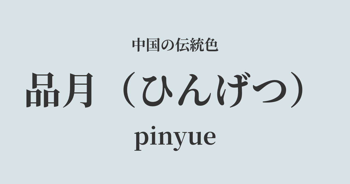
| Color name | Shinatsuki |
|---|---|
| reading | Hingetsu |
| pinyin | streetyue |
| HEX | #D8E3E7 |
| RGB | 216, 227, 231 |
What is Hinagi? Origin and etymology
"Hingetsu," as its name suggests, is a very pale, bluish-white color that resembles the light of the moon shining in a clear night sky.
The kanji character "品" (hin) not only represents a grade or rank, but also carries meanings such as "to savor" and "to evaluate." Therefore, "品月" (hin-getsu) is thought to be a color name that embodies a poetic and elegant scene of gazing at the moon on a quiet night and savoring its beauty to one's heart's content.
It's not just a color; it's a profound name that evokes a sense of spiritual richness, such as tranquility, purity, and moments of contemplation.
Historical background of Shinotsuki
While there are few records indicating that the color name "pin-yue" was officially established by any particular dynasty, the culture of appreciating the moon has been deeply rooted throughout Chinese history.
In particular, during the Tang and Song dynasties, when poetry and painting flourished, literati and artists left behind numerous works featuring the moon as their subject. They associated the moonlight with a variety of emotions, such as loneliness, longing for home, and the vastness of the universe.
The "Hin-getsu" color scheme can be said to have originated from the aesthetic sensibilities of such literary figures. A spirit that rejects ostentatious ornamentation and finds quiet beauty in nature is reflected in this delicate color. It has been cherished by cultural figures as an introspective and intellectual color, distinct from the dazzling colors of the imperial court.
The Moon in Chinese Art and Crafts
The delicate hues of "Pin Yue" can be found in various Chinese works of art.
A prime example is the celadon porcelain fired during the Song Dynasty, also known as "yingqing." Its glaze is a translucent white with a faint bluish tint, as if it has captured moonlight, and it perfectly embodies the image of "pin-getsu" (the moon). The way the light shines through the thin parts of the vessel is truly a beauty of profound mystery.
Furthermore, in the world of ink painting, this nuance of color can be felt in the blank spaces that are not depicted, or in the mist and water surfaces that are represented with light ink. Even if this color is not directly applied, the serene atmosphere that permeates the entire painting is itself "Hin-getsu" (a type of sumi-e).
In fashion, these pure colors were favored for the clothing of noble individuals who distanced themselves from the secular world, and for intellectual scholars. The elegant hues are further enhanced when tailored into lustrous silk fabrics.
Bright moon light in front of the table, doubt is frost on the ground.
Color scheme preview
This is to check the readability of the text when this color is used as the background.
Color scheme proposal for Shinazuki
Mayuzai (#49586E)
This beautiful, contrasting color scheme evokes a quiet night sky and moonlight. The deep shade of dark blue highlights the pure white of the moon, creating an intelligent and calming impression. It is recommended for study or bedroom decor.
Blue color (#EDD1D8)
The tranquility of the moon, combined with the gentle, soft flush of lotus root, creates an elegant and refined impression. It expresses a graceful and feminine atmosphere and is ideal for color schemes in fashion and cosmetics.
Matsuka (#BCEE68)
This refreshing and natural color scheme is reminiscent of young leaves illuminated by moonlight. The cool impression of the moon is combined with the vitality of pine blossoms, creating a calming and relaxing atmosphere. Recommended for living rooms and other similar spaces.
Practical Scenes
In interior design, "Hinzuki" has the effect of making a space appear larger and brighter. When used on large areas such as wallpaper or curtains, it creates a clean, minimalist, and sophisticated atmosphere. It pairs particularly well with natural materials such as solid wood furniture and Japanese paper lighting.
In fashion, it gives a clean and intelligent impression. Choosing a pink blouse instead of a white shirt will allow you to subtly express your elegant individuality. It is easy to match with other colors and works well as a base color in your outfit.
In web and graphic design, using it as a background color enhances the content and creates a modern, trustworthy image. Its beauty is further highlighted when used in simple layouts that utilize white space.