
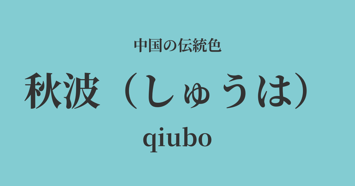
| Color name | Autumn wave |
|---|---|
| reading | Shuu |
| pinyin | qiubo |
| HEX | #83CCD2 |
| RGB | 131, 204, 210 |
What is "Shunami"? Origin and etymology
"Shūha" is a color with a very poetic name, literally meaning "waves on clear autumn water." It is a gentle, slightly melancholic blue-green that captures the image of light reflecting off the gently rippling surface of water in the clear autumn air.
This phrase eventually became widely used in the world of literature as a metaphor for "a beautiful woman's cool, alluring gaze" or "a seductive look." It's a beautiful expression that compares the sight of clear eyes glistening and rippling to the surface of autumn water. This color embodies the intelligence and delicate emotions hidden within such a woman's gaze.
Historical background of the flirtatious gesture
The word "autumn waves" appears frequently in poetry, especially from the Tang to the Song dynasties. Poets favored this evocative word when describing natural scenery or the beauty of women.
Among them, the line "The beautiful woman has not yet returned her flirtatious glance" by the Northern Song dynasty literary giant Su Shi is particularly famous and is considered a prime example of using "flirtatious glance" to mean a beautiful woman's seductive gaze.
It is unclear when the color "autumn wave" became established, but it is thought that this poetic image took deep root in people's hearts, and eventually a specific hue that evoked that scene came to be called "autumn wave." In the court culture of the Song dynasty, such delicate and literary sensibilities were highly valued, and rich narratives were sought in colors as well.
The flirtation in Chinese art and crafts
The color "Shuha" (秋波) has deep ties to the world of Chinese art, particularly ceramics. The clear blue-green color, reminiscent of the sky after a rain shower, found in celadon, especially Ru ware celadon, which was considered the pinnacle of the Song dynasty, beautifully aligns with the quiet and serene image of "Shuha." The fine crackling of the glaze resembles ripples spreading across a still water surface, captivating the viewer's heart.
Furthermore, in landscape paintings, this kind of calm blue-green is sometimes used when depicting distant mountains or lake surfaces. This is because it is a suitable color for expressing the tranquility of autumn and the crispness of the air.
In fashion culture, it is said that this color was favored by women of the literary and aristocratic classes as a color that conveyed an impression of nobility and intelligence. Combined with the luster of silk, it likely further enhanced its elegance.
Beautiful person's unacknowledged episode of autumn wave, child's desire language anti-fly spit.
Color scheme preview
This is to check the readability of the text when this color is used as the background.
Autumn Wave's Color Scheme Proposal
Black (#1D1B20)
The deep black of the ink complements the clear blue-green of the autumn waves, creating a quiet and intellectual atmosphere reminiscent of calligraphy or ink painting. The beautiful contrast gives a refined impression.
Blue color (#EDD1D5)
The pale pink of lotus root adds warmth and softness to the cool hues of autumn waves. This color scheme expresses an elegant, feminine, and ephemeral beauty.
Moon white (#D9D6C3)
By combining it with a pale, moon-white color reminiscent of moonlight, it evokes a fantastical and tranquil scene like the surface of water on a quiet moonlit night. It creates an elegant and peaceful impression.
Practical Scenes
In interior design, it's ideal for spaces where you want to relax, such as bedrooms, studies, and living rooms. Incorporating it into a wall, curtains, cushions, or other fabrics creates a relaxing yet intellectual atmosphere. Pairing it with white, gray, or light wood-grain furniture creates a sophisticated space.
In fashion, this color gives an intelligent and elegant impression, making it ideal for items such as dresses, blouses, and scarves. In particular, pairing it with supple, lustrous materials like silk or linen further enhances the delicate beauty of the autumnal pattern.
In web and graphic design, it is effective when you want to convey a sense of trust or tranquility. Rather than using it boldly as the main color, using it as an accent color or in a background gradient results in a refined and elegant design.