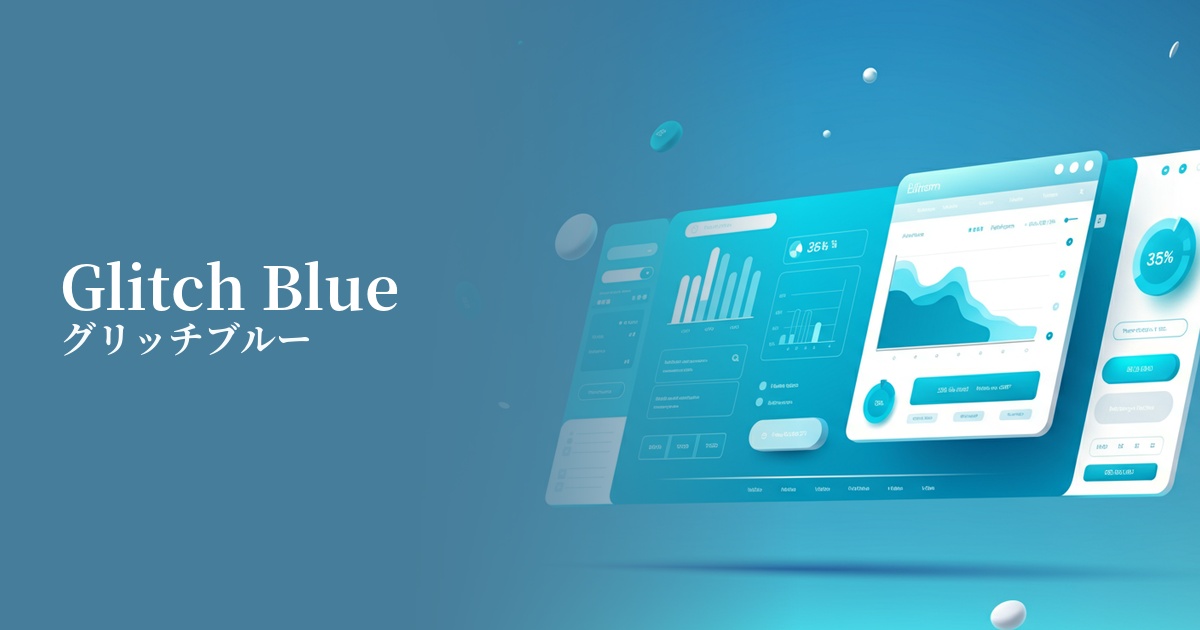
| English name | Glitch Silver |
|---|---|
| Katakana | Glitch Blue |
| HEX | #3333FF |
| RGB | 51, 51, 255 |
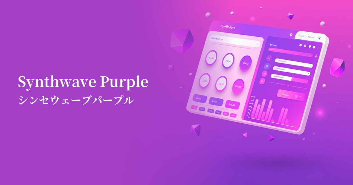
| Design Theme | Neon & Cyberpunk Colors |
Why is it a trend? (Background and reasons)
The rise of glitch blue is driven by the growing interest in virtual spaces such as the metaverse and VR/AR. In today's world, where digital and reality merge, this color is being embraced as a symbol of a "digital native" sensibility.
Another major factor is the revival of cyberpunk and retro-futuristic cultures that were popular from the 80s to the 90s. This color, which has both a nostalgic and futuristic feel, has inspired many creators.
The widespread adoption of dark mode, in particular, has provided a canvas where vibrant colors like glitch blue truly shine. Because they stand out against a dark background, they are incredibly effective as visual hooks in UI design.
The psychological effects of design and UX
Glitch Blue strongly evokes keywords such as innovation, technology, and the future. Incorporating it into your website or app can give users the impression that your service is innovative and cutting-edge.
Because it is a highly saturated and energetic color, it strongly attracts the user's attention. It has the effect of bringing movement and vitality to static designs and creating a dynamic user experience.
On the other hand, these unrealistic colors also have a psychological effect that enhances immersion in the digital world. In games and entertainment content, they can act as a trigger to draw users into that world.
However, while highly visible, overuse can cause visual fatigue in users. A smart approach in UX design is to use it as a "spice" to highlight important information or actions.
Visibility testing (UI component example)
Practical usage (best practices)
The most effective use is as an accent color. By using it only in areas where you want to encourage user interaction, such as CTA buttons, links, and active elements in forms, you can expect to improve conversion rates.
In the hero area of your website, which determines the first impression, it's recommended to use a dark background with a glitch blue gradient or abstract shapes. This will instantly convey a strong impact and the brand's cutting edge to visitors.
In SaaS product dashboards, using this color for graphs and charts that display important figures helps users intuitively grasp the information. However, it's important to clearly define the rules for using the color to avoid confusion with other information.
Incorporating glitch blue into button and card hover effects allows you to provide rich feedback to user actions, creating an interactive and enjoyable user experience.
Recommended color scheme suggestions
Charcoal (#36454F)
By placing glitch blue against a deep charcoal gray background, the colors stand out vividly, creating a futuristic world reminiscent of cyberpunk or science fiction. This combination offers high visibility and is ideal for modern UI design.
Deep Pink (#FF1493)
These colors are almost complementary, creating an exciting combination that brings out the best in each other. It's perfect for creating a highly energetic and playful design reminiscent of 80s synthwave.
Alice Blue (#F0F8FF)
When combined with a bright, clean Alice Blue, the strong presence of Glitch Blue is softened, creating a refreshing and technical impression. This is suitable when you want a lighter, more approachable atmosphere while maintaining a cutting-edge feel.