| English name | Creamy Yellow |
|---|---|
| Katakana | Creamy Yellow |
| HEX | #FFFACD |
| RGB | 255, 250, 205 |
| Design Theme | Pastel & Macaron Colors |
Why is it a trend? (Background and reasons)
As interest in comfort in the digital space grows, soft, eye-friendly hues like creamy yellow are gaining attention. By avoiding overly vibrant colors and strong contrasts, these hues are expected to reduce visual fatigue from prolonged screen time, making them a popular choice for user-friendly designs.
As values such as sustainability and wellness become more widespread in society, these philosophies are now reflected in design. This color, reminiscent of natural light and organic materials, is highly compatible with the brand image that proposes a comfortable and healthy lifestyle, and conveys a sincere message to users.
The trend is evolving from traditional minimalism based on achromatic colors to "soft minimalism," which adds a more human warmth and approachability. Creamy yellow is highly valued in sophisticated, modern designs because it adds a subtle nuance that prevents the design from becoming too inorganic while maintaining simplicity.
The psychological effects of design and UX
The bright, positive energy of yellow is gently enveloped by the cream color, giving the user a calm and pleasant sense of happiness. Its characteristic feature is its ability to express feelings of joy and hope in a calm tone.
Soft, muted colors help to ease users' apprehension and naturally draw them into the content. This is especially helpful for first-time visitors to the site, as it helps to create a friendly and trustworthy first impression.
This color, reminiscent of natural light, linen, and freshly baked bread, is a perfect match for brands that emphasize organic products and handcrafted aesthetics. Its understated elegance creates a sophisticated world in the lifestyle and fashion sectors.
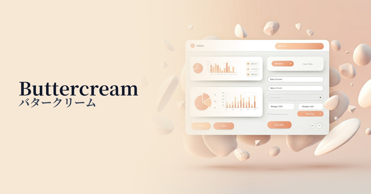
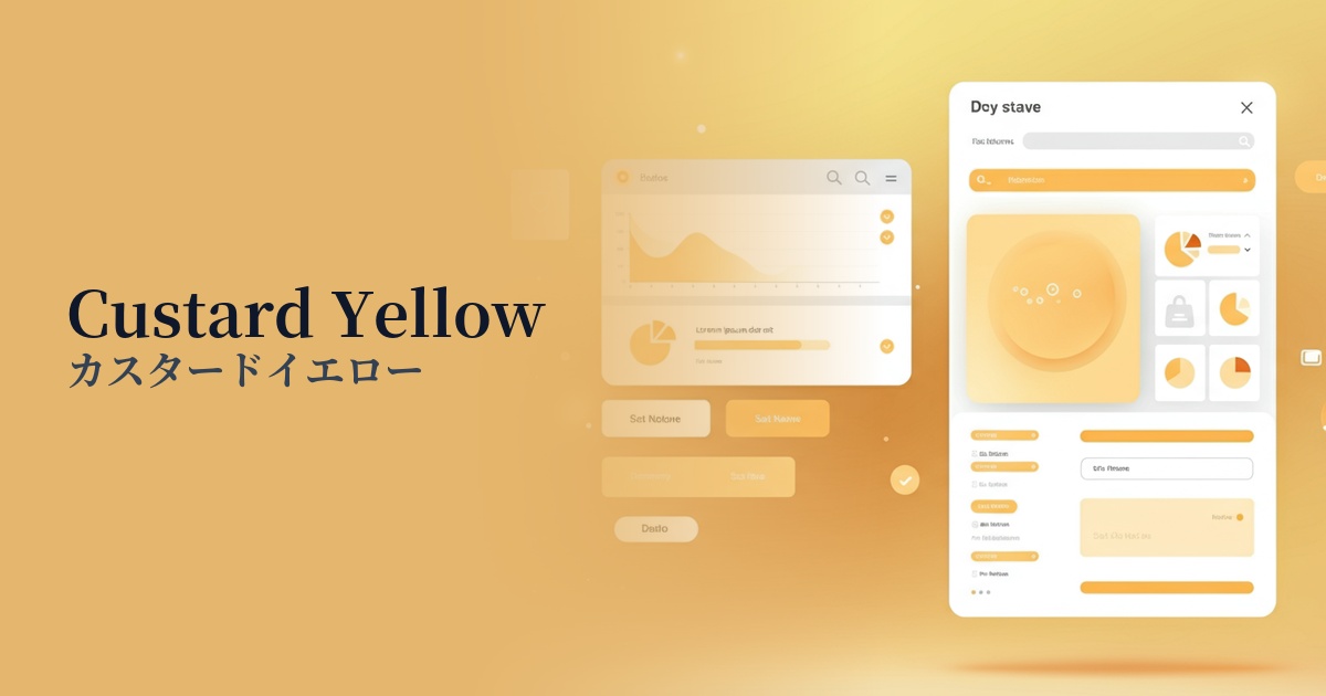
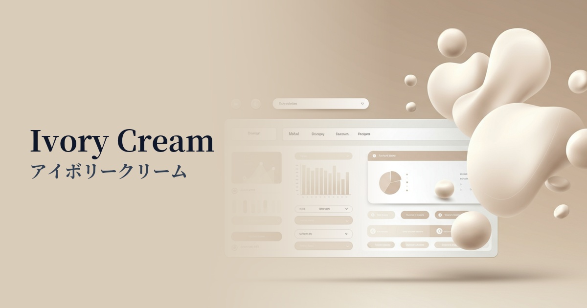
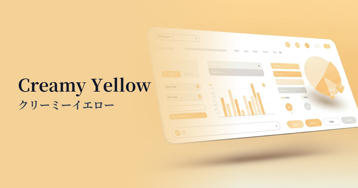
Visibility testing (UI component example)
Practical usage (best practices)
By using this color as the background for the entire site, it creates a sense of warmth and unity throughout the page. In this case, choosing dark gray or brown tones for the text color will ensure sufficient contrast while maintaining eye-friendly readability.
In minimalist designs based on white or light gray, it's effective to use it as an accent for CTA buttons, important links, and icons. It subtly attracts the user's attention without being overly assertive, smoothly guiding them to the next action.
By using it as the background color for content areas or card-type UIs, you can visually and gently group blocks of information. When combined with sufficient white space (negative space), it creates a rhythmic, rhythmic, and easy-to-read layout.
By boldly using it as the background color for the hero area displayed in the first view, or as a component color for the key visual, it becomes a powerful means of instantly conveying the brand's worldview of "gentleness" and "naturalness" to visitors.
Recommended color scheme suggestions
Slate Gray (#708090)
The warmth of creamy yellow is balanced by the sophisticated and calming slate gray. This modern and stable color scheme is recommended for SaaS UIs and corporate websites where you want to convey both trustworthiness and refinement.
Sage Green (#B2AC88)
The combination with sage green, reminiscent of plants in nature, is ideal for organic and wellness-themed themes. It provides users with a sense of comfort and reassurance, effectively emphasizing a natural and healthy brand image.
Rosy Brown (#BC8F8F)
Pairing it with a slightly reddish rosy brown creates a feminine and elegant impression. It's perfect for situations where you want to express feminine softness and warmth, such as in cosmetics, fashion, and lifestyle media.