| English name | Champagne Yellow |
|---|---|
| Katakana | Champagne Yellow |
| HEX | #F7F3E3 |
| RGB | 247, 243, 227 |
| Design Theme | Pastel & Macaron Colors |
Why is it a trend? (Background and reasons)
In recent years, web design has seen a rise in popularity for concepts like "warm minimalism" and "quiet luxury," which go beyond simple minimalism. Instead of stark white or sterile gray, neutral colors that evoke a sense of warmth, such as champagne yellow, are being chosen to provide a comfortable and sophisticated user experience.
As users spend more time interacting with digital devices, they unconsciously tend to seek solace and connection with nature. Champagne yellow, a color reminiscent of light and natural materials, brings a calm and organic atmosphere to the screen. This element of "soothing" resonates with the hearts of today's users.
Another major appeal of this color is its ability to subtly convey a sense of luxury and exclusivity. While not flashy, its delicate hue speaks to high quality, making it a popular choice for D2C brands that prioritize brand identity and for creators' portfolio websites.
The psychological effects of design and UX
Champagne yellow, as its name suggests, evokes the image of "champagne," conveying positive impressions such as elegance, sophistication, and a touch of celebration. It's an effective color when you want to make users feel excited or special.
As a yellowish off-white, it softens the coldness of pure white, providing users with warmth and a sense of security. By enveloping the entire UI in this color, you can create a friendly and comfortable space.
Its clean, almost white appearance makes it suitable for designs where cleanliness and trustworthiness are required. Because it's a subtle color that doesn't interfere with the content, it can highlight the main product or information, and is expected to help users focus on it.
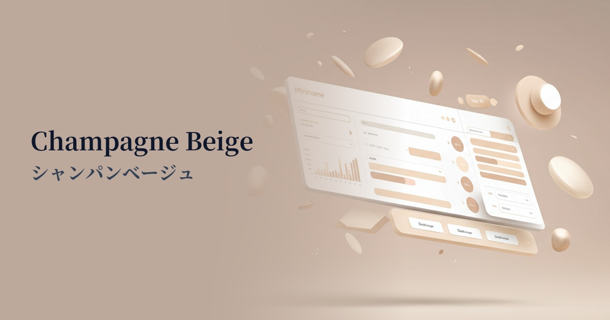
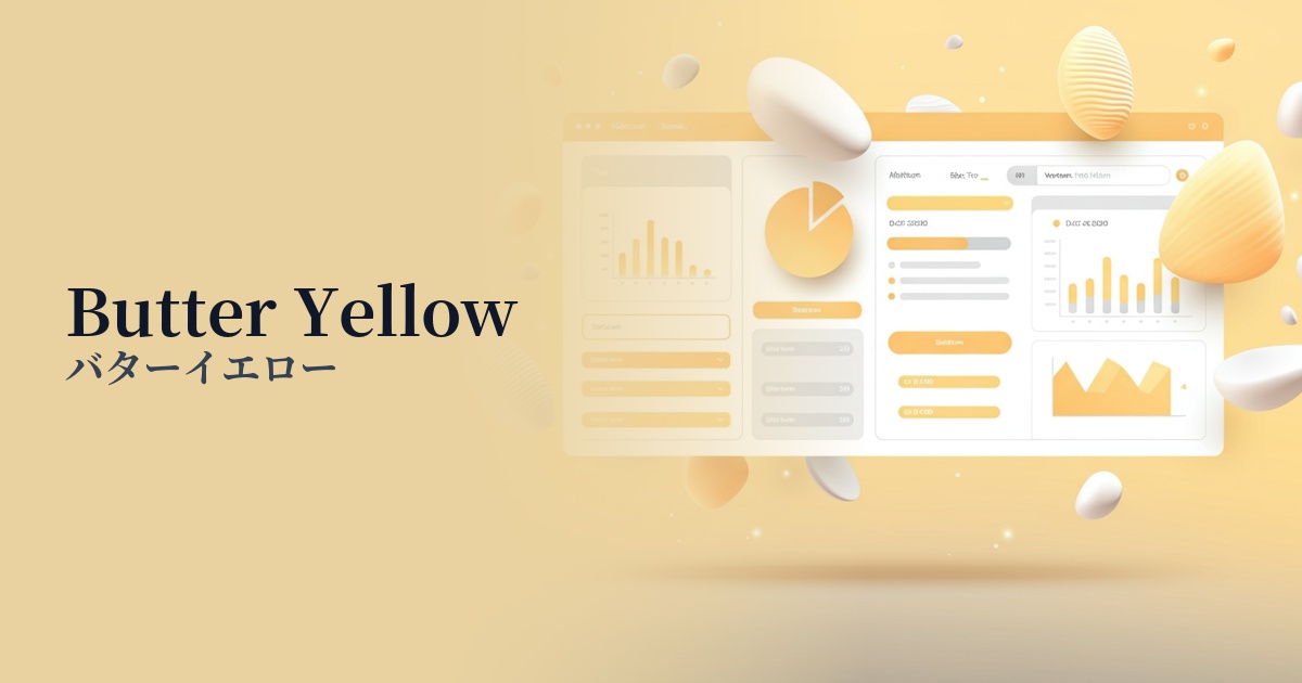
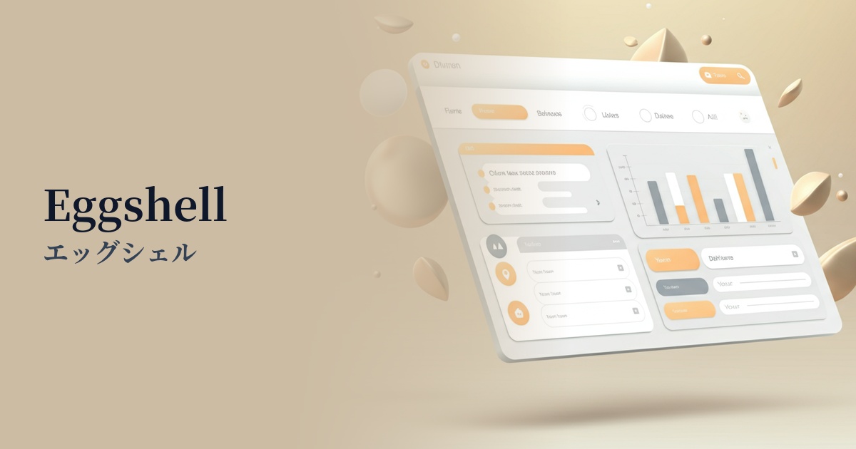
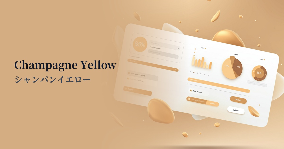
Visibility testing (UI component example)
Practical usage (best practices)
Its most effective use is as the background color for the entire website. When used extensively, it creates a warm, minimalist aesthetic, making well-placed white space feel richer and more meaningful.
Combining this color with other neutral colors (such as light gray or very pale beige) is also recommended for card-style UIs and as background colors for each section. The varying shades of color subtly indicate the hierarchy of information, helping users intuitively understand the structure.
This color also plays a supporting role, beautifully complementing strong accent colors. For example, when combined with buttons or links in dark navy, burgundy, or deep green, the accent color stands out even more, drawing attention.
Choosing a slightly softer charcoal gray or sepia tone for text color, rather than pure black, will create a more harmonious and sophisticated overall tone. However, be sure to use a tool to check that the contrast ratio with the background color meets WCAG standards.
Recommended color scheme suggestions
Slate Gray (#708090)
The warmth of champagne yellow and the calmness of slate gray create a sophisticated and trustworthy feel. Using these colors for text and important UI elements results in a highly readable, intelligent, and modern design.
Sage Green (#9DC183)
By combining it with sage green, which evokes nature, it creates an organic and comfortable atmosphere. This color scheme is ideal for wellness-related websites or when you want to convey a sustainable brand image.
Rosy Brown (#BC8F8F)
The muted pinkish Rosie Brown adds elegance and femininity to champagne yellow. It's perfect for cosmetic brands and bridal designs, creating a sophisticated and mature aesthetic without being overly sweet.