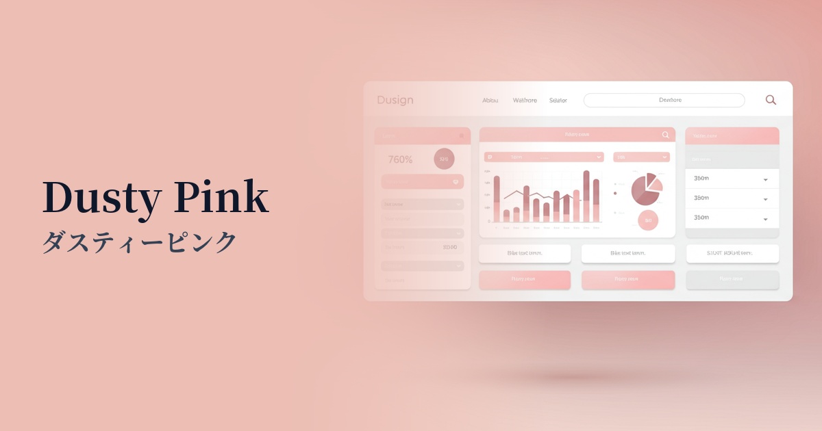
| English name | Dusty Pink |
|---|---|
| Katakana | Dusty Pink |
| HEX | #DCA6A6 |
| RGB | 220, 166, 166 |
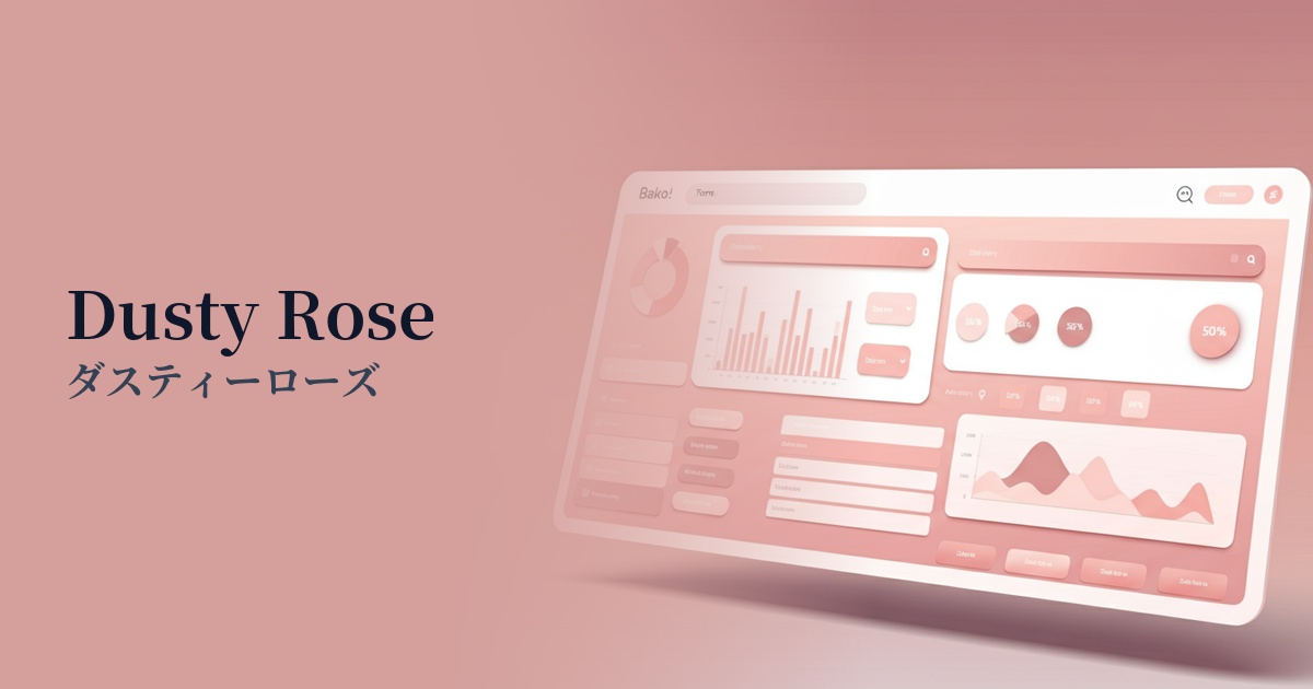
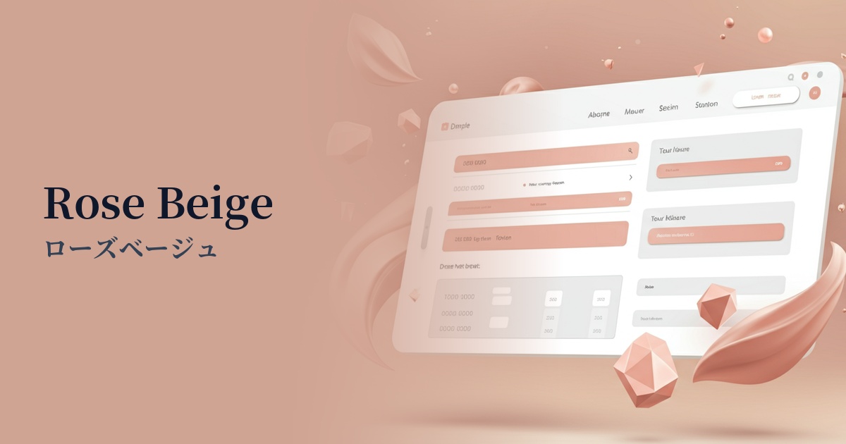
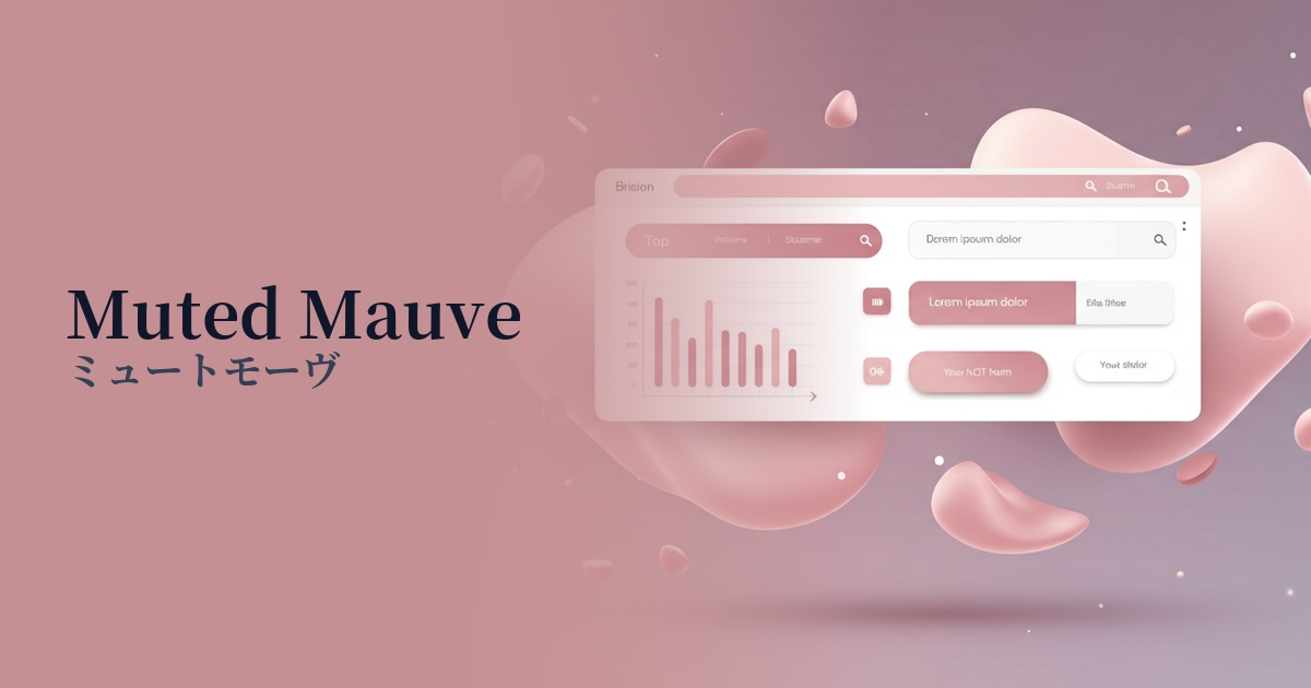
| Design Theme | Muted colors & earth tones |
Why is it a trend? (Background and reasons)
In recent years, the world of web design has seen a shift from bright and vivid colors to more subdued and sophisticated "muted colors." Dusty pink (#DCA6A6) is a color that is attracting attention as a prime example of this trend.
This trend is driven by a growing preference for minimalism and natural aesthetics. In today's information-saturated digital environment, users tend to seek designs that offer visual comfort. The gentle and soothing atmosphere of dusty pink perfectly meets this need.
Furthermore, its gender-neutral appeal, which overturns the conventional stereotype that "pink equals femininity," is another reason for its popularity. The grayish hue tones down the sweetness and appeal to a wide range of users regardless of gender, helping to build a modern and inclusive brand image.
The psychological effects of design and UX
Dusty pink evokes a sense of security and calmness in users. Its low saturation makes it easy on the eyes, offering a user experience benefit of reducing eye strain even during prolonged viewing. These characteristics make it particularly well-suited for wellness and lifestyle-related services.
This color is not just simply "cute," but also possesses an air of elegance and sophistication. While it evokes a vintage or nostalgic feel, depending on the colors it's combined with, it can also create a cutting-edge and modern image.
It is also effective in situations where you want to convey trustworthiness and sincerity. Because it is non-aggressive and gives a gentle impression, it helps to shorten the psychological distance with users and express an approachable brand personality.
Visibility testing (UI component example)
Practical usage (best practices)
Using it as a background color for a wide area will bring a consistent and calm atmosphere to the entire site. However, it is important to choose a color that provides sufficient contrast for the text placed on top, such as dark gray or charcoal, to ensure readability.
Caution is advised when using this color for the main CTA button. Due to its low saturation, it may get lost among other elements. Using it as an accent color, specifically for auxiliary buttons, icons, or hover effects, can attract user attention without sacrificing elegance.
It excels as a "supporting element" in design, such as a background to enhance product images on an e-commerce site, a dividing line on a portfolio site, or decoration below a blog heading. Because it doesn't overpower the main content, it doesn't detract from it.
It's also effective to use it as the color of graphs and tags in SaaS dashboards and analytics tools. By combining it with other warning colors (red and yellow) or success colors (green), it becomes easier to visually organize the priority of information.
Recommended color scheme suggestions
Charcoal (#36454F)
Charcoal gray adds a sophisticated and modern touch to the overall design, complementing the softness of dusty pink. It's also ideal as a highly readable text color, creating a refined and mature atmosphere.
Steel Blue (#4682B4)
The warm pink and cool blue tones complement each other beautifully, creating a near-complementary color combination. This results in a calm yet fresh and stylish impression, creating a design that conveys confidence and reliability.
Antique White (#FAEBD7)
The warm off-white of antique white further enhances the gentle atmosphere of dusty pink. It's perfect for creating an overall soft, natural, and comfortable space.