| English name | Coral Beige |
|---|---|
| Katakana | Coral beige |
| HEX | #E3B3A5 |
| RGB | 227, 179, 165 |
| Design Theme | Muted colors & earth tones |
Why is it a trend? (Background and reasons)
The popularity of coral beige stems from the recent strong interest in "earth tones" and "neutral colors" in web design. Colors reminiscent of nature and the earth bring a sense of peace and an organic atmosphere to the digital space. Among these, coral beige is favored for its exquisite balance, combining the universal sense of security of beige with the vitality and warmth of coral.
Another major reason is the evolution of minimalism, with "soft minimalism" and "human-centered design," which emphasize human warmth and comfort rather than simply stripping away information, becoming mainstream. Coral beige, which is not overly assertive yet not inorganic, gives users both a friendly and sophisticated impression, perfectly expressing the atmosphere required for modern digital experiences.
The psychological effects of design and UX
Coral beige combines the "sense of security" and "calmness" inherent in beige with the positive psychological effects of coral, such as "happiness," "gentleness," and "vitality." Adding a muted tone elevates these impressions to something more "refined" and "elegant."
From a UI/UX perspective, this color is expected to have the effect of allowing users to concentrate on the content in a relaxed state without feeling intimidated. Because it is a non-aggressive and pleasant tone, it contributes to building a foundation for a positive user experience in web services where long-term use is expected, and in lifestyle, wellness, and beauty platforms where building trust with users is important.
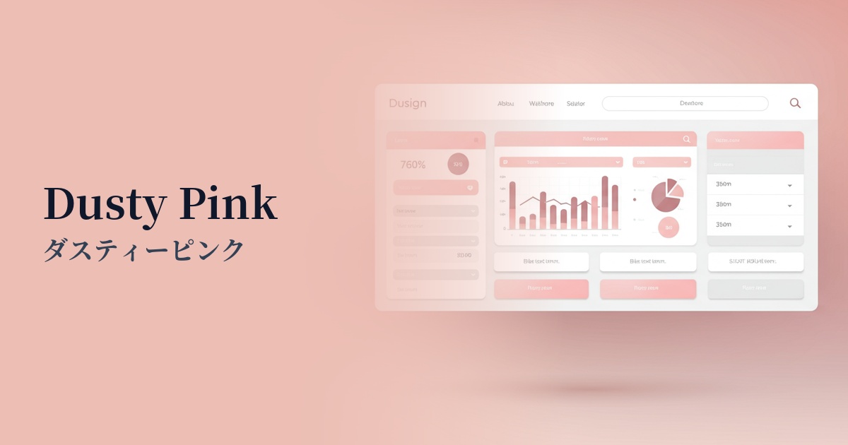
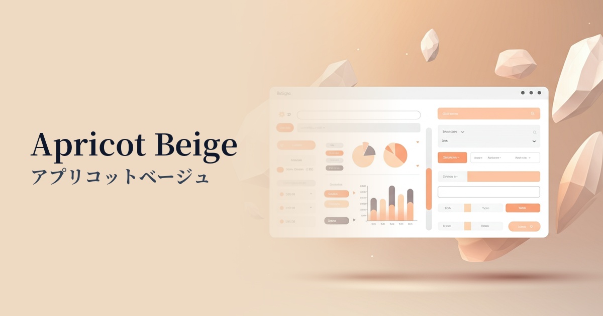
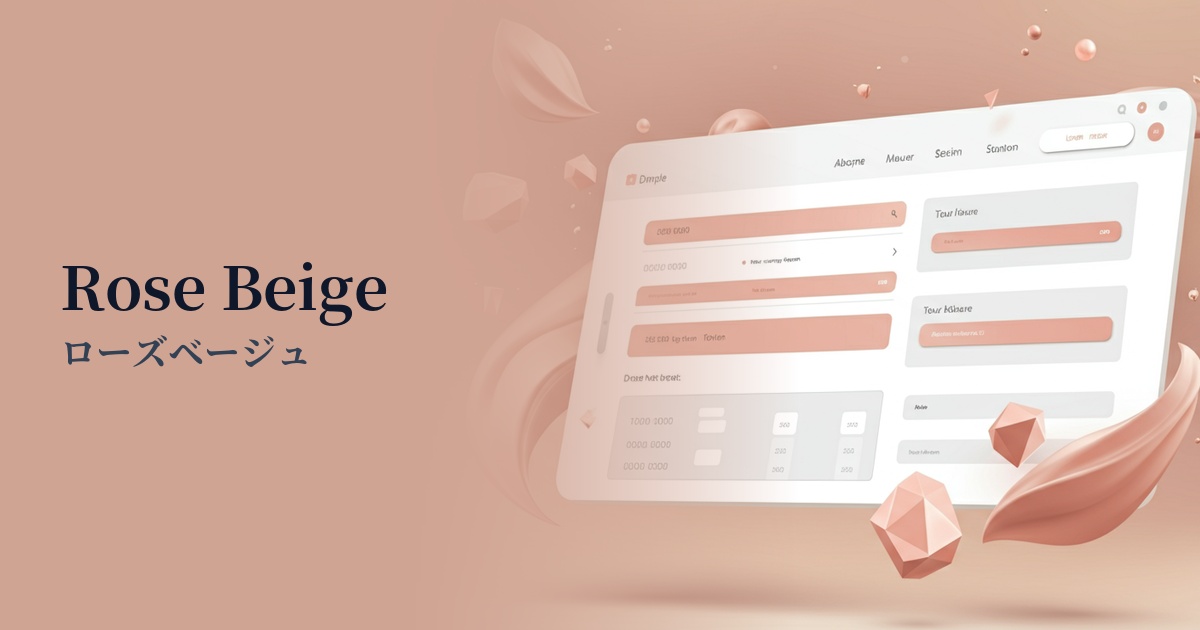
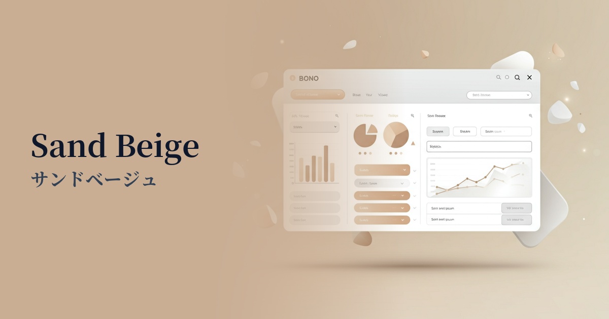
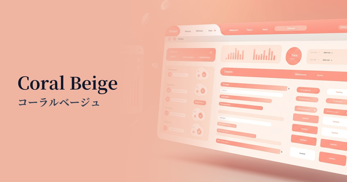
Visibility testing (UI component example)
Practical usage (best practices)
One of the most effective uses is as the background color for the entire site. Even when used over a large area, it doesn't feel overwhelming, creating an elegant canvas that highlights content and photos. In particular, combining it with a minimalist layout that makes good use of white space can create a sophisticated and refined aesthetic.
It's also effective to use it as an accent color for elements you want to encourage user action on, such as CTA buttons and important links. Because it's not too bright, it can naturally guide users to take action without startling them. It stands out gently against white or off-white backgrounds.
It's ideal for the background of card-style UIs and as a band color to separate sections. It visually organizes groups of information in an easy-to-understand way, while bringing a soft rhythm and sense of unity to the entire page.
Using it as a key color for illustrations and icons can give the entire brand a friendly and organic feel. Its appeal is particularly evident on websites in fields such as fashion, cosmetics, interior design, and food.
Recommended color scheme suggestions
Slate Gray (#708090)
The warmth of coral beige, combined with the intelligent and cool impression of slate gray, creates a modern and sophisticated atmosphere. This color scheme is recommended for B2B websites and portfolio sites where trustworthiness is essential.
Sage Green (#B2AC88)
By combining it with sage green, which evokes nature, it creates an organic and comfortable space. It is ideal for websites with themes that are gentle on the mind and body, such as wellness, sustainability, and natural cosmetics.
Ivory (#FFFFF0)
The bright and clean impression of ivory complements the warmth of coral beige, creating a very light and positive atmosphere. The minimalist design, which makes good use of negative space, achieves both a sense of openness and approachability.