| English name | Charcoal Gray |
|---|---|
| Katakana | Charcoal Gray |
| HEX | #5E6368 |
| RGB | 94, 99, 104 |
| Design Theme | Muted colors & earth tones |
Why is it a trend? (Background and reasons)
In recent years, web design has seen a trend towards avoiding pure black (#000000) which strains the eyes, and instead favoring softer, more refined dark tones. Charcoal gray is a prime example of this trend. It is increasingly being adopted by many services, especially in dark mode UIs, as it reduces eye strain while creating a sophisticated and calming interface.
The trend also stems from its affinity with design movements such as minimalism and brutalism. Charcoal gray provides a quiet and stable foundation for highlighting content and other color elements. This color, which is not overly assertive but has a strong presence, is highly effective in building timeless, modern designs.
Furthermore, it can be seen as part of a major trend such as "muted colors" and "earth tones." These colors, reminiscent of charcoal and stones found in nature, give users a sense of security and trust. The organic feel of the materials and the combination with other earth tones can convey a calm and sincere brand image.
The psychological effects of design and UX
Charcoal gray combines the "luxury" and "gravitas" of black with the "neutrality" and "calmness" of gray. This gives users an intelligent, sophisticated, and trustworthy impression. When used on corporate websites or dashboards for SaaS services that handle highly specialized information, it can visually reinforce the reliability of the service.
Because the colors are low in saturation and neutral, there is less visual noise, creating an environment where users can easily concentrate on the content. Compared to colorful interfaces, the information appears more organized, contributing to improved usability. In particular, it provides a calm reading experience on text-heavy pages.
This classic color is less prone to trends and is loved across generations. Designs based on this color are not influenced by fleeting trends and will not feel outdated for a long time. It is an ideal choice when you want to express the enduring nature and stability of your brand.
Visibility testing (UI component example)
Practical usage (best practices)
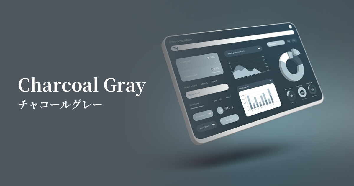
It is very effective as the main background color for websites and applications. In particular, in dark mode UIs, it has the UX benefit of being less tiring on the eyes during prolonged use because it has a softer contrast than pure black. Brightly colored text and elements stand out nicely.
It's also recommended to use it as the main text color on a light background. Compared to setting text in pure black (#000000), it creates a slightly softer impression and softens the overall atmosphere of the page. At the same time, sufficient contrast with a white background is maintained, making it easier to meet accessibility standards (WCAG).
By utilizing this for various UI elements such as buttons, form elements, card borders, and footers, you can effectively create a visual hierarchy. For example, using a bright color for the primary button and charcoal gray for secondary buttons or inactive elements can intuitively guide the user to the action they should take.
It also excels at acting as a "background" to highlight vibrant accent colors. By placing vivid brand colors or CTA buttons against a calm charcoal gray background, those colors stand out even more, effectively attracting the user's attention.
Recommended color scheme suggestions
Mustard (#FFDB58)
The combination of calm charcoal gray and warm mustard creates a sophisticated yet approachable impression. This color scheme is recommended for portfolios and brand websites that aim to convey both trustworthiness and creativity.
Coral (#FF7F50)
The gravitas of charcoal gray, combined with the vitality and energy of coral, creates a modern and memorable design. When used for CTA buttons or accents, it is expected to attract the user's attention and encourage action.
Sage Green (#B2AC88)
Charcoal gray and sage green are both earth tones that evoke nature. This combination provides users with a sense of security and calmness, making it ideal for wellness-related services and sustainability-themed websites.