| English name | Warning Orange |
|---|---|
| Katakana | Warning Orange |
| HEX | #FFA500 |
| RGB | 255, 165, 0 |
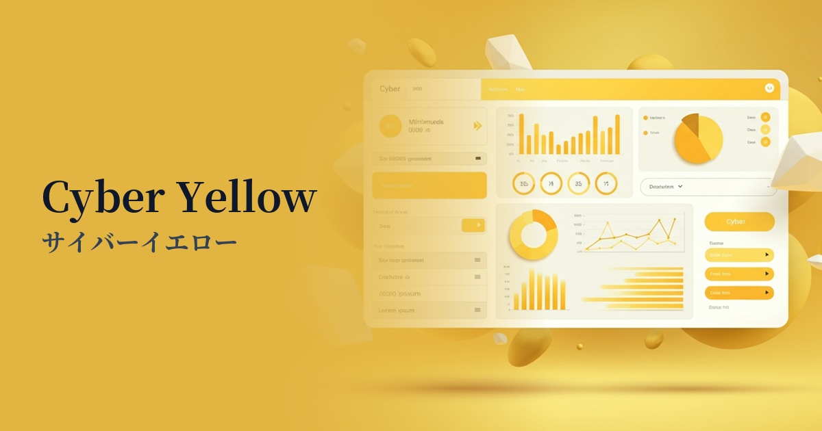
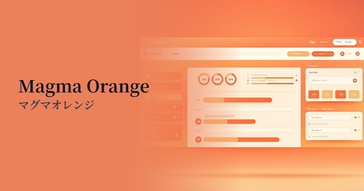
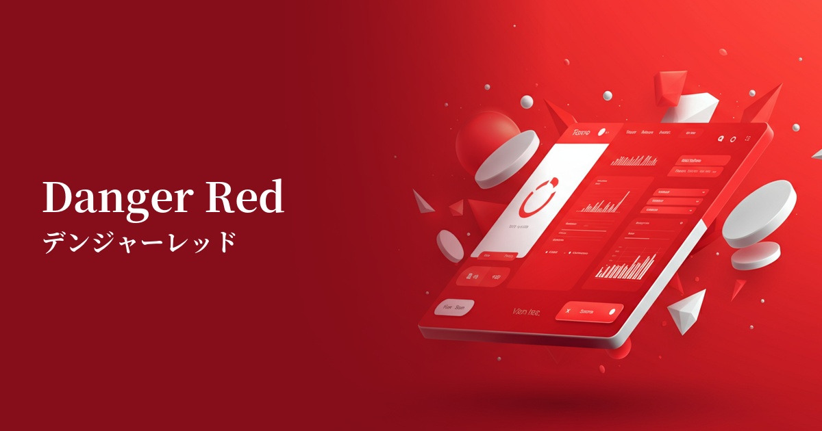
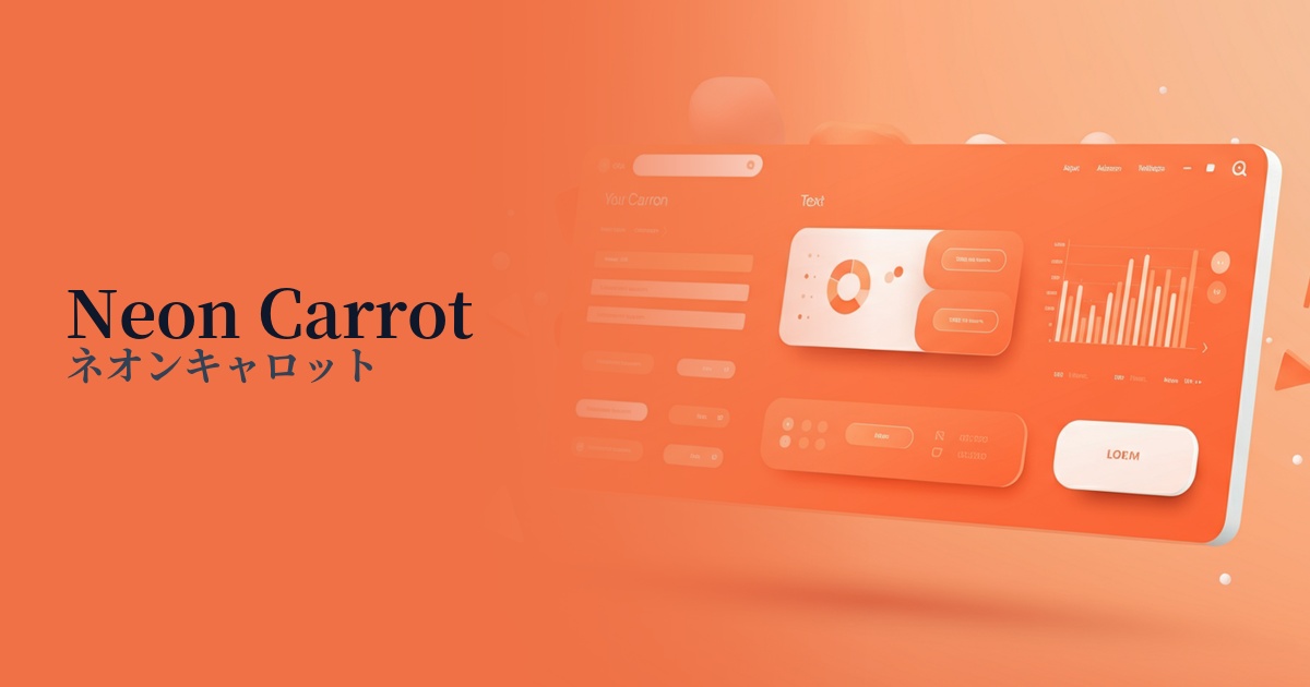
| Design Theme | Neon & Cyberpunk Colors |
Why is it a trend? (Background and reasons)
The reason warning orange is gaining attention is the resurgence of design trends such as cyberpunk and Y2K, which reinterpret 80s and 90s culture. These styles create a digitally nostalgic, futuristic feel and are characterized by highly saturated, artificial colors. In particular, in today's UIs where dark mode is widespread, warning orange, which stands out vividly against a dark background, functions as a very effective visual accent.
Furthermore, this color goes beyond simply being a warning color; it is also used to symbolize positive energy and creativity. Because it can combine the functionality of attracting attention with psychological effects such as vitality and fun, it tends to be actively adopted in SaaS dashboards and technology company websites where the goal is to encourage user action while also creating a friendly impression of the brand.
The psychological effects of design and UX
Warning orange, as its name suggests, conveys meanings of "warning" and "attention," and has a strong power to attract the user's attention and guide them to a specific action. It doesn't convey as much danger as red, and it also possesses the positivity of yellow, making it suitable for encouraging positive actions that require a little attention, such as "important notice" or "try it out."
Psychologically, it evokes feelings of energy, vitality, creativity, and enthusiasm. In UI/UX design, this energetic impression can be used to convey the innovativeness and enjoyment of a service to users and is expected to increase engagement. However, overuse can make the entire screen cluttered and stressful for users. It is important to use it strategically, only as an accent.
Visibility testing (UI component example)
Practical usage (best practices)
The most effective application is to CTA (Call To Action) buttons. By using this color on important buttons that directly lead to conversions, such as "Start Free Trial" or "Add to Cart," you can naturally attract users' attention and expect an increase in click-through rates.
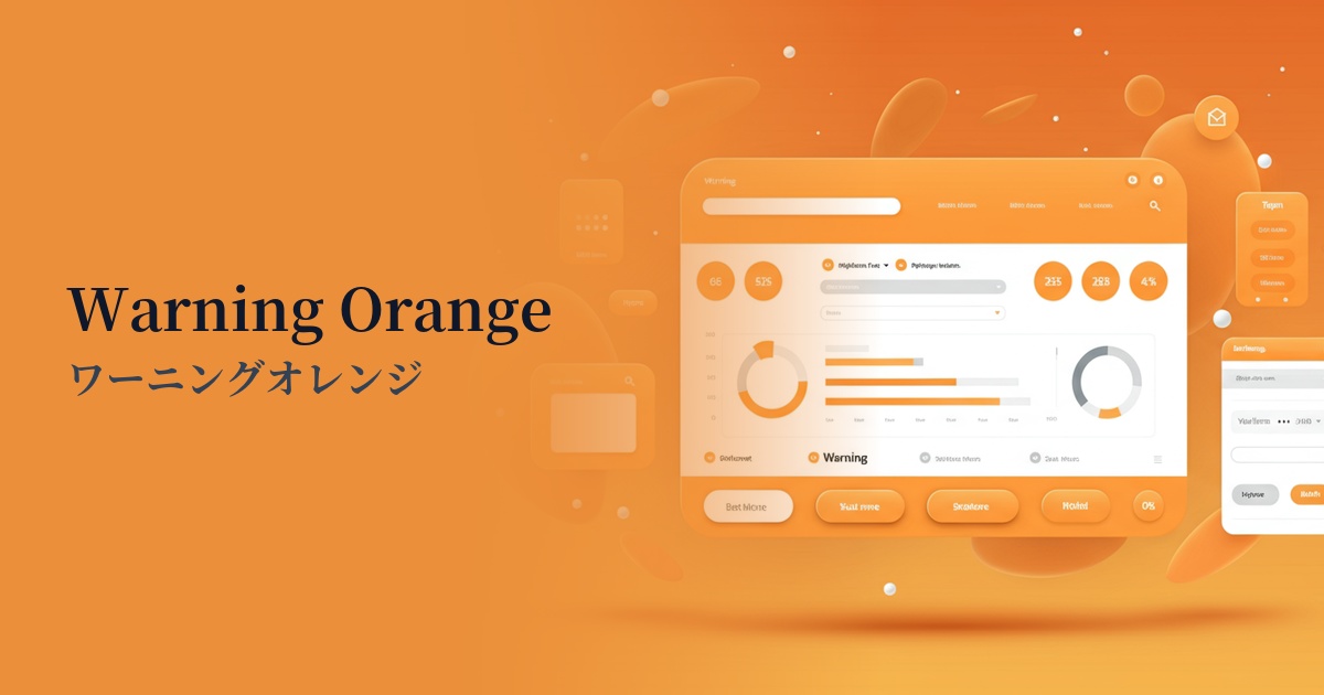
It's ideal for alerts and notifications in SaaS dashboards and management interfaces. By using it for "caution" level notifications, which are between "red" (indicating errors) and "blue" (indicating general information), users can intuitively judge the urgency of the information.
It's also a good idea to incorporate it as an accent in the typography or illustrations of the main visual or hero section. This instantly conveys the brand's energetic and innovative image to users visiting the site.
It's also effective for highlighting data points you want to draw particular attention to in graphs and diagrams. Even on screens with a lot of information, it helps users grasp important figures at a glance.
Recommended color scheme suggestions
Midnight Blue (#191970)
The deep blue powerfully complements the vibrancy of the orange, creating a futuristic and sophisticated impression. This professional combination conveys both trustworthiness and cutting-edgeness, making it ideal for dark mode UIs and technology-focused websites.
Alice Blue (#F0F8FF)
The slightly bluish, clean white refreshingly neutralizes the warmth of the orange, creating a modern and light atmosphere. It functions as a friendly accent while maintaining readability on content-driven websites.
Deep Pink (#FF1493)
The bold combination of orange and pink strongly evokes the atmosphere of Y2K and pop culture. It's ideal for building an energetic and playful brand image, and creates a design that leaves a strong impression on users.