| English name | Neon Carrot |
|---|---|
| Katakana | Neon Carrot |
| HEX | #FF9933 |
| RGB | 255, 153, 51 |
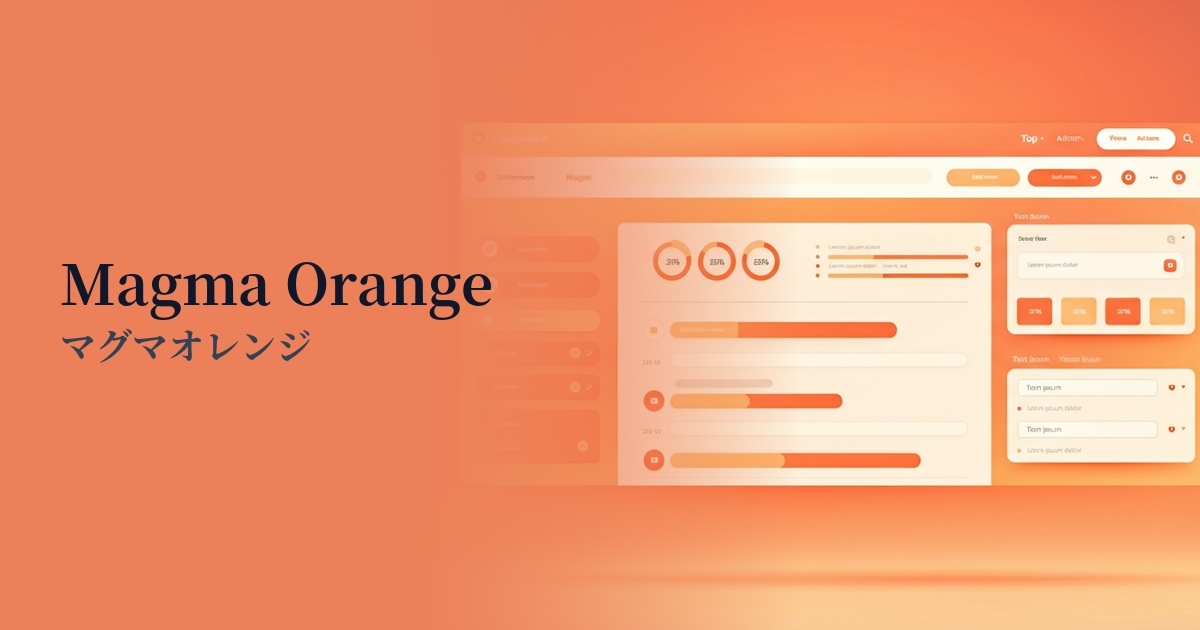
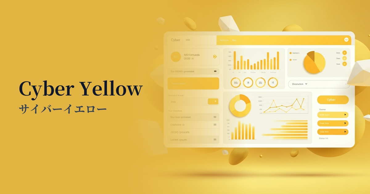
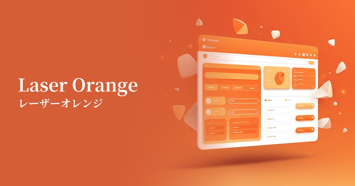
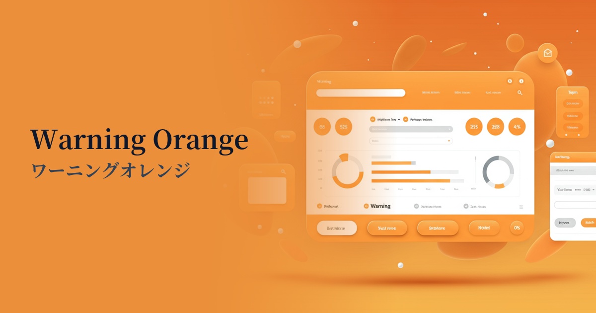
| Design Theme | Neon & Cyberpunk Colors |
Why is it a trend? (Background and reasons)
Vibrant colors like neon carrots have emerged as a trend in web design amidst the revival of 80s and 90s culture and the renewed interest in cyberpunk aesthetics. This digitally-inspired, luminous expression simultaneously evokes nostalgia and a sense of the future, attracting many users.
The modern web environment is an age of information overload. In this context, neon colors, with their power to instantly capture a user's attention and guide them to important actions, are an extremely powerful tool in marketing and UI design. They are particularly effective in situations where you need to grab attention in an instant, such as social media feeds and advertising banners.
Furthermore, the widespread adoption of high-resolution, wide-color-gamut displays has also fueled this trend. Vibrant colors that once tended to appear dull can now be beautifully reproduced exactly as the designer intended. This makes it easier for creators to pursue bolder and more expressive designs.
The psychological effects of design and UX
Neon Carrot amplifies the positive impressions of orange—such as energy, vitality, and fun—with the glow of neon. It gives users a positive and creative feeling, fostering a sense of familiarity with the brand and service.
In UI/UX design, its high visibility makes it crucial for "attention-grabbing." Applying it to elements you want users to definitely see, such as CTA buttons, error messages, and new feature notifications, can be expected to improve engagement and conversion rates.
However, because it is a color with very strong energy, using it too much can cause visual stress to users. The overall design may become noisy, and truly important information may get buried. It is important to use it strategically, only as an accent.
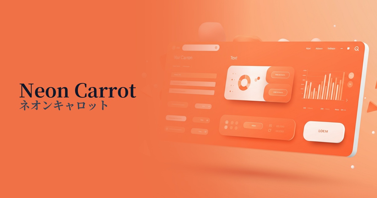
Visibility testing (UI component example)
Practical usage (best practices)
One of the most effective uses is on CTA (Call To Action) buttons on landing pages and e-commerce sites. Using Neon Carrot on buttons such as "Buy Now" or "Try for Free" naturally guides the user's eye and encourages clicks.
It pairs perfectly with designs that utilize dark mode. Neon Carrot shines vividly against a dark background, creating a futuristic and sophisticated impression. It's ideal for tech companies and entertainment service websites to express the brand's cutting edge.
If you want to tone down the overall tone of your site, it's best to use it as a limited accent color, such as for icons, link hover effects, or indicators in active navigation menus. This will give your design a modern vibrancy without compromising usability.
By partially incorporating it into the typography and graphic elements of the hero area, you can create a powerful impact at first glance. You can visually convey the brand's passion and innovative spirit to the user.
Recommended color scheme suggestions
Midnight Blue (#191970)
This is a classic combination that best showcases the vibrancy of neon carrots. The dark background absorbs the light, making the colors stand out like a neon sign. It's perfect for tech or cyberpunk-style designs, offering high visibility and a modern feel.
Gainsboro (#DCDCDC)
By combining it with light gray, the strong presence of neon is softened, creating a clean and sophisticated atmosphere. This allows for a balanced color scheme that can be used for important notifications in SaaS dashboards, for example, without disrupting the overall design.
Dodger Blue (#1E90FF)
Combining orange with blue tones, which are close to its complementary color, enhances each other's beauty, creating a very dynamic and energetic impression. It's perfect for memorable and distinctive designs such as creative portfolios and event websites.