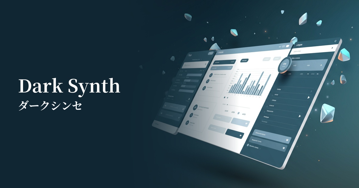
| English name | Dark Synth |
|---|---|
| Katakana | Dark Synth |
| HEX | #7B00FF |
| RGB | 123, 0, 255 |
| Design Theme | Neon & Cyberpunk Colors |
Why is it a trend? (Background and reasons)
The rise of dark synth music stems from the resurgence of retro-futuristic aesthetics such as "synthwave" and "cyberpunk," inspired by 1980s science fiction films and music. This purple color, both nostalgic and fresh, has captured the hearts of creators as the perfect color to express the unreality and immersion of the digital world.
Another major factor is the widespread adoption of dark mode UI. Against a dark background, highly saturated colors like dark synths appear to glow vividly, clarifying visual hierarchies and guiding the user's attention to key elements. More than just decorative, these colors possess functional beauty, and are increasingly being adopted by many services.
The psychological effects of design and UX
Purple has long been considered a color symbolizing creativity, mystery, and nobility. Dark Synth's vibrant purple, in addition to these impressions, gives users a digital-native sensibility of "energy," "innovation," and "excitement" brought about by the glow of neon lights.
In UI/UX design, this color has the power to intuitively convey to users the impression that "this is a new, cutting-edge service." When used for buttons and important notifications, it can also have a psychological effect that encourages user action, and it can strongly reinforce the brand's innovative image.
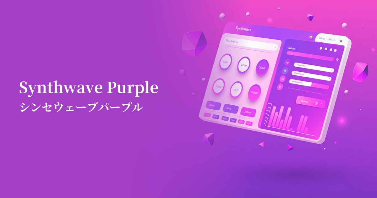
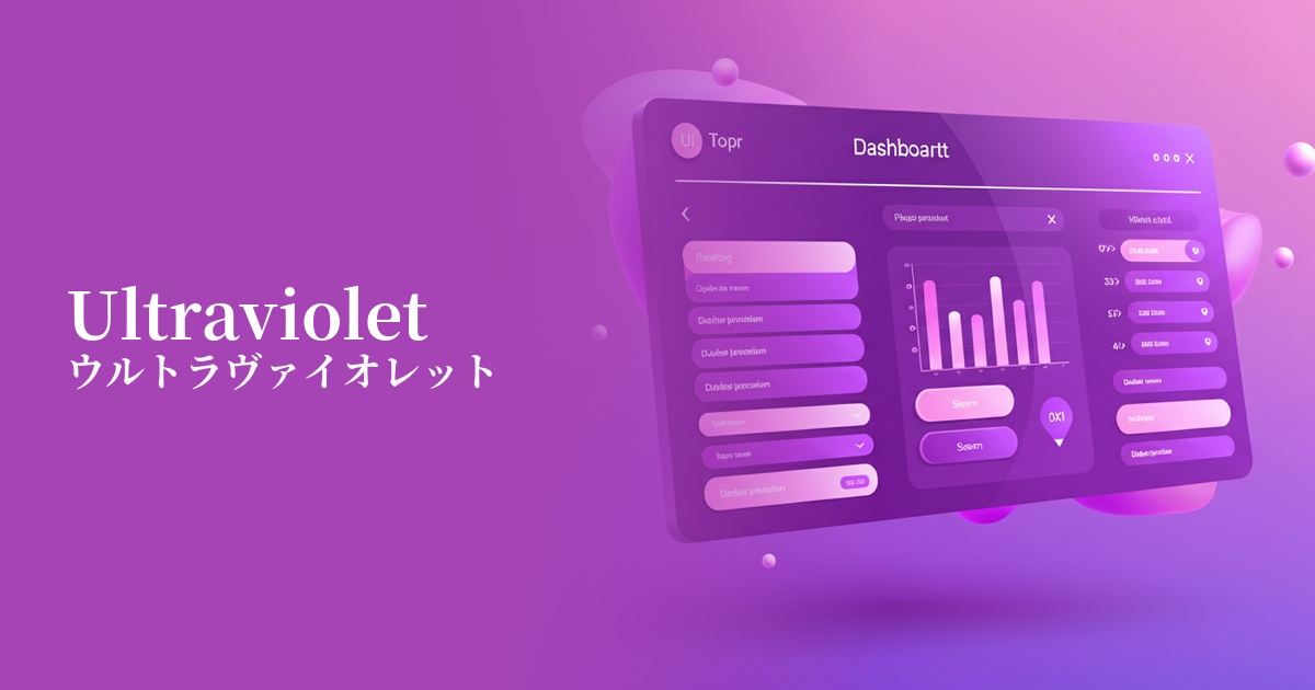
Visibility testing (UI component example)
Practical usage (best practices)
Its most effective use is as an accent color. When used on CTA buttons, active navigation, icons, and loading bars in a dark-mode-based interface, it naturally guides the user's gaze and improves usability.
It's also a great idea to incorporate it as part of a gradient in the background of landing pages or hero sections. Combining it with other neon colors (such as cyan or magenta) will create a powerful first impression on visitors and immediately draw them into the world of your service.
SaaS dashboards and data visualization tools can be used to highlight specific important graphs or figures. However, overuse can make the information look cluttered, so the key is to use it only on the one point you want to draw attention to the most.
As a point of caution, when using it as a background color over a wide area, you must always check the readability of the text placed on top. Ensure accessibility by combining it with white or very light gray text that meets WCAG contrast standards.
Recommended color scheme suggestions
Deep Pink (#FF1493)
The mystical purple of dark synth and the vivid energy of deep pink merge to create a quintessential cyberpunk synthwave world. It's highly visually impactful and ideal for bold designs that will stick in the user's memory.
Daffodil (#FFFF31)
By combining it with a vibrant yellow, which is close to its complementary color, the presence of the dark synth is further enhanced. It emphasizes a futuristic impression and is also effective for UI elements that draw attention or serve as a warning, achieving a balance between playfulness and functionality.
Charcoal (#36454F)
This combination with a calming charcoal gray maximizes the vibrancy of dark synths. When used as a background color, dark synths stand out as an accent, creating a modern and sophisticated dark mode UI.