| English name | Porcelain |
|---|---|
| Katakana | Porcelain |
| HEX | #F5F5F5 |
| RGB | 245, 245, 245 |
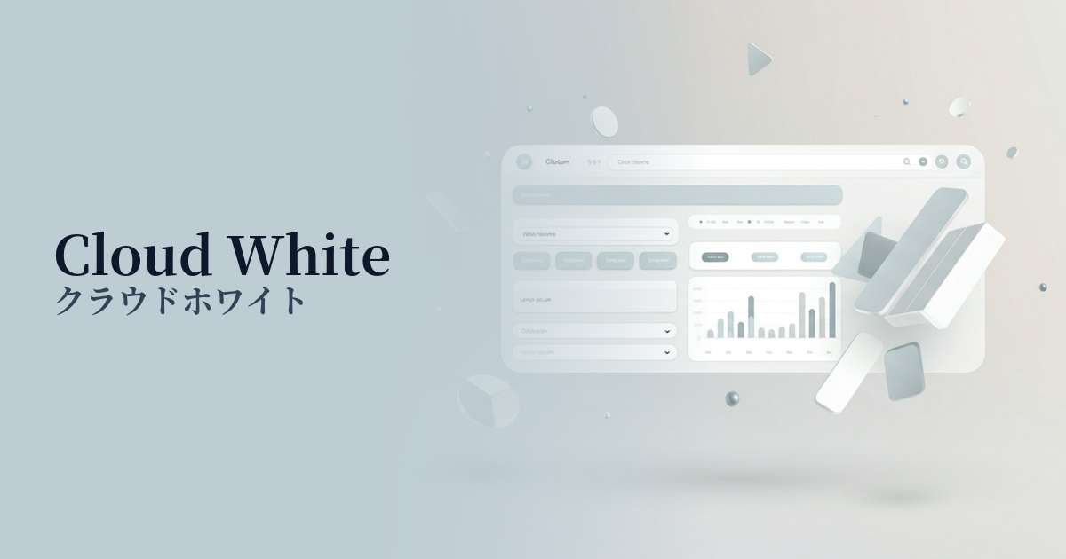
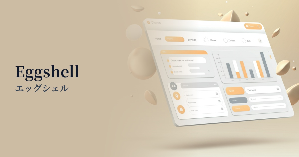
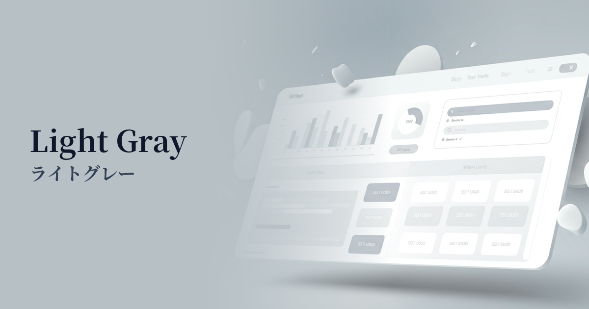
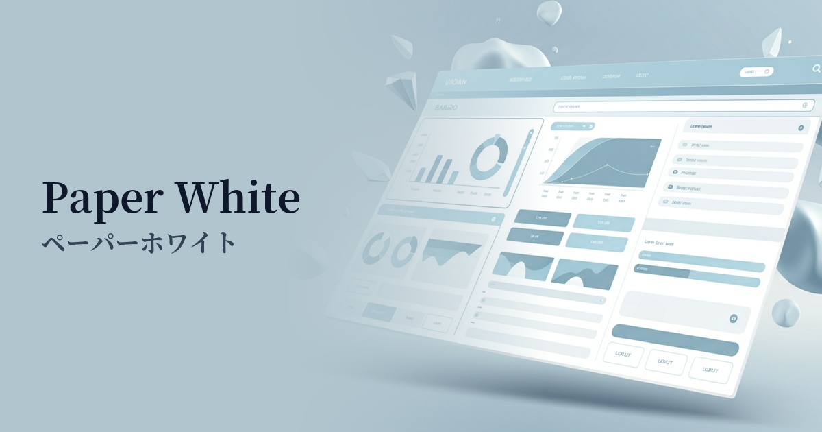
| Design Theme | Neutral & Minimal Background Colors |
Why is it a trend? (Background and reasons)
In recent years, minimalism—a simple and clean style—has become mainstream in web design as a reaction against the information-overloaded digital environment. Porcelain, with its slightly more subdued hue than pure white, allows the content itself to take center stage while still conveying a sophisticated impression, making it an ideal background color for this trend.
The concept of "digital calm," which prioritizes user visual comfort, is also boosting the popularity of porcelain. Its pure white brightness is expected to reduce eye strain even during prolonged viewing. This allows users to concentrate on content without stress, leading to an overall improvement in the site's user experience (UX).
Another contributing factor is the trend of digitally representing the physical textures of the real world, such as ceramics and high-quality paper. As the name "porcelain" suggests, it evokes a smooth and luxurious texture, adding depth and elegance to the design.
The psychological effects of design and UX
Porcelain conveys an impression of cleanliness, purity, and tranquility. It also has the effect of making a space appear larger, bringing a sense of openness and order to the entire page.
From a UI/UX perspective, this color functions as a "quiet background." Because it's not overly assertive, it naturally directs the user's attention to truly important information (text, images, CTA buttons, etc.). This can lead to improved usability and conversion rates.
Furthermore, its slightly muted tone compared to pure white is easier on the eyes and contributes to accessibility. This moderate calmness instills a sense of security and trust in users, and helps create a professional impression, especially on corporate websites and SaaS dashboards.
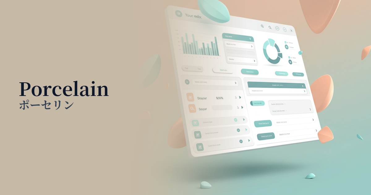
Visibility testing (UI component example)
Practical usage (best practices)
The most common use is as the background color for an entire website. It's particularly effective for minimalist portfolio sites, e-commerce sites, and blogs, easily creating a clean and modern aesthetic that makes content stand out.
In card-based UI design, using a light gray background and porcelain for the card portion creates a subtle three-dimensional effect. This makes it easier to visually recognize chunks of information and clarifies the hierarchical structure of the interface.
Combining it with a vibrant accent color can further enhance its appeal. For example, using a vivid color for a CTA button or important links on a landing page, while using a porcelain background, can effectively guide the user's attention.
By consciously using "negative space" in design not merely as empty space, but as "porcelain-colored space," a more intentional and sophisticated layout is achieved. This brings a sense of luxury and tranquility to the entire design.
Recommended color scheme suggestions
Slate Gray (#708090)
The clean feel of porcelain is combined with the calmness and intelligence of slate gray. It's ideal for SaaS UIs and corporate websites where reliability is paramount, giving a modern and professional impression.
Sage Green (#9DC183)
The natural and calming sage green color stands out beautifully against the clean porcelain background. It's perfect for organic product and lifestyle brand websites, creating a comfortable and relaxed atmosphere.
Terracotta (#E2725B)
The minimalist porcelain canvas, combined with the warmth and earthy texture of terracotta, creates a warm and artistic impression. Recommended for craft product and interior design websites.