| English name | Coral Mist |
|---|---|
| Katakana | Coral Mist |
| HEX | #FDECE6 |
| RGB | 253, 236, 230 |
| Design Theme | Neutral & Minimal Background Colors |
Why is it a trend? (Background and reasons)
In recent years, web design has seen a rise in popularity not only for pure white (#FFFFFF) and gray, but also for neutral colors with a slight tint. Coral Mist is a popular choice among many creators because it adds a human warmth and sophisticated feel to minimalist designs.
Furthermore, the growing interest in digital wellness is also a contributing factor. The off-white color, which reduces screen glare and is easy on the eyes, alleviates the visual strain on users when they view content for extended periods. The soft shade of Coral Mist contributes to creating a comfortable user experience.
Amidst growing values such as sustainability and organic products, earth tones that evoke the natural world are gaining popularity. Coral Mist has a natural and gentle hue reminiscent of skin, soil, and the sunrise, making it ideal for expressing a brand image that resonates with modern lifestyles.
The psychological effects of design and UX
Coral Mist, with its soft, warm tones, evokes a sense of calm and reassurance in the user. Its non-aggressive and approachable impression is expected to shorten the psychological distance between the brand and the user.
Because it is a very delicate and understated color, it is suitable for expressing refined luxury and minimalist beauty. In particular, its effect is further enhanced when combined with a clean layout that makes good use of white space.
From a UI/UX perspective, using this color as the background softens the overall tone of the site without hindering the visibility of the main content, such as text and photos. It also reduces screen glare compared to pure white, which can help alleviate eye strain for users.
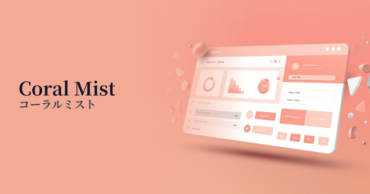
Visibility testing (UI component example)
Practical usage (best practices)
Its most effective use is as the background color for the entire website. In particular, when used on minimalist portfolio sites or lifestyle brand websites, it enhances the content while creating a sophisticated aesthetic.
It's also ideal for e-commerce sites that handle products where keywords like "gentle," "natural," and "safe" are important, such as cosmetics, wellness products, baby products, and organic foods. It doesn't detract from the appeal of the products, but visually reinforces the brand's gentle image.
It's also a good idea to use it as a background color for card-style UIs or as a divider between sections. It gently separates groups of content without using strong borders, resulting in a seamless and pleasant interface.
When combined with dark accent colors (e.g., dark green or navy), it also acts as a buffer to soften the overall impression. It reduces the contrast with strong colors, creating a balanced color scheme.
Recommended color scheme suggestions
Sage Green (#B2AC88)
The combination of earth tones creates a very natural and comfortable space. This color scheme is recommended for organic product and wellness-related websites where you want to give users a sense of security and relaxation.
Slate Gray (#708090)
The combination of warm coral mist and sophisticated slate gray creates a refined overall design. It's ideal for situations where you want to achieve both a sense of reliability and a modern, refined atmosphere.
Terracotta (#E2725B)
Adding terracotta, which shares the same warm reddish hue as coral mist, as an accent creates a unified yet energetic color scheme. It allows you to express a human warmth and handcrafted feel within a minimalist design.