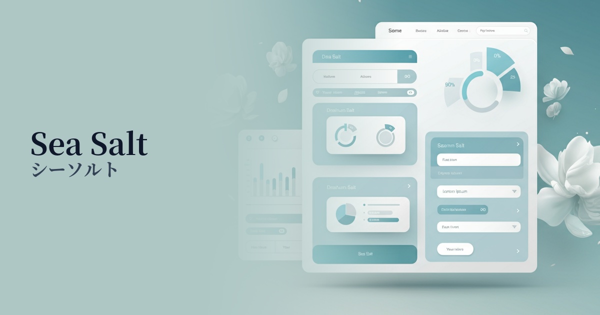
| English name | Sea Salt |
|---|---|
| Katakana | Sea salt |
| HEX | #DAE2E1 |
| RGB | 218, 226, 225 |
| Design Theme | Neutral & Minimal Background Colors |
Why is it a trend? (Background and reasons)
Amidst the rise of minimalism and clean design, understated neutral colors like sea salt are gaining attention. In today's information-saturated world, users seek visually calm and soothing interfaces, and this color meets that need.
As the name "sea salt" suggests, it's an ideal color for expressing values such as nature, wellness, and sustainability. Organic products and lifestyle brands are increasingly adopting it to convey a calm and honest image.
This color is incredibly versatile and its greatest appeal lies in its ability to harmonize with any content. It functions as the perfect canvas, not interfering with other design elements such as vibrant photographs, sophisticated typography, and bold accent colors, but rather highlighting them as the main focus.
Furthermore, because it has a slight tint compared to pure white (#FFFFFF), it can also be expected to reduce screen glare. This offers a UX benefit by reducing eye strain from prolonged use of digital devices and providing a more comfortable viewing experience.
The psychological effects of design and UX
Sea Salt evokes feelings of calmness, tranquility, and cleanliness in the user. The slightly greenish light gray brings a sense of peace and relaxation, easing the overall tension on the screen.
In UI/UX design, this color helps to give users an unconscious sense of security and foster trust. It is particularly effective in creating a clean and honest impression in services that handle personal information, as well as in healthcare and financial applications.
Using it as a background color reduces visual noise, making it easier for users to focus on the main content and important information. This can have a psychological effect of reducing cognitive load and supporting smoother information comprehension.
Visibility testing (UI component example)
Practical usage (best practices)
It is most effective when used as the background color for an entire website. Using sea salt in ample white space creates a minimalist design with a sense of openness and sophistication. It is especially recommended for portfolios and product websites.
Using sea salt as the background for specific sections (e.g., "Customer Testimonials" or pricing plans) on a website with a white background creates a visual rhythm on the page. It helps to gently group information and avoid monotony.
This background color is ideal for card-based UI elements such as blog posts and product lists. It gently distinguishes cards from each other, making the grouping of content easier to understand. Adding a subtle shadow (box-shadow) creates a more three-dimensional design.
Instead of using it as the background color for a CTA button, using it as the text color within the button or as the border color surrounding the button adds a subtle yet elegant accent. Combining it with the main accent color adds depth to the design.
Recommended color scheme suggestions
Slate Gray (#708090)
The gentle feel of sea salt is complemented by the intelligent and calm impression of slate gray. This combination is ideal for SaaS dashboards and B2B service websites where you want to achieve both reliability and a sophisticated atmosphere.
Terracotta (#E2725B)
The natural sea salt color, accented with warm terracotta, creates an organic, earth-toned aesthetic. It's perfect for lifestyle brands and craft product e-commerce sites.
Rosy Brown (#BC8F8F)
The clean impression of sea salt is harmoniously blended with the gentle, calming sweetness of rosy brown. This color scheme is recommended for beauty brands and wedding-related websites when you want to create an elegant and feminine atmosphere.