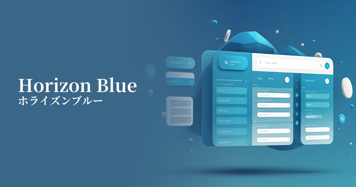
| English name | Horizon Blue |
|---|---|
| Katakana | Horizon Blue |
| HEX | #E2EAF1 |
| RGB | 226, 234, 241 |
| Design Theme | Neutral & Minimal Background Colors |
Why is it a trend? (Background and reasons)
In today's information-saturated digital environment, many users seek simple and calming interfaces. Horizon Blue is gaining attention as a clean background color that is easier on the eyes than pure white and encourages focus on content. Its value is increasing amidst the growing trend towards minimalism and a return to clean design.
As its name "Horizon" suggests, this color evokes images of vast skies and calm seas. Its ability to combine natural tranquility with a cool, intellectual impression makes it a popular choice for branding, particularly in SaaS and technology companies. It also has a strong affinity with contemporary themes such as wellness and mindfulness.
Horizon Blue works effectively not only as a background color in light mode, but also in designs that employ dark mode. For example, using it as the color for card UI or active elements within a dark theme creates a soft, not-too-strong contrast, helping to build a sophisticated UI.
The psychological effects of design and UX
While blue generally symbolizes trust and integrity, the soft and light Horizon Blue provides a calm sense of reassurance to users without creating a feeling of pressure. This psychological effect is particularly effective in UI/UX design for services where reliability is paramount, such as finance, healthcare, and B2B SaaS.
The color scheme, reminiscent of the sky and horizon, creates a sense of visual expanse and openness. It gives the entire interface a clean and organized appearance, reducing clutter even on screens with a large amount of information. This provides a comfortable browsing experience that doesn't stress the user.
Compared to a pure white background, light reflection is reduced, which is expected to lessen eye strain even during prolonged use. This allows users to concentrate more deeply on the content, resulting in improved readability and increased dwell time.
The cool, slightly gray-tinged tones evoke a modern, sophisticated, and forward-thinking feel. Even without being overly decorative, simply using this color as a base gives the entire design a contemporary and stylish impression. It's the perfect color to express cutting-edge technology and a minimalist design philosophy.
Visibility testing (UI component example)
Practical usage (best practices)
Using it as the background color for an entire website or application creates a clean and spacious feel. It's ideal as a foundation for highlighting content and images while minimizing visual clutter.
In SaaS dashboards where data and graphs are the main focus, using Horizon Blue as the background makes important information stand out and improves visibility. It can also be expected to reduce eye strain for users who stare at monitors for long periods of time.
This color is effective when used as the background color for each card when arranging multiple information cards in a grid layout. It gently indicates the separation between elements, eliminates the feeling of clutter on the screen, and gives an orderly impression.
It also plays a key supporting role in highlighting vibrant primary colors. For example, when using strong colors like coral pink or electric blue for a CTA button, using Horizon Blue as the background enhances the vibrancy of the accent color while creating an elegant overall tone.
It's also recommended to use it for interactive elements such as buttons and input fields. By setting the default state to white or light gray and changing it to horizon blue on hover or when active, you can provide users with intuitive and pleasant feedback.
Recommended color scheme suggestions
Navy Blue (#000080)
By using a deep navy blue for text and key UI elements, the brightness of Horizon Blue stands out, achieving both high readability and a sense of reliability. It gives a clean and intelligent impression, making it an ideal color scheme for business websites and SaaS applications.
Coral (#FF7F50)
The cool horizon blue is accented with warm coral, creating a friendly and appealing contrast. When used in CTA buttons and other elements, it effectively captures the user's attention.
Sage Green (#9DC183)
The combination with sage green, which evokes nature, creates a calm and relaxed atmosphere. This pleasant color scheme is ideal for wellness-related services and designs that want to express an organic worldview.