| English name | Light Success |
|---|---|
| Katakana | Light Success |
| HEX | #DCFCE7 |
| RGB | 220, 252, 231 |
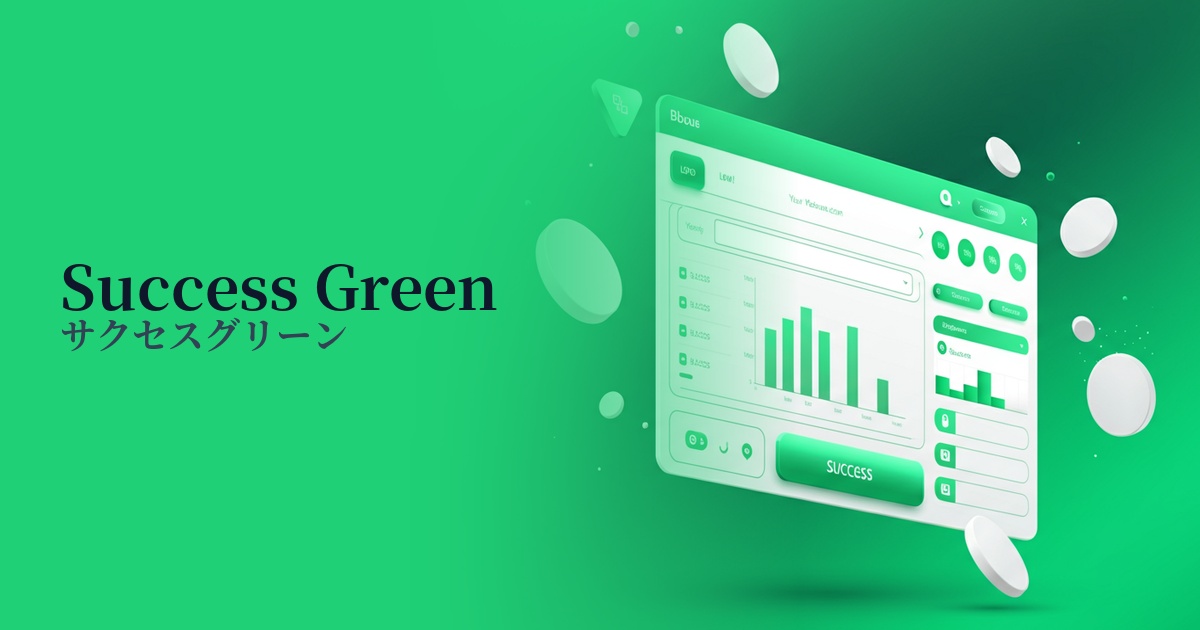
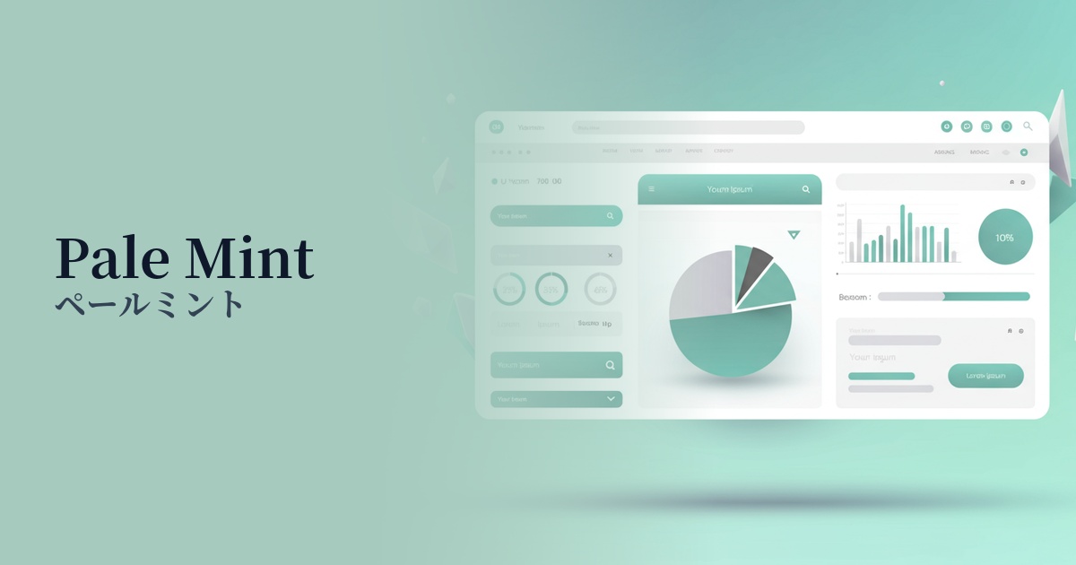
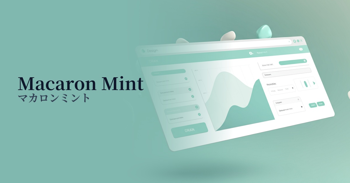
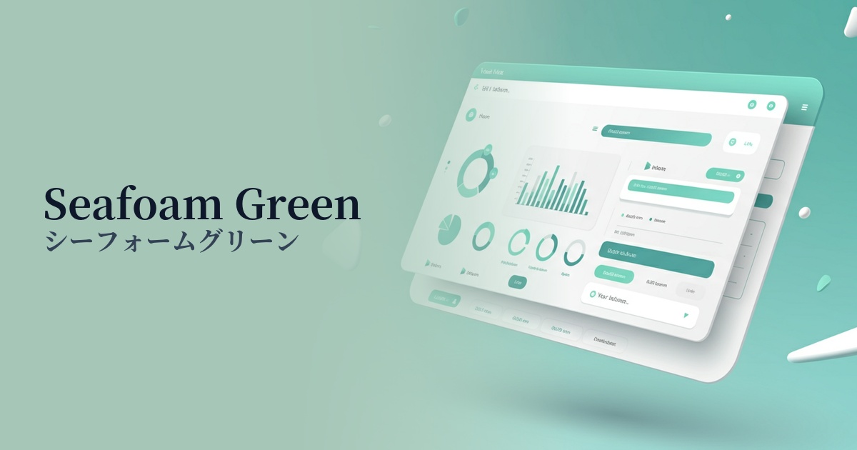
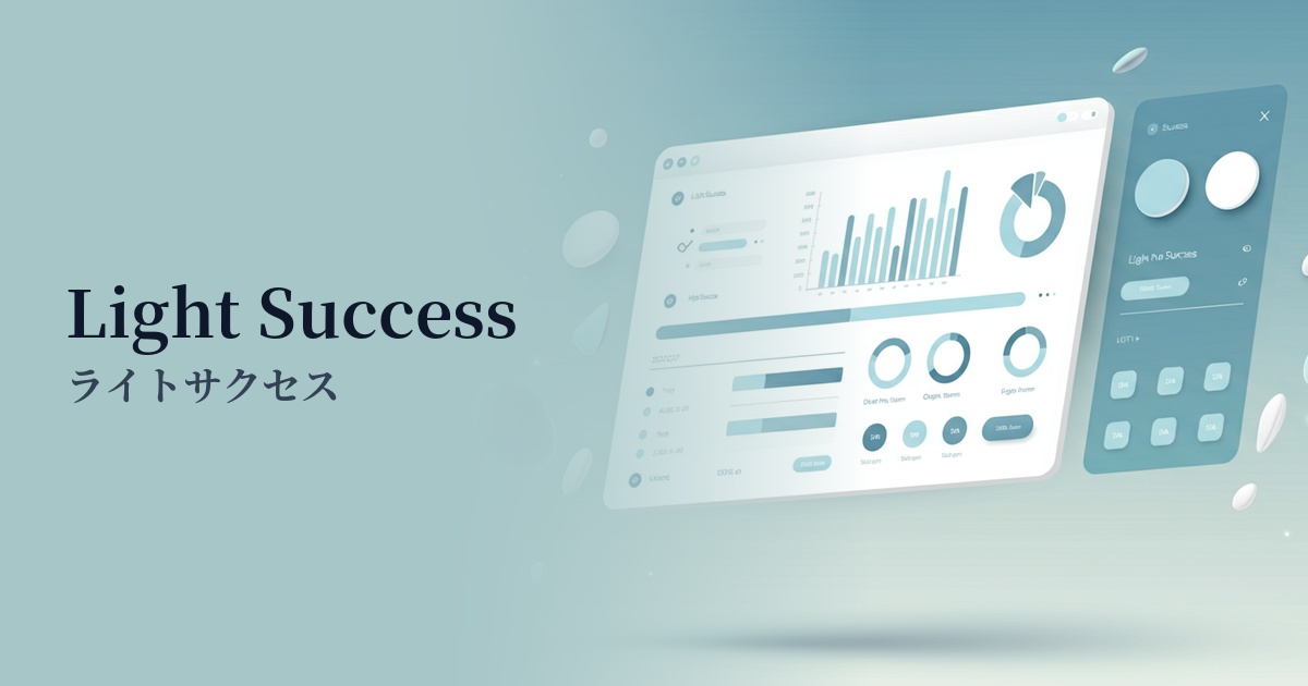
| Design Theme | UI System & Alert Colors |
Why is it a trend? (Background and reasons)
In recent years, the importance of UI/UX that provides accurate feedback to users has been increasing in web design. Bright green, like that used in Light Success, is gaining attention as a system color that intuitively and instantly conveys positive states such as "success," "completion," and "valid." It plays a role in visually informing users that their actions have been processed correctly and providing a sense of security.
Another contributing factor is the growing interest in accessibility. There is now a demand for lighter variations that can be used as background colors, in addition to the traditional dark green. LightSuccess is characterized by its ability to maintain contrast with text and icons while giving a soft, eye-friendly impression, making it less burdensome for users even when displayed for long periods in alert messages and notification areas.
In an era where minimalist and clean designs are prevalent, there is a growing demand for colors that convey meaning without being overly flashy. Light Success blends naturally into simple layouts based on white and gray, and adds the context of "success" without disrupting the clean aesthetic, which is why it is being adopted by many SaaS products and modern websites.
The psychological effects of design and UX
Green symbolizes nature and harmony, and has a psychological effect of giving users a sense of security and stability. Bright greens, especially those like Light Success, convey positive messages such as "safe" and "OK to proceed," lowering the psychological barrier for users to take action.
Using this color at the point when a user completes an action, such as submitting a form or saving settings, can create a small sense of accomplishment. This positive feedback is highly effective in increasing user engagement and fostering trust in the service.
Often used in contrast to red (danger color) to indicate errors, it plays a role in visually reinforcing successful experiences. Because users can instantly understand the system status, it contributes to a stress-free and smooth operating experience.
Visibility testing (UI component example)
Practical usage (best practices)
The most common use is as the background color for success notifications (alert messages) such as "Message sent successfully" after a form has been submitted.
In input forms, applying borders and backgrounds to fields that have passed validation provides real-time feedback to encourage users to enter correct information.
Using this as the background color for tags and badges indicating statuses such as "Active," "Online," and "Completed" in SaaS dashboards and other applications can create a highly visual and easy-to-understand UI.
It's also ideal as a background color for toast notifications (short notifications that appear in the corner of the screen). It concisely communicates the success of an action without interrupting the user's work.
It's also effective to use a background color to highlight the most recommended plan in a price plan comparison chart. This provides a visual signal that gently encourages the user's decision-making.
Recommended color scheme suggestions
Charcoal (#36454F)
Using a dark charcoal gray as the text color ensures extremely high readability even against the bright background of Light Success. This is a fundamental UI design combination that clearly conveys the message of success and gives an impression of reliability and composure.
Dodger Blue (#1E90FF)
By combining vibrant Dodger Blue with links and buttons, you can effectively place elements that encourage the next action within success notifications. The sense of security from Light Success is combined with an energetic impression that motivates action, smoothly guiding users through the process.
Ash Gray (#B2BEB5)
Using ash gray for separators and supplementary text creates an overall soft and sophisticated atmosphere. This understated color scheme blends easily with clean, modern design systems, leaving a user-friendly impression.