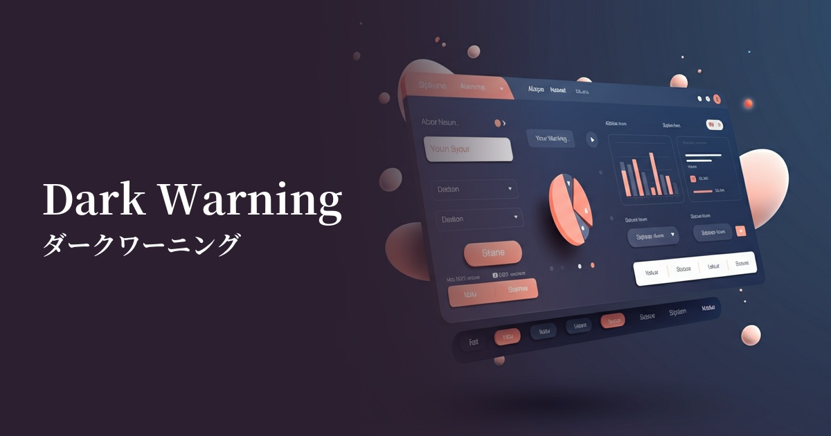
| English name | Dark Warning |
|---|---|
| Katakana | Dark Warning |
| HEX | #B45309 |
| RGB | 180, 83, 9 |
| Design Theme | UI System & Alert Colors |
Why is it a trend? (Background and reasons)
In recent years, the adoption of dark mode has become commonplace in web design. Traditional bright warning colors (such as yellow) tend to stand out against dark theme backgrounds and can be harsh on the eyes. Dark warnings, with their deep hues, blend naturally into dark backgrounds, maintaining visual harmony while still effectively conveying attention, making them a trending trend.
Furthermore, as user experience (UX) matures, there is a growing demand for more sophisticated UIs that can convey important information without causing excessive stress to users. Dark warnings, rather than attracting attention with flashy visuals, convey nuances of "importance" and "need to be checked" with their calm tone. This allows users to calmly process information and make appropriate decisions.
From an accessibility standpoint, this color is highly effective. In particular, when combined with white or light gray text, it helps meet the contrast ratio standards set by WCAG. This allows more people, including users with visual impairments, to accurately perceive the information.
The psychological effects of design and UX
Dark warnings, in addition to the direct messages of "attention" and "warning" conveyed by the common warning color yellow, convey a calmer impression of "importance," "seriousness," and "credibility." Because the tone is more subdued than bright colors, it can draw the user's attention to the information without making them feel urgent or anxious.
In UI/UX design, this psychological effect is utilized to encourage users to make calm judgments. For example, by using it in confirmation dialogs for irreversible actions such as "This action cannot be undone," users can recognize the warning but examine the content without panicking. It can be said to be a well-balanced color that can draw attention without compromising credibility.
Visibility testing (UI component example)
Practical usage (best practices)
This color is ideal for displaying validation errors during form input. By using this color for the borders of input fields or as the text color for error messages, you can accurately communicate to users where corrections are needed.
It's also effective for system alerts in SaaS dashboards and management screens. It's particularly useful as the background color for important notification banners that users should be aware of, even if immediate action isn't required, such as "Your account is about to expire" or "Your storage capacity has reached 90%."
It's also useful for prompting users to confirm important actions on settings screens and other areas. By using it in warning messages next to delete buttons or confirmation messages when changing security settings, you can gently but effectively convey the importance of the action.
This can also be applied to labels on e-commerce sites such as "Limited Stock Remaining." Rather than excessively urging purchases, it can be presented as useful information to users with the nuance of "Notice to those considering a purchase."
Recommended color scheme suggestions
Alice Blue (#F0F8FF)
By placing dark warnings against a very bright blue background, the visibility of warning messages is maximized. Important notices can be effectively conveyed to users within a clean and trustworthy UI.
Charcoal (#36454F)
In dark mode UIs, charcoal gray backgrounds and dark warnings work exceptionally well. The warnings don't blend too much into the background, yet they are easy on the eyes, resulting in a modern and sophisticated design.
Steel Blue (#4682B4)
When combined with a calm, steel blue tone, it creates an intelligent and trustworthy impression. This color scheme is especially recommended for SaaS dashboards and other applications where you want to balance information display with warning displays.