
| Japanese color name | Young bamboo |
|---|---|
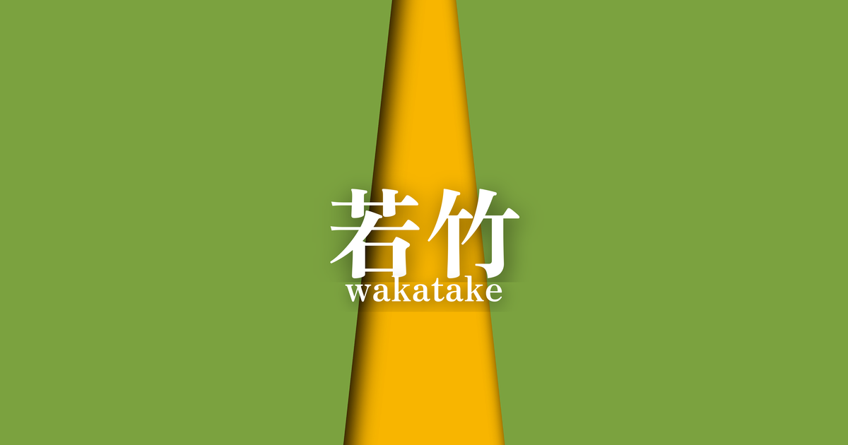
| reading | wakatake |
| season | 春 |
| Color of the table | Wakatakeiro (young bamboo green) |
| Back color | Japanese rose (yamabuki) |
What is Wakatake? Origin and Etymology
The layered color combination "Wakatake" (young bamboo), as its name suggests, is a color scheme that expresses the scene of young bamboo sprouting in early spring. The "Wakatake" color used on the outside symbolizes the fresh green of bamboo that begins to grow vigorously after surviving the winter. On the other hand, the "Yamabuki" (Japanese kerria) used on the inside is said to represent the yamabuki flowers that bloom at the base of the bamboo grove, or the warm spring sunlight that shines into the bamboo grove. This vivid contrast of green and yellow skillfully expresses the vitality and brightness of nature in spring.
Historical background of young bamboo
In the aristocratic society of the Heian period, "kasane no irome," the use of color combinations in clothing to express the changing seasons, was an important cultural practice. "Wakatake" (young bamboo) is one of the colors that represent spring, and it is presumed that, due to its youthful hue, it was mainly used for formal wear and everyday attire of young men and women. The exact date of its creation is unknown, but its name can be found in later documents concerning clothing, such as the "Masasuke Shōzoku Shō."
This color scheme, symbolizing vitality and growth, is thought to have played a role in announcing the arrival of spring in various scenes at the imperial court.
Related literature, waka poetry, and seasonal words
Bamboo frequently appears in classical literature, including "The Tale of the Bamboo Cutter," as a symbol of mystery and vitality. The word "wakadake" (young bamboo) has been used in waka poetry as a metaphor for youth, growth, and a pure heart. In the world of haikai poetry, "wakadake" is a seasonal word for spring, used when composing poems about bamboo shoots just emerging from the ground or the sight of young bamboo growing lush and green.
These layered color combinations are deeply intertwined with literary backgrounds and a sense of the seasons, and can be said to embody the Japanese aesthetic.
To pray for the continued growth of young bamboo, we must look to the thousand generations of people of old.
The season and scenery of young bamboo
"Wakatake" is a color combination that heralds the arrival of spring and is mainly worn from February to April. The Wakatake color on the outside symbolizes the vitality of bamboo, which sprouts after enduring the winter cold and grows straight towards the sky. The Yamabuki color on the inside evokes the warm spring sunshine and the Yamabuki flowers that add color to bamboo groves. This vibrant color scheme signifies embodying the joy and hopeful scene of spring, when the harsh winter ends and all things begin to become active, giving the wearer a fresh and youthful impression.
Color scheme proposal for young bamboo
Light green (#A9D159)
Light green, like young bamboo green, is a color that symbolizes the young leaves of spring. When combined, it expresses the gradation of spring budding, giving an even more youthful and vibrant impression. Similar shades of green were also used in layers in the clothing of the Heian period.
Suou (#9E3D3F)
By combining the vibrant green of young bamboo green with the deep red of madder red, a powerful contrast is created where each color enhances the other. It evokes the budding of spring and the strength of the earth, and is an impressive color scheme even in modern designs.
White training (#FEFDF9)
By combining it with a pure white, almost white, the vibrancy of the young bamboo green and the yellow of the Japanese kerria stands out, adding a sense of cleanliness and elegance. It expresses the mist and clear air of spring, creating a refreshing and sophisticated space in kimono and interior design.
Practical Scenes
The "Young Bamboo" color scheme can be widely used in everything from traditional Japanese clothing to modern designs. In the world of kimono, incorporating this color scheme into spring formal wear such as visiting kimonos or casual kimonos, or into accessories like obiage and obijime, creates a sophisticated look that evokes the season. In interior design, using it in fabrics such as curtains and cushions will bring brightness and vitality to the space.
Furthermore, in graphic design for websites and advertisements, it can be used as a key color when the theme is nature or growth, giving viewers a fresh and positive impression.