
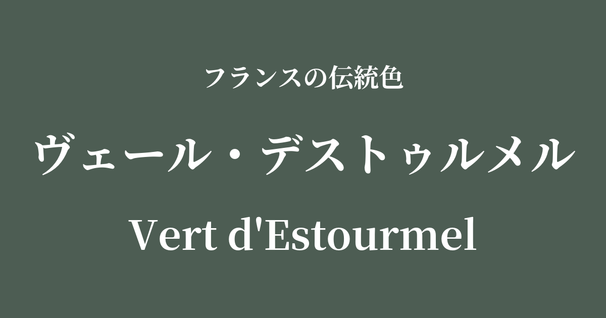
| French | Vert d'Estourmel |
|---|---|
| Katakana | Veil Destrum |
| HEX | #4d5d53 |
| RGB | 77, 93, 83 |
What is Veil Destrumer? Origin and Etymology
"Vert d'Estourmel" is a French name for a deep, calming shade of green, meaning "the green of the Destourmel family."
This color is said to originate from the d'Estourmel family, a distinguished noble family with roots in northern France. This green, which the family used in their coats of arms, uniforms, and banners, was not merely a color, but a symbol of the family's pride and identity.
These colors, reminiscent of deep forests and abundant nature, may reflect the landscape of Picardy, the region that the family once ruled. They likely embody a strong connection to the land and timeless values that have endured through the ages.
The historical background of Veil Destrumer
The House of Destrumel is a prestigious samurai family with a long history dating back to the Middle Ages. They produced many prominent figures who played significant roles in French military and political affairs, particularly during the 18th and 19th centuries.
In aristocratic society, it was common to use a specific color as a symbol of one's family. The veil d'estrummer likely played an important role in demonstrating a family's presence in public. It was a color used to clearly distinguish one's family from others, whether on military banners on the battlefield or on the elaborate attire of the court.
Even as much of aristocratic culture was transformed by the French Revolution, these traditional characteristics were passed down to future generations as cultural heritage that conveyed the memories of each family and region.
Veil Destrumer in the world of art and fashion
The muted, deep green of Vert d'Estrumer can be found in a variety of art forms, from the elegant interior decoration of 18th-century Rococo to the majestic depictions of nature in 19th-century Romantic paintings. In particular, it was effectively used in landscape painting to express the depth and mystery of forests.
In the world of fashion, this color has traditionally had a deep connection to men's wardrobes. Historically used in hunting jackets and military uniforms, it was favored as a color symbolizing composure, reliability, and dignity. Even today, incorporating this color into men's coats, suits, and ties creates a classic and intellectual impression.
In textile culture, it was used in heavy velvet curtains and tapestries (wall hangings) with intricate patterns, bringing a dignified and tranquil atmosphere to a space.
Color scheme preview
This is to check the readability of the text when this color is used as the background.
Vert Destrumel's color scheme proposal
Gris de Lignan (#dcdbd2)
The combination of a calm, deep green with a light, linen-like gray creates a natural and sophisticated atmosphere. It's recommended for creating an elegant space that is both classic and modern.
Rouge de Flandres (#8d3329)
The combination of deep forest-like green and ripe fruit-like red creates a dramatic impression of vitality and gravitas, exuding a traditional and dignified atmosphere.
Jaune de Mars (#e8a200)
By adding a deep mustard-yellow accent to a dark green, the colors complement each other, creating a warm and sophisticated color scheme. It's perfect for autumn and winter outfits.
Practical Scenes
In interior design, using Vert Destrumel as wallpaper or accent wall material in studies and living rooms brings a sense of calm and depth to the space. When combined with velvet or leather sofas, dark wood furniture, and brass lighting, it creates a very sophisticated atmosphere.
In fashion, this color is used to create an intelligent and sophisticated impression. It pairs exceptionally well with warm materials such as wool and tweed coats and corduroy trousers. Combining it with neutral colors like beige, ivory, and camel creates a refined and mature look.
In websites and graphic design, using this color as a background can convey a sense of sophistication and reliability. It is particularly effective when you want to convey a solid image, such as for established brands, law firms, or educational institutions.