
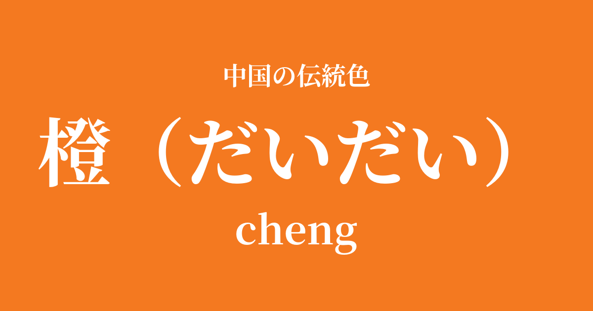
| Color name | 橙 |
|---|---|
| reading | Orange |
| pinyin | cheng |
| HEX | #F47920 |
| RGB | 244, 121, 32 |
What is a bitter orange? Origin and etymology
The name of the color "orange" comes, as the name suggests, from the citrus fruit "daidai" (bitter orange).
These fruits sometimes remain on the branches even after winter has passed, until new fruits appear the following year. This appearance is reminiscent of a family line continuing "generation after generation" from parent to child, and from child to grandchild, and has therefore been considered an auspicious tree that symbolizes prosperity of descendants and longevity.
This auspicious image was also carried over into the color name, and orange became deeply rooted in Chinese culture not just as the color of a fruit, but as a symbol of abundance, happiness, and the lasting prosperity of the family. It is also a color that evokes a vibrant energy, like the warmth of the sun or a blazing fire.
Historical background of orange
In Chinese history, orange has not often been treated as the main color compared to red and yellow, which are central colors based on the Five Elements philosophy. However, due to its bright and cheerful nature, it has been cherished as an important color that adds color to people's lives.
Especially during the Tang Dynasty, a period of flourishing culture, a wide range of colors became popular through international exchange, and orange appeared as a vibrant accent in paintings and textiles. Rather than being used in court ceremonies, it can be seen in decorations for festivals and in crafts that adorned the lives of ordinary people.
From the Song dynasty onward, orange was highly valued among literati who appreciated natural landscapes as a color to represent the twilight sky, the autumn harvest, and ripe fruits. In particular, in popular woodblock prints called "nian ga" that celebrated the New Year, orange fruits and other orange-colored fruits were frequently depicted as symbols of wishes for happiness and wealth.
Orange in Chinese Art and Crafts
In the world of Chinese art, orange was an indispensable color for expressing the brilliance of life and the changing seasons.
For example, in Tang sancai pottery, vibrant orange glazes are used along with green and brown, creating a lively and beautiful form. Also, in the painting of porcelain from the Song dynasty onward, a fresh orange color was effectively used when depicting auspicious fruits such as persimmons and mandarins.
In painting, especially in the meticulously brushwork of Gongbi painting, orange is used to express delicate color gradations, such as autumn foliage, sunset skies, or the patterns on the clothing of noblewomen. In particular, the citrus fruit "tachibana" (橘) is considered a symbol of good fortune because its pronunciation is similar to "yoshi" (吉), and it has been the subject of many paintings.
In clothing culture, while it is rarely the main color in traditional Chinese clothing such as Hanfu, it plays a role in adding vibrancy and warmth to the overall outfit by being used as an accent color in embroidery, sashes, and accessories.
It's been a year since I've been in the middle of a good year, and it's the best time of orange, yellow, orange, and green.
Color scheme preview
This is to check the readability of the text when this color is used as the background.
Orange color scheme proposal
Ai (#2A3B56)
The vibrant orange and deep, calming drab are complementary colors that enhance each other's beauty. This creates a sophisticated, modern impression, combining vitality and intelligence.
Akika color (#D9A44E)
By combining the orange of ripe fruit with the autumnal fragrance of the harvest season, a rich and warm harmony is created. It produces a calm, comfortable, and natural atmosphere.
Female yellow (#FBB92E)
The combination of a sun-like orange and a radiant oryellow creates a very vibrant and festive impression. It evokes a bright and positive energy, symbolizing wealth and prosperity.
Practical Scenes
Orange is a very effective color for bringing warmth and vitality to a space or design.
In interior design, incorporating orange as an accent color in cushion covers, artwork, and lighting fixtures creates a bright and inviting atmosphere throughout the room. In particular, adding orange to a space based on natural wood, white, and gray tones highlights its vibrant energy.
In fashion, orange works well as an accent color in an outfit. Simply adding an orange scarf or bag to an outfit in muted colors like navy or charcoal gray instantly transforms it into a stylish and energetic look.
In web and graphic design, using this color for buttons and banners that you want to attract user attention can enhance visibility and encourage action. It's also ideal as a key color for brands that want to convey friendliness and fun.