
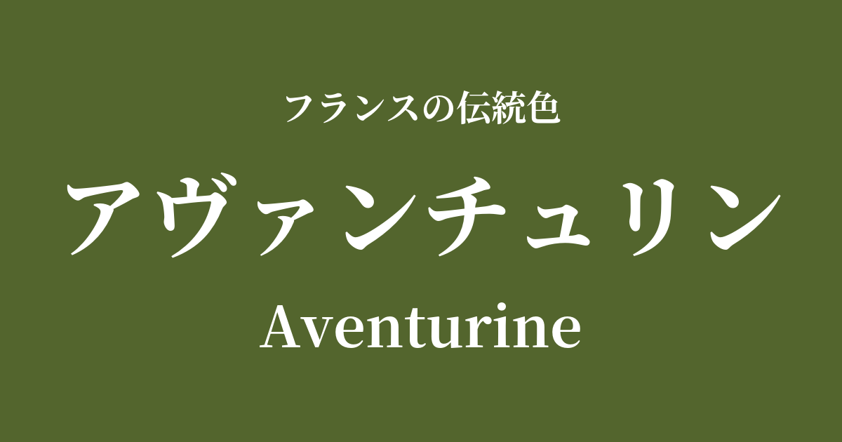
| French | Aventurine |
|---|---|
| Katakana | Aventurine |
| HEX | #53652d |
| RGB | 83, 101, 45 |
What is an aventurine? Origin and etymology
Aventurine, as its name suggests, is a color originally derived from the name of a gemstone. Its Japanese name is "sakinseki" (sand gold stone), and it is characterized by an optical effect called "aventurescence," which causes it to sparkle when it receives light, due to the presence of fine crystals such as mica mixed in with the quartz.
The origin of this color can be traced back to the Italian word "a ventura" (by chance, unexpectedly). In the 18th century, on the island of Murano in Venice, a glassmaker accidentally dropped copper powder into molten glass. This resulted in the creation of beautiful glass that shone from within. This "accidental product" was named aventurine glass, and its unique deep green color became established as a color name.
Historical background of Aventurine
Aventurine glass, with its distinctive colors and materials, was particularly beloved in 18th-century France during the opulent Rococo era. In this age of refined and elegant decoration, aventurine glass was widely used in snuffboxes, jewelry, and furniture decoration, captivating the ladies and gentlemen of the court.
In particular, in the arts and culture patronized by Madame de Pompadour, the mistress of King Louis XV, materials with such depth and luster were highly valued. The deep green of Aventurine, combined with the fashionable colors of the time such as vibrant pink and light blue, created a sophisticated color harmony that likely adorned the opulent interiors of the Palace of Versailles.
This color was not merely a trend; it was also seen as a symbol of longing for nature and a sense of mystery, and it was passed down through generations.
Adventure in the world of art and fashion
The color of aventurine truly shone in Rococo decorative art. The deep green seen in the opulent interior decorations and aristocratic attire of Jean-Honoré Fragonard and François Boucher strongly reflects the influence of this color.
Later, during the Art Nouveau period from the late 19th to the early 20th century, designs inspired by plants and insects from nature became popular. Masters of glassmaking such as Émile Gallé and René Lalique used mystical greens like Aventurine to create numerous works with organic forms that seemed to possess a life of their own.
In the world of fashion, this color, when expressed in lustrous fabrics such as velvet and silk, creates a depth and luxury reminiscent of jewels. Transcending time, it continues to be used in haute couture dresses and high-quality textiles as a color symbolizing elegance and intelligence.
Color scheme preview
This is to check the readability of the text when this color is used as the background.
Aventurine's color scheme proposal
Jaune de Naples (#f7e0a3)
The deep green of Aventurine and the bright, soft yellow known as Neapolitan yellow complement each other beautifully, creating a classic, warm, and sophisticated impression.
Rose Pompadour (#ed7a9e)
This elegant and sweet combination is symbolic of the Rococo era. The calming effect of Aventurine elegantly balances the vibrancy of pink, creating an elegant and artistic impression.
Gris de l'Ain (#d4cbb7)
The natural, flaxen gray softens the heavy feel of the Aventurine, creating a modern and calming atmosphere. This color scheme creates an intelligent, tranquil, and comfortable space.
Practical Scenes
In interior design, Aventurine is an ideal color for bringing depth and tranquility to a space. Incorporating it into a wall, a velvet sofa, or heavy curtains instantly creates a classic and sophisticated atmosphere. Combining it with gold or brass lighting and furniture handles further enhances the sense of luxury.
In fashion, simply wearing this color gives an elegant and mysterious impression. It's recommended to incorporate it into high-quality materials such as silk blouses and dresses, or wool coats. Also, using it as an accent color in accessories such as bags, scarves, and jewelry will tighten up the overall outfit and create a sophisticated style.
In the fields of web design and graphic design, it is suitable for brand websites that want to convey reliability and a sense of luxury. Using it as a background color or as an accent color for buttons and headings can give users a sense of calm and reassurance.