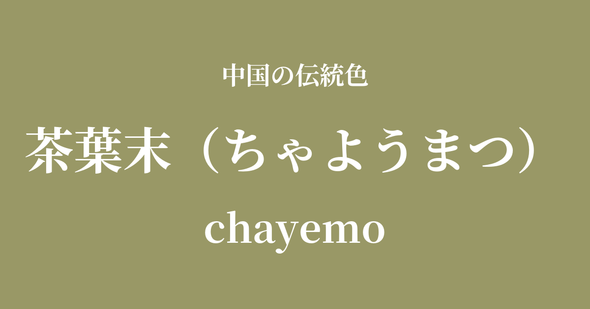
| Color name | Tea leaf end |
|---|---|
| reading | Chayoumatsu |
| pinyin | chayemo |
| HEX | #999866 |
| RGB | 153, 152, 102 |
What is tea leaf powder? Origin and etymology
Chayoumatsu, as its name suggests, is a deep, calm yellowish-green color derived from the color of "powdered tea leaves."
This color expresses the unique hue of ground green tea leaves, a blend of astringency and aroma. It draws inspiration from colors found in nature and is born from a sense of color rooted in people's lives and culture.
Historical background of tea leaf powder
The color of tea leaves is particularly well-known as the color of the glaze used on porcelain fired during the Qing Dynasty. Although it is said to have originated in the Tang Dynasty, its beauty reached its peak during the reigns of the Qing Emperors Yongzheng and Qianlong.
This glaze, also known as "Changguan glaze," was of extremely high quality and was produced only at the official kilns (court kilns) in Jingdezhen. It is said that the emperor himself sometimes supervised its production. The deep, varied colors are created when the iron content in the glaze crystallizes during the firing process.
The fact that Emperor Qianlong, who was known for his fondness for extravagant decorations, also loved such quiet and understated colors speaks to his refined aesthetic sense. Tea leaf powder is one of the colors that symbolizes the traditional Chinese aesthetic of valuing inner dignity and refinement rather than ostentation.
Tea powder in Chinese art and crafts
The color of tea leaf glaze is, first and foremost, inextricably linked to Qing Dynasty ceramics. In particular, bottles, jars, pitchers, brush washers, and other stationery items adorned with "tea leaf glaze" were deeply cherished by emperors and literati. Their surfaces are smooth and lustrous, and the way they subtly change their appearance depending on how the light hits them possesses an enduring beauty.
In the context of clothing culture, this color is thought to have been used for the Hanfu (traditional Chinese clothing) worn by scholars and officials because it conveys a sense of calm and intelligence rather than ostentation. It was a color that suited the temperament of people who disliked gaudiness and valued inner richness.
Furthermore, in Chinese painting, particularly in Gongbi painting, this type of color is sometimes used when depicting ancient objects or to add depth to the background.
The best made in the factory kiln
Color scheme preview
This is to check the readability of the text when this color is used as the background.
Color scheme suggestion for the end of tea leaves
Pilestone (#9C5442)
By combining it with ochre stone, which evokes the earth and soil, you can further enhance the natural, calm, and old-fashioned atmosphere. This color scheme is ideal for creating a quiet space such as a study or tea room.
Tsukihaku (#EAF4FC)
By combining it with Tsukishiro, a pale blue reminiscent of moonlight, the richness of the tea leaf powder is softened, creating a refined and elegant impression. It's a tasteful color scheme that evokes a quiet night scene.
Dragon robe yellow (#F2A634)
When combined with the dragon robe yellow, the color of the emperor's attire, it creates a dignified and magnificent impression reminiscent of the court culture of the Qing Dynasty. It is suitable for traditional and dignified designs.
Practical Scenes
In interior design, tea leaf powder brings depth and tranquility to quiet, contemplative spaces such as Japanese-style rooms, studies, and tea rooms. Incorporating it into a wall, cushions, curtains, or other fabrics tightens the overall space and creates a sophisticated atmosphere. It is also recommended to add it as an accent in modern spaces using ceramics.
In fashion, this color gives an intelligent and sophisticated impression. It pairs well with items with textured materials such as coats, jackets, and wool sweaters, creating a mature look. It's a color that is not affected by trends and can be cherished for a long time.
In web design and graphic design, using it as a background color conveys a sense of trust and traditional authority to the content. It is particularly effective for established brands, museums, and websites dealing with historical themes.