
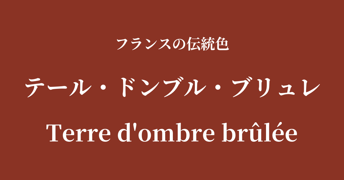
| French | Terre d'ombre brûlée |
|---|---|
| Katakana | Terre d'Ombre Brûlée |
| HEX | #8a3324 |
| RGB | 138, 51, 36 |
What is Terre d'Ombre Brûlée? Origin and Etymology
Terre d'ombre brûlée, meaning "baked Umbrian earth" in French, is a deep, warm reddish-brown color. As the name suggests, the origin of this color comes from the soil found in the Umbria region of central Italy.
The soil in this region is rich in iron hydroxide and has been used as a natural pigment since ancient times. The pigment made by simply drying this soil is called "Terre d'Ombre Naturel" (raw amber) and has a yellowish-brown color.
Terre d'Ombre Brûlée is created by further firing (roasting) this natural clay in an oven. Applying heat causes the moisture in the clay to evaporate, and the iron oxide undergoes a chemical change that makes it redder. This extra step is the secret to creating a rich reddish-brown color with a unique depth and warmth.
Historical background of Terre d'Ombre Brûlée
This pigment has a very long history, with traces of it even appearing in prehistoric cave paintings. However, its value was particularly recognized in the art world during the Renaissance in Italy. In the chiaroscuro technique, which dramatically depicts the contrast between light and shadow, this color, which creates deep and rich shading, was indispensable.
In the 17th century, this technique had a significant influence on French painters. Baroque masters such as Georges de La Tour and Nicolas Poussin used this color to give their paintings dramatic depth and richness.
In the 19th century, it established itself as a fundamental color in classical painting techniques at the French Academy of Fine Arts. Realist painters, such as Gustave Courbet, also favored terre d'ombre brûlée, the color of the earth itself, in their palettes to depict nature as it truly is. Throughout history, it has remained an indispensable color for many artists.
The Terre d'Ombre Brûlée in the world of art and fashion
Terre d'Ombre brûlée has played an extremely important role in the history of oil painting. In particular, masters of the Dutch Golden Age, such as Rembrandt and Vermeer, skillfully used this color to brilliantly express the warmth of a person's skin and the complex nuances of light and shadow in a room. Their works have had an immeasurable influence on later French painting.
This color was used not only to depict shadows, but also in underpainting and glazing (a technique of layering transparent paints), bringing rich depth and a sense of unity to the paintings.
In the world of fashion, this color is known by names such as "burnt umber" and "terracotta," and is especially beloved as a staple color for the autumn and winter seasons. It pairs exceptionally well with warm, natural materials such as wool, tweed, and leather, giving the wearer a calm and sophisticated impression. It is an intelligent and elegant shade that evokes the chic spirit of France.
Color scheme preview
This is to check the readability of the text when this color is used as the background.
Color scheme proposal for Terre d'Ombre Brûlée
Gris de l'Ain (#d2c6b4)
The earthy warmth of the Terre d'Ombre Brûlée is gently enveloped by the soft, flaxen Gris de Ain, creating a natural and refined impression. Recommended for occasions when you want to create an intelligent and calm atmosphere.
Jaune de Naples (#f7e476)
The deep reddish-brown combined with the bright, creamy yellow of Naples evokes the sun and earth of southern France, creating a rich and vibrant impression. This combination is perfect for creating a warm and inviting space.
Blue Nuit (#0f2350)
The warm color of Terre d'Ombre Brûlée and the cool color of deep night blue complement each other, creating a dramatic and modern impression. It's an impressive color scheme that balances gravitas and sophistication.
Practical Scenes
In interior design, terre d'ombre brûlée brings warmth and tranquility to a space. Incorporating it as an accent wall or adding it through fabrics such as cushions and rugs creates a comfortable and refined feel throughout the room. It pairs particularly well with natural materials such as wooden furniture, leather sofas, and houseplants, making it ideal for study rooms, living rooms, and other places where you want to relax.
In fashion, navy is a key color for autumn and winter outfits, appearing in coats, jackets, and leather accessories. Pairing it with basic colors like beige, ivory, and navy creates an elegant and classic style. It's a timeless color that exudes sophisticated intelligence.
In web and graphic design, using it as an accent color can give the entire site a sense of reliability and stability. It is particularly effective as the brand color for brands that deal with traditional crafts, history, or organic products.