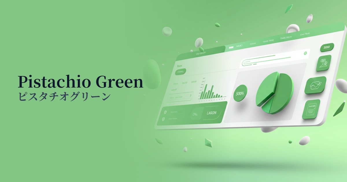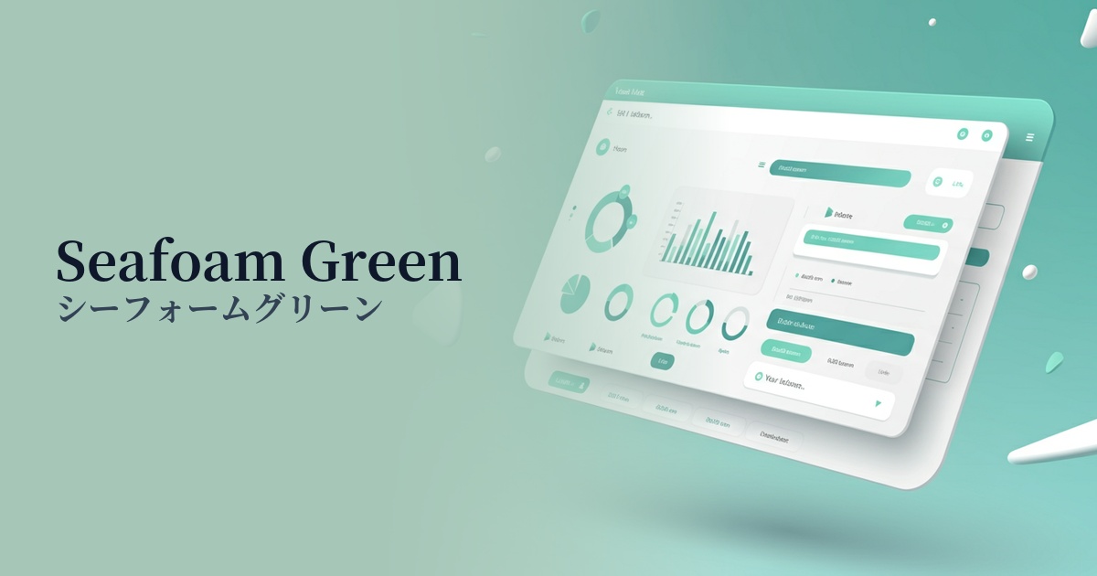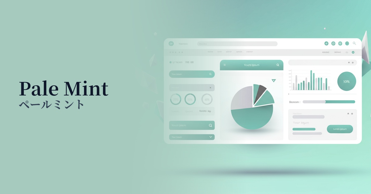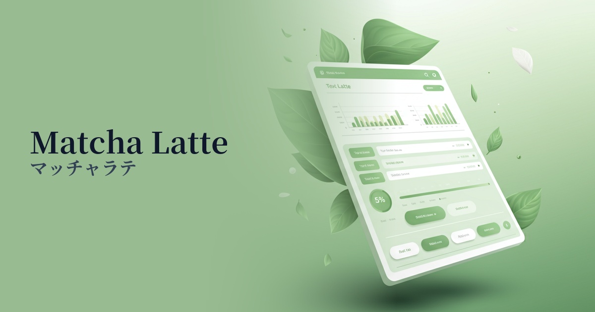
| English name | Macaron Mint |
|---|---|
| Katakana | Macaron Mint |
| HEX | #C4E8D7 |
| RGB | 196, 232, 215 |
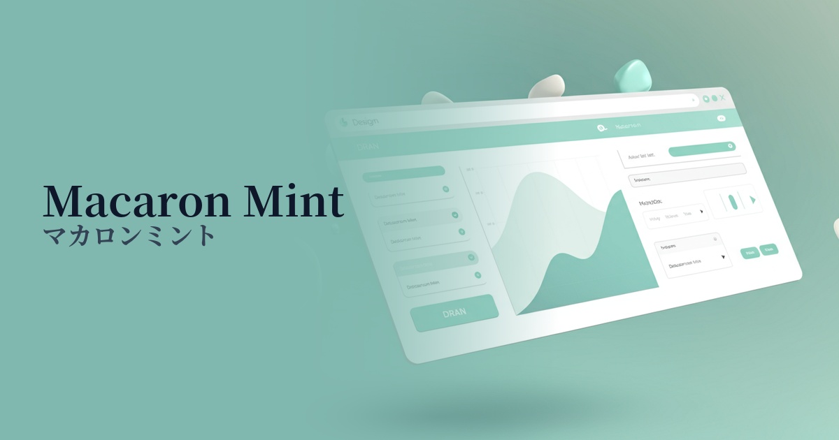
| Design Theme | Pastel & Macaron Colors |
Why is it a trend? (Background and reasons)
In today's world, where users spend a lot of time interacting with digital devices, there is a growing tendency for them to seek comfort and tranquility online. The gentle and natural hue of macaron mint reduces visual stress and provides a relaxed user experience, which is why it is being adopted by many websites and apps.
The growing social concern for sustainability and wellness is a major reason why this color is gaining attention. Macaron mint, which evokes images of nature and health, is highly effective in intuitively conveying the image of organic products, healthcare services, and environmentally conscious brands.
This is partly due to the shift in design trends from flat design to "soft UI," which emphasizes soft shading and texture. Macaron Mint is well-suited to this minimalist yet warm design, and helps create a clean and modern interface.
The psychological effects of design and UX
As the name "mint" suggests, it gives a refreshing and clean impression. In UI/UX, it evokes positive emotions in users such as "security," "cleanliness," and "trustworthiness," and is particularly effective in fields where trust is important, such as healthcare, food, and financial services.
The soft, pastel tones create a sense of approachability without any psychological pressure. They are expected to ease users' apprehension and allow them to immerse themselves in the content in a relaxed state, making them suitable for communication-focused platforms.
The bright and light color scheme conveys a sense of innovation and agility. By using it in dashboards for technology services and SaaS, which tend to be heavy and complex, you can give users the impression that it is "intuitive and easy to use" and "modern."
Visibility testing (UI component example)
Practical usage (best practices)
For services where brand identity is crucial, such as wellness apps or e-commerce sites for organic cosmetics, this color can be boldly used as the main color. By using white or light gray as the base color and applying macaron mint extensively, you can create a clean and open space.
It is effective as an accent color on corporate websites and media sites with a large amount of information. By limiting its use to CTA buttons, links, and icons, it gently guides the user's eye within a neutral color scheme and encourages important actions.
When used subtly as a section background on landing pages or article pages, it makes content divisions clearer and creates a visual rhythm. This makes it easier for users to follow information, even in long texts, and reduces fatigue. It's also ideal as a background color for card-style UIs.
Gradient effects with white or other pastel colors (such as baby blue or peach sorbet) create a softer, more dreamy atmosphere. Using them in the hero area of a website or as decorative accents can add depth and a modern touch to the design.
Recommended color scheme suggestions
Coral (#FF7F50)
The refreshing mint of macaron, combined with the warmth and vitality of coral, creates a friendly and positive impression. It's ideal for lifestyle and cosmetics brand websites where you want to convey a bright and gentle feeling to your users.
Slate Gray (#708090)
By combining it with intelligent and calming slate gray, the lightness of macaron mint is subtly balanced, creating a sophisticated and reliable atmosphere. It is recommended for SaaS UIs and B2B service websites where you want to convey a modern and honest impression.
Navajo White (#FFDEAD)
Navajo White, with its natural texture reminiscent of unbleached or linen, brings out the organic appeal of Macaron Mint to the fullest. It expresses a calming, natural worldview and is perfect for brand websites of health foods and sustainable products.