| English name | Lilac Mist |
|---|---|
| Katakana | Lilac Mist |
| HEX | #D8BFD8 |
| RGB | 216, 191, 216 |
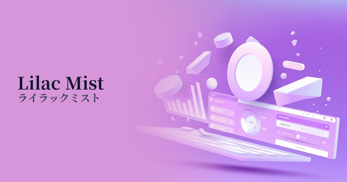
| Design Theme | Pastel & Macaron Colors |
Why is it a trend? (Background and reasons)
In recent years, web design has emphasized the "wellness" perspective, which aims to reduce visual fatigue from digital devices and provide users with a pleasant experience. Low-saturation, gentle colors like lilac mist are easy on the eyes and less likely to cause stress even during prolonged viewing, so they are being adopted by many services.
Not as sweet as pink and not as cool as blue, lilac mist perfectly matches the modern values that demand gender-neutral expression. It's an ideal color for brands that respect diversity and services that want to reach a wide target audience, as it helps build an inclusive and sophisticated image.
Furthermore, this color, which evokes a sense of nostalgia, resonates with the revival of 90s and Y2K culture. Rather than being a simple pastel color, its slightly grayish, muted tone creates a sophisticated yet nostalgic feel, leaving a fresh impression on many users.
The psychological effects of design and UX
Lilac Mist evokes images of lavender and lilac flowers, providing users with a relaxing and calming effect. In UI/UX design, it is expected to have a psychological effect of easing user tension and fostering trust in the service. In particular, it creates a pleasant user experience in wellness and mental health apps.
Purple has long been considered a symbol of nobility and mystery. Lilac Mist, a delicate variation of purple, gives an elegant and sophisticated impression. Using it on a cosmetics brand's website or a creator's portfolio can enhance the texture of products and works, creating a high-end brand image.
This color also has the effect of stimulating creativity and sensitivity. When used on creative platforms or art-related websites that want to provide users with new inspiration, it can enhance the appeal of the content and pique users' intellectual curiosity.
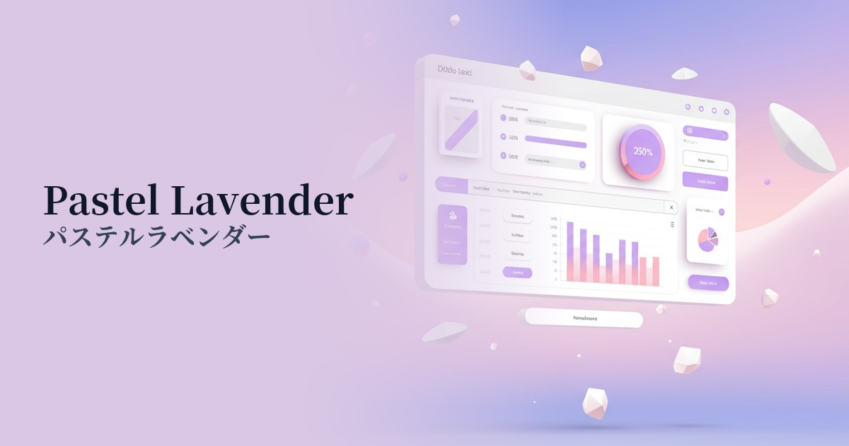
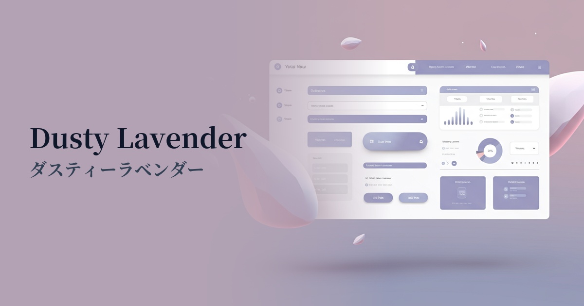
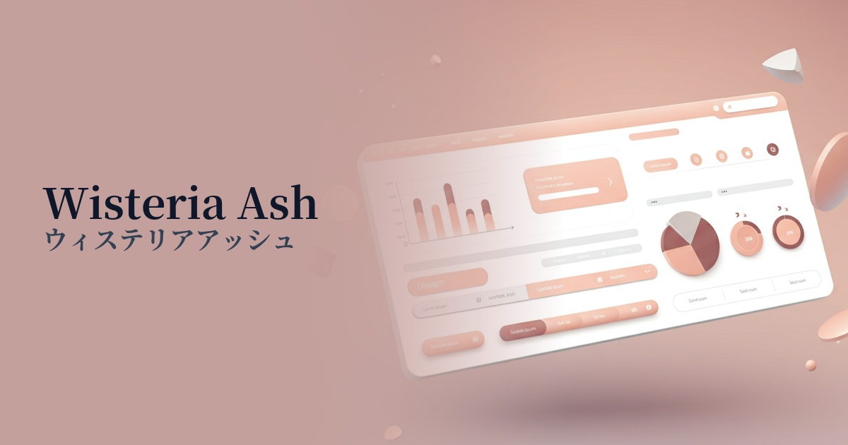
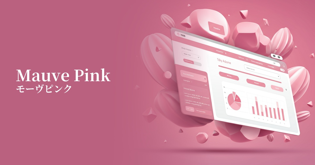
Visibility testing (UI component example)
Practical usage (best practices)
Using it as the background color for the entire site or specific sections gently enhances the content while creating an elegant and unified aesthetic. It particularly stands out when combined with a minimalist layout, resulting in a sophisticated impression.
For the main content, use white or light gray as the base color, and effectively use lilac mist as an accent color for CTA buttons, links, and important icons. This encourages user action without being overly assertive and improves usability.
In SaaS dashboards and information websites, applying this color to the background of card UIs or specific items in graphs allows you to visually group and organize information for easier viewing. It helps differentiate information from others while maintaining an overall soft tone.
It's also recommended for use in illustrations that convey the brand's worldview, or as a key color for UI icons. By combining it with other pastel or neutral colors, you can establish a friendly and memorable visual identity.
Recommended color scheme suggestions
Slate Gray (#708090)
The softness of lilac mist is complemented by the intelligent and stable impression of slate gray. It's ideal for SaaS UIs where reliability is essential, or for minimalist portfolio sites, creating a sophisticated and urban atmosphere.
Antique White (#FAEBD7)
The warmth of antique white complements the elegance of lilac mist, creating a very natural and comfortable space. It's perfect for wellness product and lifestyle brand websites where you want to convey an organic impression.
Hunter Green (#355E3B)
The ethereal atmosphere of Lilac Mist, combined with the depth of Hunter Green, creates a look that perfectly balances the vitality of nature with a sophisticated impression. It's recommended for expressing a unique worldview on high-end e-commerce sites and for creative brands.