| English name | Muted Rose |
|---|---|
| Katakana | Mute Rose |
| HEX | #C89EA3 |
| RGB | 200, 158, 163 |
| Design Theme | Muted colors & earth tones |
Why is it a trend? (Background and reasons)
In recent years, web design has seen a growing emphasis on comfort and tranquility over flashiness, driven by a growing interest in minimalism and sustainability. Mute Rose is gaining attention as a color that aligns with this trend of "Quiet Design," offering users a calm and sophisticated experience.
We are exposed to a vast amount of digital information every day, and many people experience "digital fatigue." Muted, muted colors like muted rose are easy on the eyes and less tiring to look at screens for extended periods. They are increasingly being adopted as colors that reduce the visual burden on users and support a comfortable browsing experience.
Moving beyond the traditional stereotype of "pink = feminine" and in response to the growing demand for more inclusive expression, muted rose is gaining value as a color that is easily accepted regardless of gender. Its understated, calm tone conveys "elegance" and "high quality" to a wide range of users, regardless of gender.
The psychological effects of design and UX
Mute rose gives viewers an impression of elegance, grace, and sophistication. Unlike the youthfulness and cuteness of vibrant pink, the addition of grayish tones gives it a mature and composed feel.
This color has a psychological effect of calming the user's mind and providing a sense of security. In UI/UX design, it helps to alleviate user tension and allow them to concentrate on the content in a relaxed state. It is particularly well-suited for wellness, beauty, and lifestyle services.
While possessing a romantic atmosphere, its expression is extremely subtle. Because it avoids becoming overly sweet, it contributes to building a brand image that emphasizes luxury and reliability. It creates a sense of familiarity with users while simultaneously giving them the feeling of having a special experience.
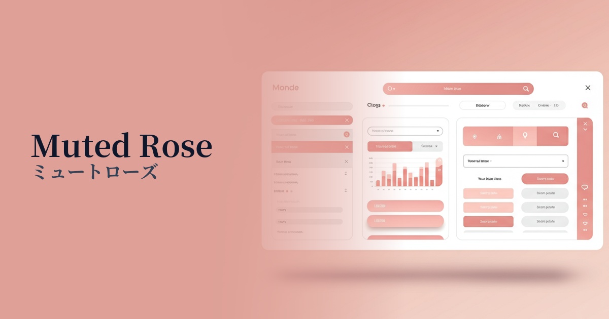
Visibility testing (UI component example)
Practical usage (best practices)
Using this as the background color for the entire site brings a soft and elegant sense of unity to the space. However, to ensure readability, choose a color with sufficient contrast for the text, such as charcoal gray (#333333) or off-black.
In designs where the main content is composed of white or light gray, using accent colors for CTA buttons, important links, and icons can be very effective. It subtly guides the user's gaze and encourages clicks without being overly assertive.
When used as the background color for card-style UIs that display multiple pieces of information, or for sections that group specific content, it gently indicates boundaries between different elements. It helps visually group information and organize the overall structure of the page in an easy-to-understand way.
By using it as the key color for your brand's illustrations and icons, you can create a consistent tone and style throughout your visuals. It's ideal for situations where you want to achieve both approachability and a sophisticated aesthetic.
Recommended color scheme suggestions
Slate Gray (#708090)
The softness of muted rose is complemented by the hard, intellectual impression of slate gray. Its modern and sophisticated atmosphere makes it ideal for SaaS UIs and portfolio sites, achieving both trustworthiness and style.
Ivory (#FFFFF0)
The natural, creamy texture of ivory complements the elegance of muted rose, creating an overall warm and comforting atmosphere. It's ideal for wellness and lifestyle brands that want to express an organic worldview.
Sage Green (#B2AC88)
The combination of earth tones creates a very calm and natural impression. The intellectual tranquility of sage green moderates the sweetness of muted rose, making it ideal for designs that want to create an elegant and botanical atmosphere.