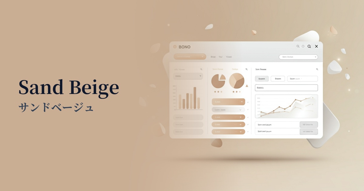
| English name | Sand Beige |
|---|---|
| Katakana | Sand Beige |
| HEX | #DCD1C4 |
| RGB | 220, 209, 196 |
| Design Theme | Muted colors & earth tones |
Why is it a trend? (Background and reasons)
In recent years, interest in nature and sustainability has grown in web design, and earth tones reminiscent of the earth and plants have become a major trend. Sand beige, in particular, is attracting attention as a versatile color that gives a sophisticated impression.
The trend of minimalism and "quiet luxury," which eliminates excessive ornamentation and emphasizes essential values, is also boosting the popularity of sand beige. It's not flashy, but its high-quality and calm atmosphere quietly enhances the appeal of the content itself.
In today's information-saturated digital environment, users unconsciously seek visual comfort. Neutral colors like sand beige, which are less stimulating, reduce strain on the user's eyes and offer the UX benefit of being less tiring to look at for extended periods.
The psychological effects of design and UX
As its name suggests, sand beige evokes images of sandy beaches and dry land, providing users with psychological effects such as a sense of security, calmness, and relaxation. It has a natural warmth and gives a friendly impression.
Understated, grounded colors are effective in conveying "sincerity" and "trustworthiness." They are useful for building a brand image on websites for organic products, wellness services, and companies where trustworthiness is paramount.
From a UI/UX perspective, it's an excellent background color. Because it's not overly assertive, it doesn't interfere with the main content such as text and photos, helping users focus on the information. It also possesses an elegant and sophisticated feel, enhancing the overall quality of the design.
Visibility testing (UI component example)
Practical usage (best practices)
Using it as the background color for your entire website easily creates a unified and calming aesthetic. It particularly enhances a sophisticated impression when combined with a layout that utilizes ample white space.
This background color is ideal for card UIs used in blog post lists, product lists, and similar applications. It gently separates information while reducing the overall clutter on the page, resulting in a clean and uncluttered appearance.
Sand beige itself is a subtle color, making it an excellent supporting player that enhances vibrant accent colors. For example, when using highly saturated blue or green for buttons or links, using sand beige as a background will make the accent colors stand out more effectively.
This approach is particularly effective on landing pages (LPs) dealing with products in the wellness, lifestyle, fashion, and interior design sectors. It evokes an organic and mindful lifestyle, contributing to the enhanced value of the products and services offered.
Recommended color scheme suggestions
Slate Gray (#708090)
The warmth of sand beige, combined with the intelligent and cool impression of slate gray, creates a modern and sophisticated atmosphere. This combination is recommended for B2B websites and portfolio sites where trustworthiness is essential.
Rosy Brown (#BC8F8F)
These muted colors, with their similar tones, complement each other exceptionally well. They create a gentle, feminine, and organic impression. Perfect for lifestyle brands, cosmetics, and wellness-related designs.
Moss Green (#8A9A5B)
This natural and comforting color scheme evokes the earth (sand beige) and plants (moss green). It conveys a sense of security and sincerity to users on a website themed around sustainability and ecology.