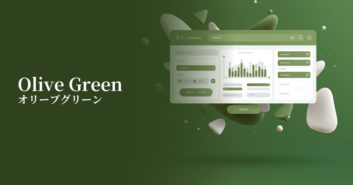
| English name | Olive Green |
|---|---|
| Katakana | Olive Green |
| HEX | #8A8F78 |
| RGB | 138, 143, 120 |
| Design Theme | Muted colors & earth tones |
Why is it a trend? (Background and reasons)
In recent years, there has been a growing interest in a return to nature and sustainability in web design. Olive green is attracting attention as a color that symbolizes this context of "organic" and "natural." It resonates with the user's desire for peace and comfort in the digital space and plays a role in conveying authentic textures beyond the screen.
This color is appealing not just because it's a neutral color, but also because of its versatility. It has the stability of neutral colors like gray and beige, while adding the vitality and calmness unique to green. As a result, it's useful in expressing the worldview of a wide range of genres, from eco-conscious brands to sophisticated tech companies and lifestyle media.
Furthermore, the popularization of earth tones and muted colors in the fields of fashion and interior design has also influenced web design trends. Comfortable color schemes from the real world are being incorporated into digital interfaces, creating a more unified brand experience.
The psychological effects of design and UX
Olive green evokes psychological effects such as calmness, harmony, and stability in users. Its subdued saturation reduces eye strain during prolonged viewing, creating an environment conducive to focused content. This is a crucial element in improving the user experience (UX) of information-heavy websites and applications.
This color evokes feelings of "reliability" and "solidity." Because it's rooted in nature, such as the earth and plants, it gives users a sense of authenticity and reassurance. It's particularly effective for brands in organic products, financial services, and wellness-related fields in building trust. It conveys a grounded, honest image rather than flashiness.
In contrast to the youthfulness and vibrancy of vibrant green, olive green conveys an impression of maturity, sophistication, and elegance. Its understated yet deep hue is ideal for subtly projecting a sense of luxury and quality. It communicates to users that the brand is calm, thoughtful, and discerning.
Visibility testing (UI component example)
Practical usage (best practices)
Using it boldly as a background color can create an immersive and calming space. Especially when combined with a minimalist layout, it makes the content stand out and enhances a sophisticated impression. In this case, using slightly warmer shades of white, such as ivory or light beige, for the text softens the contrast and creates overall harmony.
Olive green can be used not only as the main CTA button, but also for buttons indicating secondary actions, or as the background color for information cards. Using olive green for actions such as "View Details" or "Save" gently guides the user and clearly creates a visual hierarchy.
It's also recommended to use it as an accent color in a clean design based on white or beige. By limiting its use to headings, icons, and link text, you can bring an elegant rhythm and natural feel to the entire page, effectively attracting the user's attention.
This color truly shines in contexts that directly reflect a brand's philosophy, such as e-commerce sites selling sustainable products, wellness services like yoga and meditation, restaurants offering carefully selected ingredients, or portfolio sites showcasing architecture and interiors that utilize natural materials.
Recommended color scheme suggestions
Navajo White (#FFDEAD)
When combined with warm Navajo White, it maximizes the natural feel of olive green. It's ideal for organic product websites or when you want to create a comfortable space, giving a calm and sophisticated impression.
Burnt Sienna (#E97451)
Adding Burnt Sienna, a reddish-brown color, as an accent creates a much more modern and warm impression. It's recommended for designs that want to express a slightly unique and artistic worldview, such as apparel and interior design.
Slate Gray (#708090)
Combining it with a calming Slate Gray creates an intelligent and trustworthy color scheme. It's ideal for UI designs that want to convey a sense of security to users, such as SaaS dashboards and financial services, emphasizing a professional impression.