| English name | Laser Magenta |
|---|---|
| Katakana | Laser Magenta |
| HEX | #FF00FF |
| RGB | 255, 0, 255 |
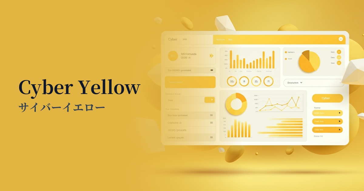
| Design Theme | Neon & Cyberpunk Colors |
Why is it a trend? (Background and reasons)
The renewed interest in laser magenta stems from the cyberpunk culture of the 1980s and the revival of the "Y2K" style that was popular from the late 1990s to the early 2000s. Its retro-futuristic aesthetic, which evokes a sense of nostalgia, is being re-evaluated as a fresh and appealing element in contemporary digital expression.
Furthermore, the development of virtual space technologies such as VR/AR and the metaverse is strongly supporting this trend. Unrealistic and artificial hues like laser magenta are ideal as colors to symbolize the digital world and a sense of the future, and they play a role in inviting users to new experiences.
Furthermore, in today's information-saturated world, the importance of color in instantly capturing a user's attention is increasing. Especially in social media feeds and digital advertising, there is a need for impact that makes users stop scrolling. Laser magenta's strong visual hook is a powerful tool to prevent creatives from getting lost in the crowd.
The psychological effects of design and UX
Laser magenta, with its extremely high saturation, gives users a strong impression of being "energetic," "bold," and "innovative." It is highly effective in visually conveying a brand's innovativeness and forward-thinking attitude in fields such as technology, entertainment, and fashion.
This color, rarely found in nature, strongly evokes feelings of the "extraordinary" and "virtual space." By using it in UI/UX design, it's possible to draw users into the service's unique worldview and provide an immersive and unique brand experience.
On the other hand, because this color is very visually stimulating, overuse carries the risk of causing user fatigue or making the overall design appear unsettling. From an accessibility standpoint, caution is needed when using it as a text color, and the general rule is to use it sparingly, mainly as an accent.
Visibility testing (UI component example)
Practical usage (best practices)
The most effective and safest use is as an accent color. By using it exclusively on CTA buttons, important links, and notification icons in dark mode or monochrome layouts, you can naturally guide the user's eye to the intended location, contributing to improved conversion rates.
In situations where you want to make a strong impact in the short term, such as a special website for a music event or a landing page introducing cutting-edge technology, boldly adopting this color as the main color can be effective. It allows you to express the brand's worldview in a powerful and memorable way.
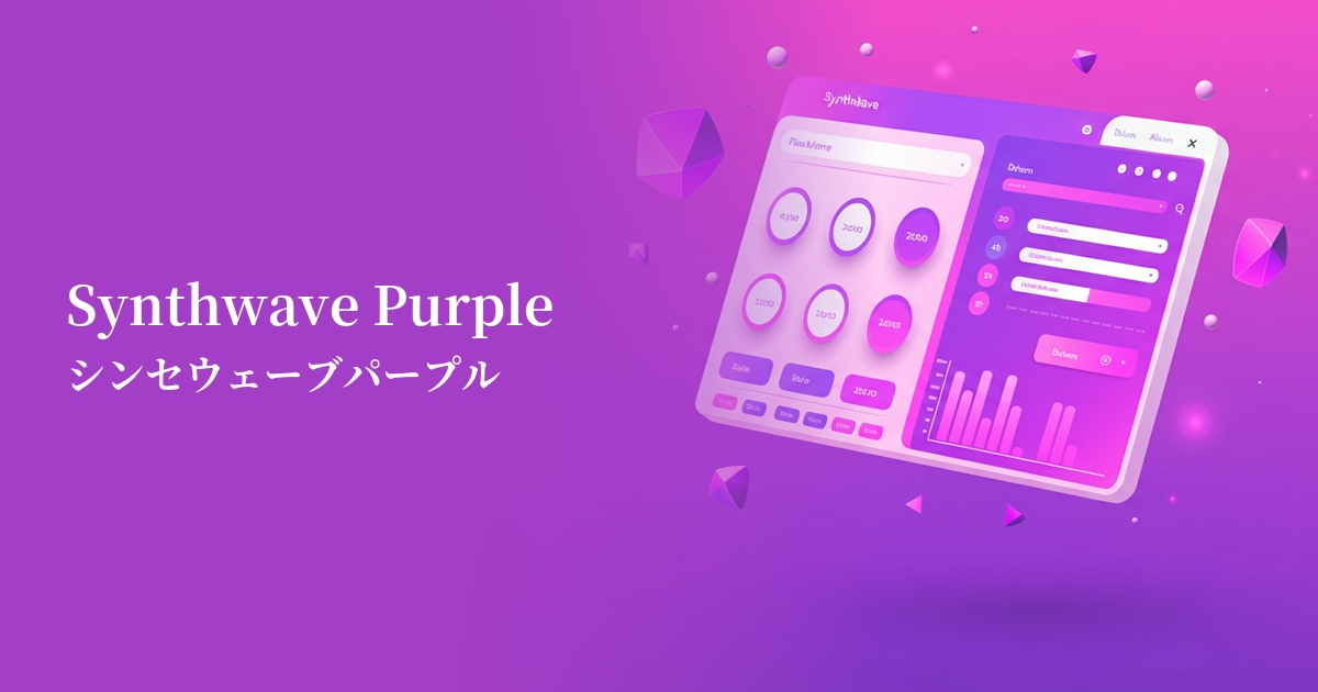
Combining it with other neon colors like electric blue and cyber yellow to create gradients is also a popular technique. Applying it to backgrounds or hero images can create a fantastical, dimensional visual style reminiscent of synthwave.
It's also recommended to incorporate this color into micro-interactions such as hover effects and loading animations. By providing vivid feedback to user actions, you can create a fun and pleasant user experience, which is expected to increase engagement.
Recommended color scheme suggestions
Charcoal (#36454F)
Against a dark charcoal gray background, the laser magenta appears to glow like a neon sign. This dramatically improves visibility and is a classic combination that most effectively expresses a cyberpunk or futuristic worldview.
Lawn Green (#7CFC00)
When combined with a vibrant green that is close to its complementary color, the two colors enhance each other even more, creating a very energetic and exciting impression. It's perfect for creating a retro and pop atmosphere reminiscent of 80s arcade games.
Dodger Blue (#1E90FF)
A gradient combining magenta and similar shades of blue creates a dreamy, synthwave-like sunset atmosphere. The smooth color transitions make this a very effective color scheme for creating visuals with depth and immersion.