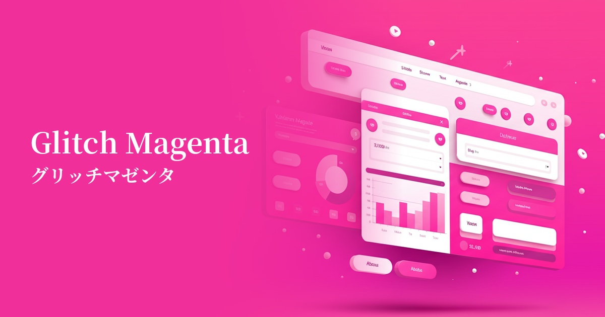
| English name | Glitch Magenta |
|---|---|
| Katakana | Glitch Magenta |
| HEX | #E6007E |
| RGB | 230, 0, 126 |
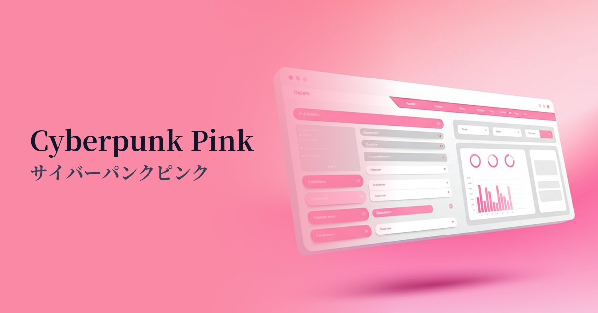
| Design Theme | Neon & Cyberpunk Colors |
Why is it a trend? (Background and reasons)
The rise of glitch magenta is largely influenced by advancements in technologies such as the metaverse, AI, and VR. This surreal and vivid color is highly effective in representing virtual spaces and digital worldviews, and is increasingly being adopted as a color that symbolizes innovation and a sense of the future.
Another contributing factor to this trend is the re-evaluation of retro-futuristic aesthetics such as cyberpunk and synthwave, which were popular from the 80s to the 90s, through a modern interpretation. The unique atmosphere, a fusion of nostalgia and novelty, is captivating many creators and users.
There is a growing preference for bold and energetic color schemes, particularly among Generation Z, who are digital natives. For social media "visual appeal" and as a means of digital self-expression, impactful colors like glitch magenta have the advantage of attracting user attention and being easily memorable.
The psychological effects of design and UX
Glitch magenta conveys an impression of energy, futurism, boldness, and excitement. Its vividness instantly captures the user's attention, creating a psychological effect that evokes feelings of exhilaration and excitement.
In UI/UX design, this color is effective when used in areas where you want to make a strong impact on the user and encourage action. It is a color that is very compatible with brand images that want to appeal to innovation and originality, such as cutting-edge technology companies, entertainment services, and creative portfolios.
On the other hand, because it is highly saturated, using it excessively can cause visual fatigue or make users feel overwhelmed. Therefore, it is wise to use it as a "spice" to highlight key points rather than as the dominant color in the entire design.
Visibility testing (UI component example)
Practical usage (best practices)
The most effective use is as an accent color. By limiting its use to key elements that you want to draw the user's attention or encourage action, such as CTA buttons, notification badges, and active status indicators, you can clarify the visual hierarchy of the entire interface.
Combining it with a dark mode design brings out the full potential of Glitch Magenta. Placing this color against a charcoal gray or off-black background not only makes it stand out and improves visibility, but also easily creates a sophisticated, futuristic aesthetic.
It's also recommended to apply it to the typography and key visuals in the hero section. Using it boldly in areas that determine the first impression of a site can strongly impress with the brand's personality. However, avoid using it in long body text, as it can impair readability.
From an accessibility standpoint, careful attention must be paid to the contrast ratio with the background color. Especially when using text on a white or light-colored background, it may not meet WCAG standards, so it is crucial to always check with a contrast checker.
Recommended color scheme suggestions
Charcoal (#36454F)
The glitch magenta stands out vividly against the dark charcoal gray background, most effectively expressing a cyberpunk or futuristic worldview. It's a classic combination with high visibility that powerfully attracts the user's attention.
Electric Blue (#7DF9FF)
The combination of neon colors enhances the digital and electric feel. The passionate impression of glitch magenta is combined with the coolness of electric blue, resulting in a dynamic and cutting-edge design.
Cloud White (#F0F8FF)
This combination is effective when you want to create a clean and minimalist impression. By placing glitch magenta as an accent within a vast amount of white space, the energy of the color stands out, resulting in a sophisticated and modern design.