| English name | Butter Yellow |
|---|---|
| Katakana | Butter Yellow |
| HEX | #FEFDE9 |
| RGB | 254, 253, 233 |
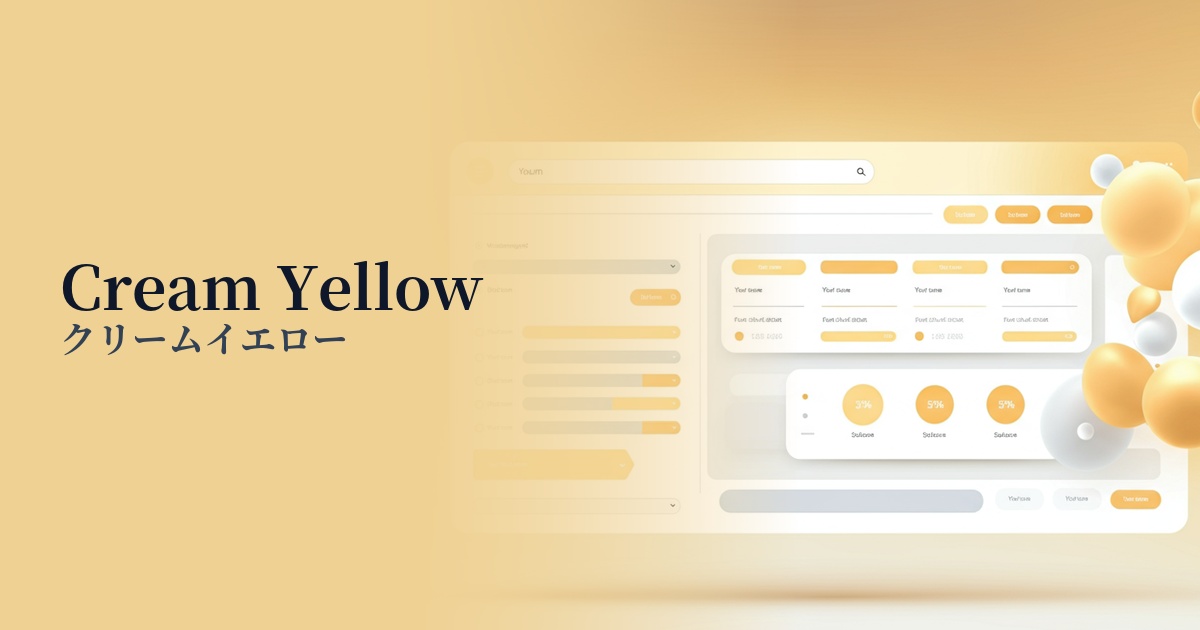
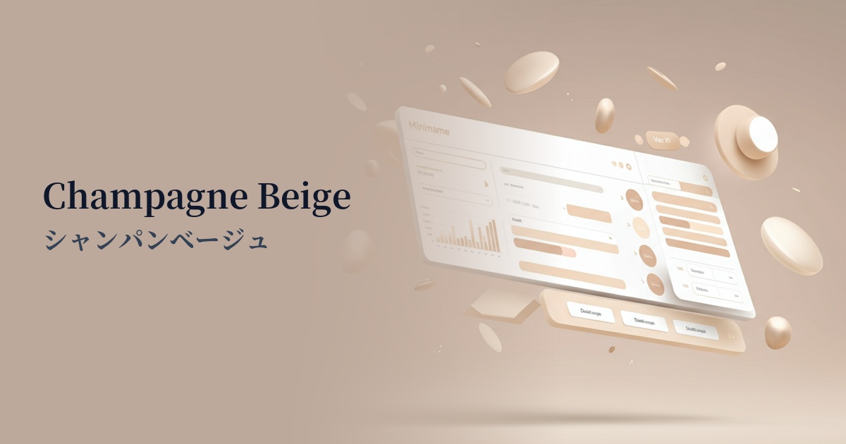
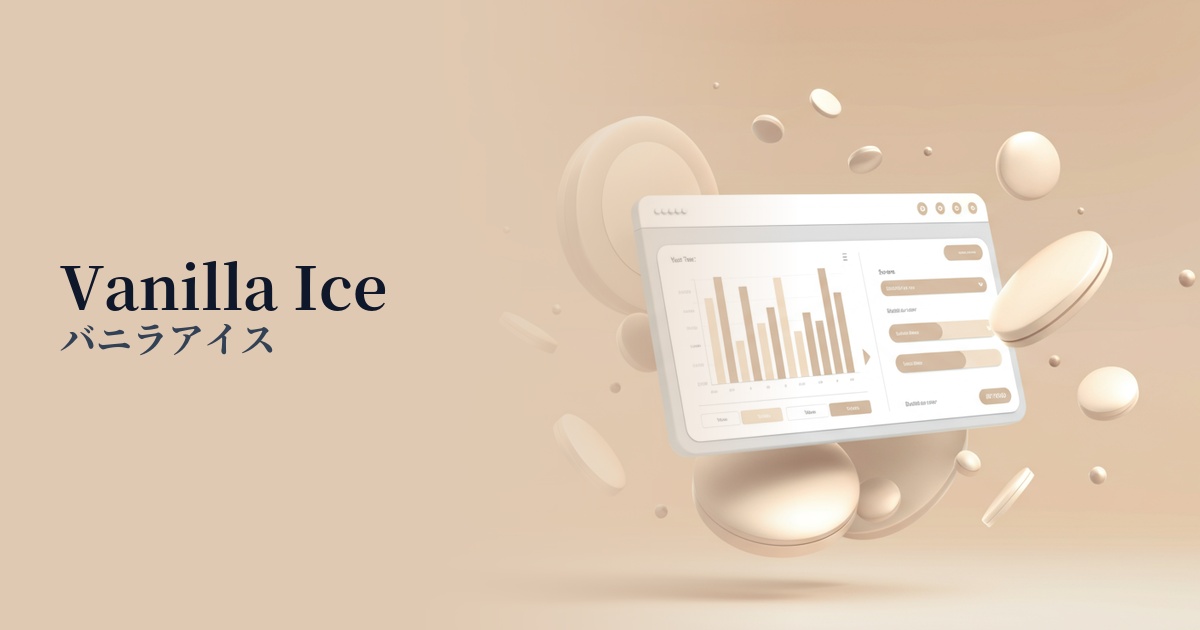
| Design Theme | Neutral & Minimal Background Colors |
Why is it a trend? (Background and reasons)
In recent years, warm, neutral colors—not just white or gray—have gained attention in web design. Butter yellow, in particular, offers a perfect balance, maintaining a sophisticated minimalist impression without becoming overly sterile, making it a popular choice among many designers.
With digital eye strain from prolonged screen time becoming a growing concern, there is a trend towards preferring color palettes that are gentle on the eyes and provide comfort. The calming shade of butter yellow gives users a sense of security and harmonizes naturally with modern values such as sustainability and organic products.
Another appealing aspect of this color is its remarkable versatility. It blends easily with any content or photograph and has the power to enhance the beauty of other accent colors. Therefore, it's easy to adopt on a wide range of brand and service websites, without being limited to a specific industry.
The psychological effects of design and UX
The smooth, gentle colors, reminiscent of butter, provide users with an unconscious sense of security and comfort. Using them as a UI background helps users relax and focus on the content, contributing to a screen that is less tiring even during prolonged use.
Bright and calming yellow psychologically evokes optimistic and positive emotions. Incorporating this color into your designs helps to shorten the psychological distance between you and your users, naturally building a friendly and positive brand image.
Butter yellow is a subtle color that doesn't make a strong statement, yet it can bring a high-quality and sophisticated atmosphere to the entire space. When you want to balance seemingly contradictory elements such as luxury and approachability, butter yellow is a very effective choice.
Visibility testing (UI component example)
Practical usage (best practices)
The most effective use of this color is as a background color for large areas. By using it as the background for an entire content area or page, you can create a consistent and calm atmosphere throughout the entire site. It works particularly well with minimalist designs that make good use of white space.
Using butter yellow as the background color for card UI or specific sections against a white background is also a good idea. It visually clarifies the grouping of information and adds a subtle rhythm and depth to the design.
Because this color is very bright, care must be taken with the contrast with the text color. Using charcoal gray or dark brown text creates a softer contrast than black, while maintaining high readability. This is also an excellent combination from an accessibility standpoint.
This is ideal for product pages on e-commerce sites that want to convey the naturalness and high quality of products such as organic cosmetics, homemade bread, baby products, and fine linens. It enhances the appeal of the products with a warm and inviting atmosphere without detracting from their charm.
Recommended color scheme suggestions
Slate Gray (#708090)
The warmth of butter yellow, combined with the intelligent and calming slate gray, creates a modern and sophisticated impression. This color scheme is recommended for B2B services where trustworthiness is essential, and for creator portfolio websites.
Sage Green (#B2AC88)
The combination with sage green, reminiscent of nature and the earth, creates a comfortable and organic space. It's perfect for branding wellness-related services or e-commerce sites that handle sustainable products.
Rosy Brown (#BC8F8F)
Adding a slightly reddish-brown shade like rosy brown creates a gentle and feminine atmosphere. It's suitable for designs that want to express a soft and elegant worldview, such as those for cosmetic brands or lifestyle media.