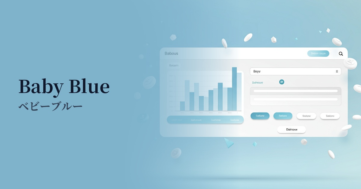
| English name | Breeze Blue |
|---|---|
| Katakana | Breeze Blue |
| HEX | #EFF6FF |
| RGB | 239, 246, 255 |
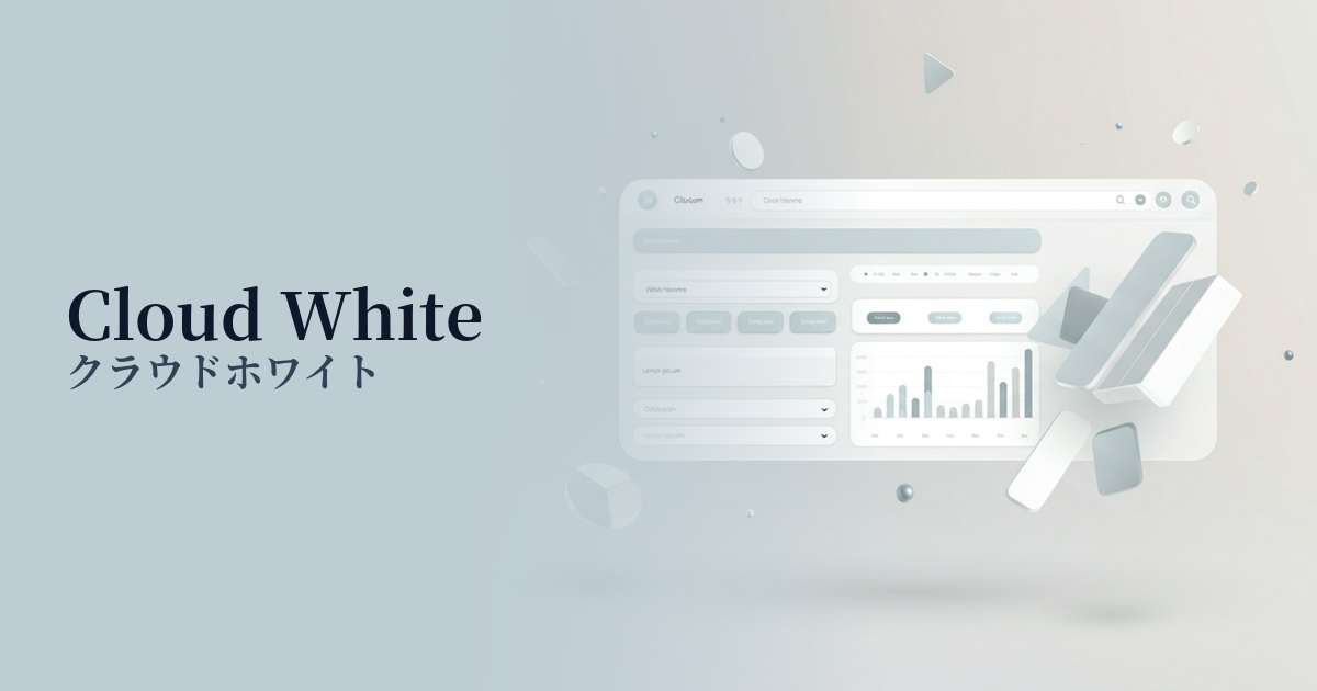
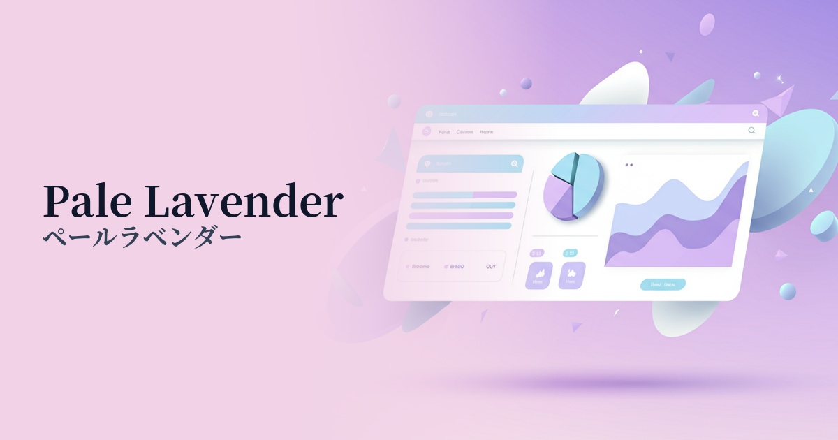
| Design Theme | Neutral & Minimal Background Colors |
Why is it a trend? (Background and reasons)
In recent years, there has been a noticeable return to minimalism and clean aesthetics in web design. Extremely pale, neutral colors like breeze blue can be said to symbolize this trend. By having a slight tint compared to pure white (#FFFFFF), it gives the digital space a refined depth and subtle individuality.
Furthermore, as our screen time continues to increase, there is a growing emphasis on user visual comfort. Breeze Blue is gentle on the eyes and less irritating, offering UX benefits such as reduced fatigue during prolonged viewing. Due to these characteristics, it is particularly favored by blog media where content focus is important, and SaaS applications where users spend extended periods of time.
The growing interest in digital detox and wellness is also contributing to the popularity of this color. Its calming hue, reminiscent of the sky and water, provides users with a sense of psychological security and tranquility. It's an ideal choice for brands that want to build relationships with users through a calm and trustworthy approach rather than attracting attention with flashy designs.
The psychological effects of design and UX
Breeze Blue, as its name suggests, is a color that evokes a sense of lightness and comfort, like a gentle breeze. Psychologically, it conveys positive impressions such as cleanliness, openness, tranquility, and trust.
From a UI/UX design perspective, this color excels as a background color. Its understated nature enhances the visibility of text, images, and UI components in the foreground, helping users focus on the most important information.
The image of trust and integrity that this color conveys is particularly effective for B2B SaaS products, financial services, and healthcare-related websites. It can help alleviate user anxiety, foster trust in the service, and potentially have a positive impact on conversions. Furthermore, its ability to create a sense of spaciousness makes it a perfect match for modern, airy layouts that utilize white space.
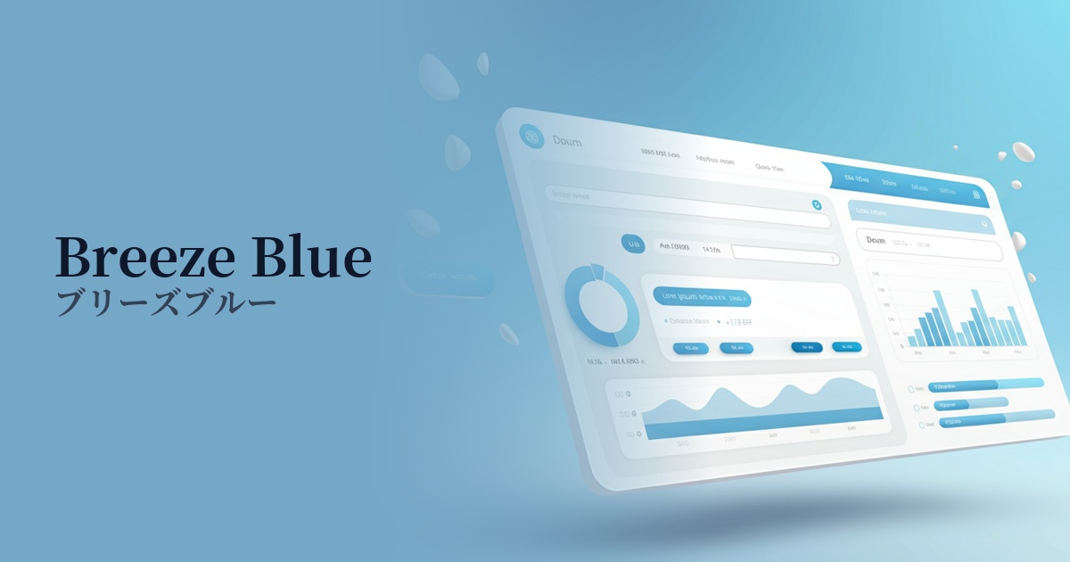
Visibility testing (UI component example)
Practical usage (best practices)
The most common use is as the background color for the entire website. Setting Breeze Blue as the background for content areas or sections creates a consistent, clean impression across the page, giving it a modern feel.
It's also ideal for the UI of information-heavy SaaS dashboards and management screens. It doesn't interfere with elements like data, graphs, and tables, providing an environment where users experience less visual stress even when looking at the screen for extended periods.
On a landing page (LP), using a specific color as the background for a particular section can effectively convey your message. For example, it's effective in areas where you want to emphasize reliability and peace of mind, such as "Customer Testimonials," "Case Studies," or "Security Information."
Breeze Blue is also a great supporting color that enhances other colors. When using a vibrant primary color for CTA buttons or icons, placing this color in the background makes the accent color stand out more and naturally encourages user action.
Recommended color scheme suggestions
Slate Gray (#708090)
By using a calm slate gray for text and UI elements, combined with the clean feel of breeze blue, the design conveys reliability and professionalism. It's ideal for SaaS admin panels and corporate websites.
Coral (#FF7F50)
Adding warm coral as an accent to a calming breeze blue background brings vitality and approachability to the design. Using it for CTA buttons and other elements is highly effective in attracting user attention.
Navy (#000080)
When combined with deep navy, it creates a strong contrast, giving a modern and sharp impression. Using it for headings and important navigation enhances visibility and creates a sophisticated atmosphere.