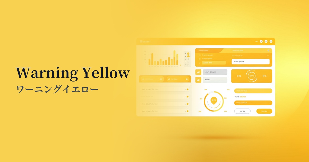
| English name | Light Warning |
|---|---|
| Katakana | Light Warning |
| HEX | #FEF9C3 |
| RGB | 254, 249, 195 |
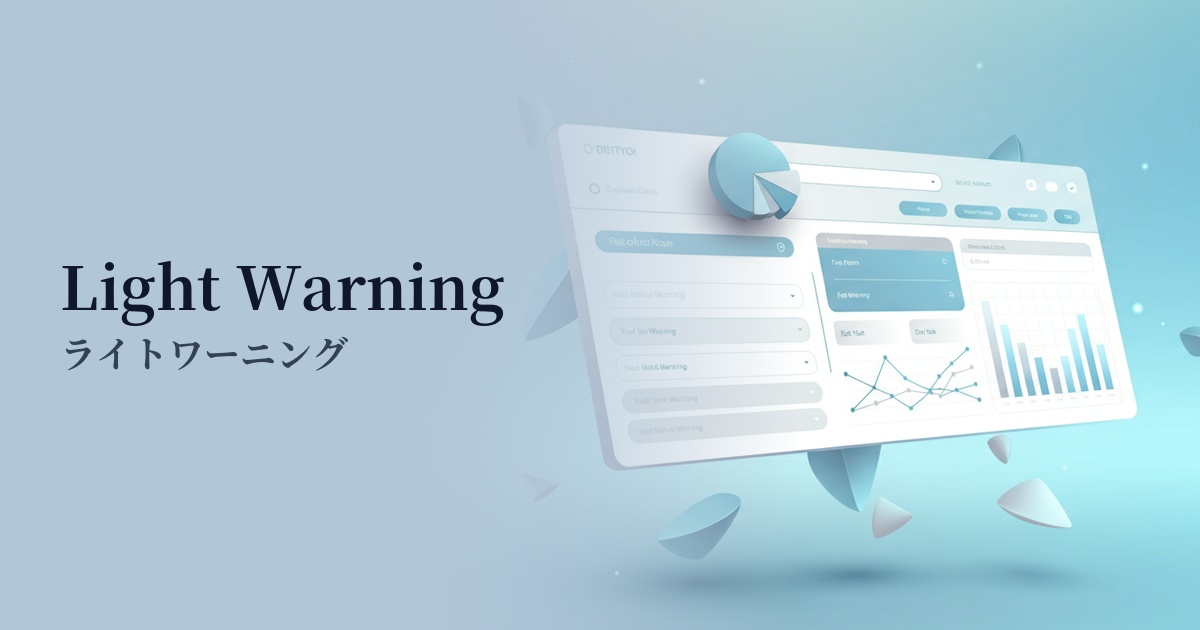
| Design Theme | UI System & Alert Colors |
Why is it a trend? (Background and reasons)
In recent years, web design has emphasized providing a smooth experience for users without causing them excessive stress. Therefore, instead of strong warning colors like traditional red or highly saturated yellow, there has been a growing focus on "light warnings," which convey information more softly. This reflects the UX design philosophy of gently communicating important information without startling the user.
In an era where minimalist and clean UIs are becoming mainstream, light warnings are a perfect fit for this design philosophy. In layouts based on white and light gray, they can attract attention without interfering with other elements. This exquisite balance of not being overly assertive is one of the reasons why they are supported by so many designers.
The growing interest in accessibility is another factor behind this color trend. For users sensitive to bright light and high contrast, softer, less stimulating colors are easier on the eyes and improve the ease of information processing. Light warnings are a valid option in aiming for user-friendly designs for everyone.
The psychological effects of design and UX
The greatest psychological effect of light warnings is "gentle attention." Rather than strong warnings indicating danger or errors, they are suitable for conveying a supplementary nuance such as "Please check" or "Here is the information." This allows for smooth operation without causing users unnecessary anxiety or impatience.
This color, a warm, pale yellow reminiscent of butter or custard cream, evokes a sense of familiarity and comfort in the user. Even impersonal messages from the system can feel more human and warm when used as a background color.
From a UI/UX perspective, it strikes an excellent balance in terms of visibility. It doesn't get lost too much against a pure white background, nor does it stand out too much compared to other content. Therefore, it's ideal for gently highlighting information that you want to "just let the user know," such as form input assistance or notifications of completed settings.
Visibility testing (UI component example)
Practical usage (best practices)
The most common use case is as the background color for notification banners and alert messages. It is particularly effective for positive feedback on user actions, such as "Draft has been automatically saved" or "Settings have been updated," as well as for minor reminders.
It's also useful as the background for hints and guidance areas while users are filling out forms. Applying this color to supplementary explanations displayed when users are unsure how to fill out the form creates a helpful impression while intuitively conveying that the information is important.
It's also suitable for highlighting specific rows within data tables in SaaS dashboards and management screens. For example, by lightly coloring rows with statuses such as "Pending Approval" or "On Hold," users can quickly find the relevant items in a list.
It's also ideal for cookie consent banners, which are implemented on many websites. By displaying them at the bottom or top of the site without being intimidating, you can naturally encourage the necessary action without disrupting the user experience.
Recommended color scheme suggestions
Davy's Gray (#555555)
Placing dark gray text, such as Davy's Gray, against a light background in a light warning makes it easier to meet WCAG contrast ratio standards. This is a classic combination that provides excellent readability and a calm, trustworthy impression.
Dodger Blue (#1E90FF)
Adding blue, a color that is close to its complementary color, as an accent color brings vibrancy and contrast to the entire screen. Using this blue for buttons and links placed within attention-grabbing areas can effectively guide users to their next action.
Alice Blue (#F0F8FF)
By combining it with a very light blue background color, it gently highlights the light warning area while maintaining a clean and sophisticated impression. It's ideal for creating a soft atmosphere with a minimalist design.