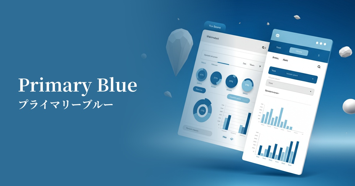
| English name | Recommended Blue |
|---|---|
| Katakana | Link Blue |
| HEX | #0B69A3 |
| RGB | 11, 105, 163 |
| Design Theme | UI System & Alert Colors |
Why is it a trend? (Background and reasons)
Link blue has a long history of being widely used as the color for hyperlinks since the early days of the web. This shared user understanding that "blue text = clickable" is very powerful, and in modern web design, where usability is paramount, it is being re-evaluated as a color that encourages intuitive operation.
The fact that many design systems and UI frameworks adopt these colors as primary colors or standard colors for interactive elements is also a factor behind this trend. This makes it easier to build a consistent UI and gives users a stable impression of reliability and formality. It tends to be particularly favored in SaaS and B2B services.
The growing concern for accessibility is also contributing to the popularity of this color. Link Blue has the advantage of easily providing sufficient contrast against common white or light gray backgrounds, and readily meeting WCAG (Web Content Accessibility Guidelines) standards. This allows for designs that are easier to see and use for a wider range of users.
The psychological effects of design and UX
LinkBlue evokes psychological effects such as "trust," "integrity," and "stability" in users. For this reason, it is widely used on the websites of financial institutions, government agencies, and large corporations, instilling a sense of security and professionalism in users.
From a UI/UX perspective, this color functions as a sign of "clarity" and "operability." Elements using this color unconsciously communicate to the user that "this is important information" or "this is interactive," reducing cognitive load and facilitating smooth navigation.
It also conveys an intelligent and calm impression, and when used in the interfaces of technology companies and data analysis tools, it is expected to visually support the advanced nature and accuracy of the product.
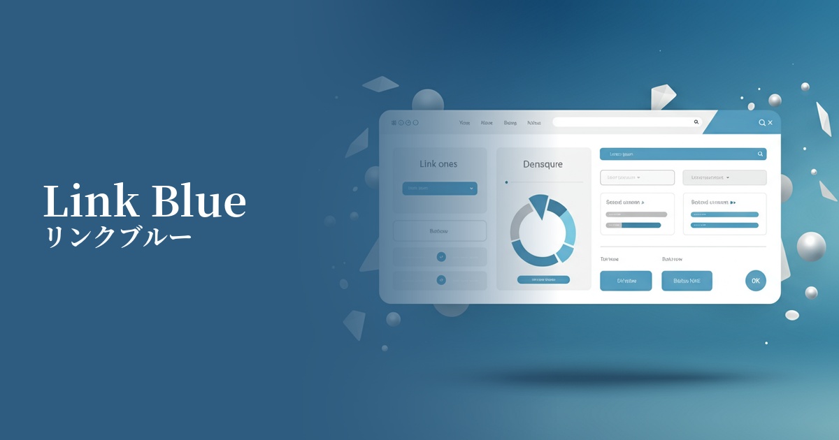
Visibility testing (UI component example)
Practical usage (best practices)
The most effective application is to interactive elements such as text links, buttons, and icons. This clearly indicates the next action the user should take, leading to improved conversion rates.
It's also a good choice as the primary color for your website or application. Using it consistently across headers, key CTAs (Call to Action), and active navigation menus can strengthen your brand image and create a cohesive design.
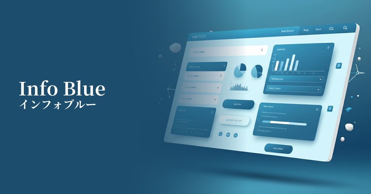
In dashboards and admin panels, it can be used as a status color to indicate "information." By combining it with other semantic colors such as success (green), warning (yellow), and error (red), users can quickly identify the type of information.
Link Blue can also be effective when used as an accent color in a design that uses monochrome or neutral colors throughout. By using Link Blue only on important functions or information you want to draw attention to, you can naturally guide the user's gaze and convey the priority of the information.
Recommended color scheme suggestions
Gainsboro (#DCDCDC)
It maintains the reliability of Linkblue while giving a clean and modern impression. Using Gainsboro for the background color and card UI enhances the visibility of the blue, resulting in a clean and professional design.
Sandy Brown (#F4A460)
These two colors are almost complementary, creating an energetic combination that enhances each other's beauty. Link Blue's solidity is combined with warmth and vitality, making it effective for use in CTA buttons and other elements where you want to strongly attract the user's attention.
Charcoal (#36454F)
Combining Link Blue with dark gray creates a sophisticated and calm impression. Using Charcoal for the text color and background adds a sense of luxury and gravitas, making it ideal for B2B services and data-driven websites.