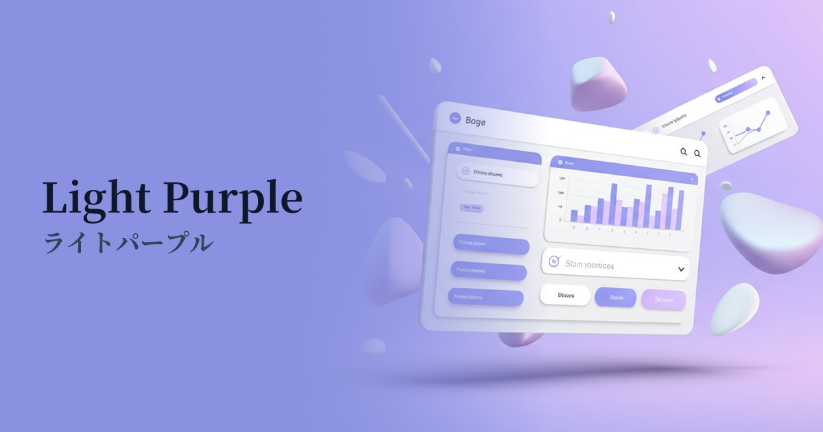
| English name | Light Purple |
|---|---|
| Katakana | Light purple |
| HEX | #EDE9FE |
| RGB | 237, 233, 254 |
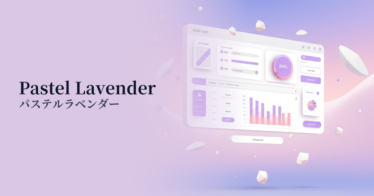
| Design Theme | UI System & Alert Colors |
Why is it a trend? (Background and reasons)
In recent years, web design has seen a trend towards soft and gentle colors that provide users with a sense of security and calmness. Light purple is a prime example of this trend. It is increasingly being used, especially in SaaS dashboards that are used for extended periods and in web services where a clean impression is required, in order to reduce the visual burden on users.
As technology and digital services become more commonplace, there's a shift from the sharp, cold designs that were once dominant to more humane, approachable designs. This light purple color conveys a sense of innovation while creating a soft, unobtrusive atmosphere, making it easily accepted by a wide range of users.
The psychological effects of design and UX
Light purple evokes images of lavender and lilac flowers, promoting calmness, healing, and relaxation. In UI design, it helps to alleviate user tension and maintain concentration.
This muted shade of purple, which evokes a noble and mysterious image, also conveys elegance and sophistication. It is well-suited for expressing a brand's worldview delicately in creative fields, wellness, and beauty services.
From a UI/UX perspective, it's ideal for indicating background color or the "active" or "selected" state of UI elements because it's not overly assertive. It can subtly display important information without interfering with user interaction.
Visibility testing (UI component example)
Practical usage (best practices)
Using it as the background color for an entire website or app creates a clean and spacious feel. It works particularly well with minimalist designs and can also improve content readability.
Using colors to indicate the state of a form's input field or a toggle switch when it's turned ON provides users with intuitive and pleasant feedback.
When used in the dashboards and settings screens of SaaS products, such as for menu selections or notification backgrounds, it can create a clean and organized impression even with a large amount of information, reducing the cognitive load on the user.
It can also be effective to incorporate light purple as an accent color rather than as the main color. For example, using light purple for buttons or icons in a design based on a dark mode can create a sophisticated, futuristic atmosphere.
Recommended color scheme suggestions
Midnight Blue (#191970)
Using a deep midnight blue for text and key elements creates a high contrast with the light purple background. This ensures visibility and results in a color scheme that conveys trustworthiness and intelligence.
Ivory (#FFFFF0)
By combining ivory with a warm off-white, the overall impression becomes very soft, natural, and elegant. It's perfect for creating a minimalist and comfortable space.
Tangerine (#F28500)
Adding a vibrant tangerine accent brings fun and energy to the gentle light purple color scheme. This combination is recommended for expressing a creative and playful brand image.