
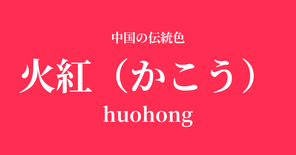
| Color name | fire red |
|---|---|
| reading | Kakou |
| pinyin | huohong |
| HEX | #FF2D51 |
| RGB | 255, 45, 81 |
What is "Huohong"? Origin and etymology
Kakō, as its name suggests, means "a color as red as fire," a vivid and vibrant red. This color originated from the awe and reverence that the ancient Chinese people felt for "fire" itself, which was indispensable to the development of human civilization.
The powerful energy of fire—which illuminates the darkness, brings warmth, and sometimes burns everything to ashes—is projected onto this vibrant hue. While the character "紅" (beni) refers to the color red in general, the addition of "火" (hi) emphasizes that this is not just any red, but a special red that is dynamic and brilliant, like a blazing flame.
Historical background of Huo Hong
In Chinese history, red held special significance. In the Five Elements theory, red belongs to the "fire" element and symbolizes the south and summer. The Han dynasty, in particular, positioned itself as a dynasty of "fire virtue," and therefore held red in the highest regard, using it in every aspect, from palace decorations to the emperor's clothing.
During the Tang Dynasty, red became the color of the official attire worn by high-ranking officials, symbolizing authority and high status. From the Song Dynasty onward, red became widely known not only in the imperial court but also among the common people as a color of good fortune and joy.
Especially during the Ming and Qing dynasties, red became a staple color for celebratory occasions in people's lives, such as decorations for the Spring Festival (Lunar New Year), bridal attire for weddings, and lanterns for festivals. The vividness of red was believed to ward off evil and bring good fortune, and it continues to be loved by the Chinese people to this day.
Huo Hong in Chinese Art and Crafts
The vibrant red of Huo Hong has been used impressively in various fields of Chinese art. For example, in the world of ceramics, the red of "yōhen yū" (yōhen yū), found in Jun ware from the Song dynasty, is well known. This is a deep red that is accidentally created in the kiln fire, and its rarity and beauty are reminiscent of the vitality of Huo Hong.
In clothing culture, red is used extensively in Hanfu, the traditional Chinese clothing worn for weddings and festivals, as a symbol of happiness and prosperity. In Peking Opera, red is considered a symbol of loyalty and courage, and is famously the color that adorns the face of the hero Guan Yu.
In painting, this vivid red is effectively used to express the strength of mythological figures or to depict the lively scenes of festivals, bringing vitality and splendor to the canvas.
Hidee Hanakoku Katsubishi
Color scheme preview
This is to check the readability of the text when this color is used as the background.
Red color scheme suggestion
Black (#3E3A39)
The deep ink-black background makes the vivid red of the fiery red stand out even more, creating a powerful and modern impression. This color scheme is effective when you want to express sophisticated luxury and hidden passion.
Female yellow (#FFC90C)
The fiery red, reminiscent of a blazing flame, is complemented by a radiant oreskin, creating an even more energetic and warm impression. It's perfect for creating a bright and joyful atmosphere, like a celebration.
Tsukihaku (#EAF4FC)
When combined with the pure and serene moon white, the passionate impression of the fiery red is softened, creating an elegant and refined atmosphere. It is recommended when you want to add a dignified calmness to a vibrant look.
Practical Scenes
In interior design, red is an ideal accent color that brings energy and warmth to a space. Incorporating it into small items such as cushions, rugs, and artwork will give the entire room a vibrant feel. When using it over a large area, combining it with neutral colors such as white or gray will create a modern space while minimizing any feeling of oppression.
In the world of fashion, red is a color that conveys confidence and glamour. It elevates an entire outfit, whether used in statement pieces like dresses and coats, or simply incorporated into accessories such as scarves, bags, or lip color. It pairs particularly well with black and gold, making it suitable for special occasions.
In web and graphic design, using red for call-to-action (CTA) buttons or important headlines can capture the user's attention and leave a strong impression. It's also an effective color for conveying a brand's passion and vitality.