
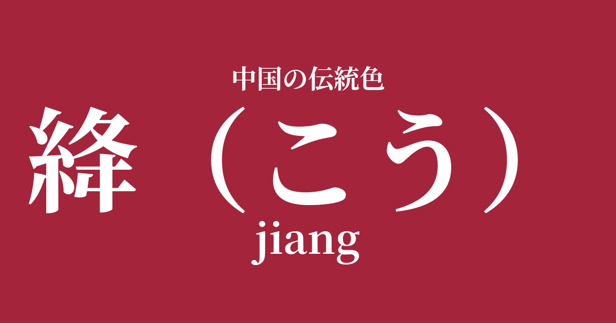
| Color name | 絳 |
|---|---|
| reading | like this |
| pinyin | jiang |
| HEX | #A4243B |
| RGB | 164, 36, 59 |
What is a yoke? Origin and etymology
The character "绛 (絳)" refers to a deep, dark red color produced by repeatedly dyeing with the roots of the madder plant. Its name is said to be a phono-semantic character combining the radical for "thread" (糹) with the character "夅" meaning "to descend," representing the way the dye deeply penetrates the thread.
Rather than being simply a bright red, this color has come to be recognized as having a sense of calm and depth due to the time and effort required to dye it. The subtle changes in hue depending on the mordant used, and the fact that it sometimes shows a complex expression with a slight purplish tint, are also part of this color's charm.
The historical background of the yoke
The history of the yi (绛) is ancient, dating back to the Zhou dynasty. The Confucian classic, the "Book of Rites," mentions the yi as the color of clothing worn by emperors and feudal lords, suggesting that it was a color of extremely high status even back then.
Even during the Han dynasty, the prestige of the color yi (绛) was inherited, as it was designated as the color of court attire worn by high-ranking officials. In the Tang dynasty, the regulations on clothing colors became even more detailed, but yi remained treated as one of the noble colors, demonstrating its presence in ceremonies and official settings.
Thus, the red of the sash has not only been a beautiful color, but has also been deeply rooted in Chinese culture throughout its long history as a color symbolizing order and dignity.
The art and crafts of Chinese art and crafts
In the history of clothing culture, yi (绛) was an important color that adorned Hanfu (traditional Chinese clothing). In particular, it was often worn at life's milestones and special ceremonies, such as wedding attire and ceremonial garments, and was considered a symbol of good fortune and vitality. Garments dyed in yi on lustrous fabrics such as silk and brocade exude a noble beauty.
Furthermore, deep red glazes reminiscent of yori can be found in the world of ceramics. For example, the porcelain known as "Langyao Hong," produced during the Ming and Qing dynasties, is also called "Niuxue Hong" (ox blood red) due to its deep red color, and its complex and profound hue is similar to the profound beauty of yori.
Kasa basket 瓘 incense orange
Color scheme preview
This is to check the readability of the text when this color is used as the background.
Mayu's color scheme proposal
Tsukihaku (#EAF4FC)
The deep red "Yui" is complemented by "Tsukishiro," reminiscent of pure moonlight, creating a quiet and elegant impression. It evokes a poetic atmosphere, like the contrast between the moon floating in the night sky and flowers rooted in the earth.
Yellow (#FFB61E)
The combination of the authoritative "绛" (yi) and the brilliant golden "是黄" (jihuang) evokes the opulent and magnificent culture of the Chinese imperial court. It adds a dignified splendor to festive occasions and auspicious designs.
Matsuka (#B5CAA0)
Combining the deep red of flowers, "Yui," with the vibrant color of young pine buds, "Shōka," creates a color scheme that evokes the vitality of nature. It's recommended when you want to create a classic yet lively and fresh impression.
Practical Scenes
In interior design, incorporating yomei (decorative cords) into accent walls, cushions, rugs, etc., brings a refined warmth and tranquility to a space. It pairs particularly well with dark brown wooden furniture and brass accessories, creating a sophisticated and classic atmosphere.
In fashion, using this color in statement pieces like dresses and coats creates an elegant and striking look. Incorporating it into glossy materials like velvet or silk further enhances the depth of the color. It's also effective as an accent color in items like bags, scarves, and lipstick.
In web design and graphics, using it as an accent color for buttons and headings can attract attention and give content a sense of sophistication and trustworthiness. Its beauty is particularly striking when added to simple designs based on white or light gray.