| English name | Peach Sorbet |
|---|---|
| Katakana | Peach Sorbet |
| HEX | #FFDAC8 |
| RGB | 255, 218, 200 |
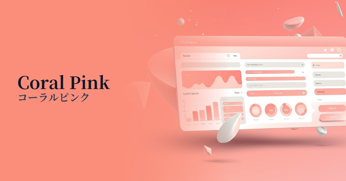
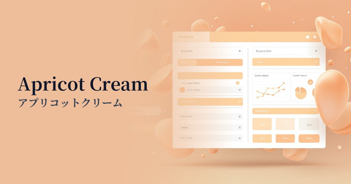
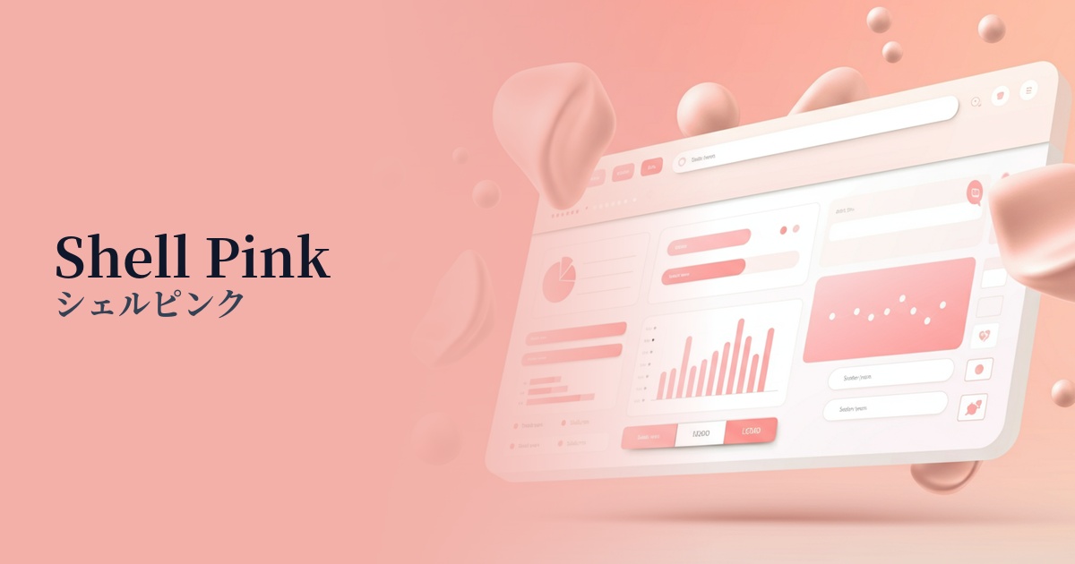
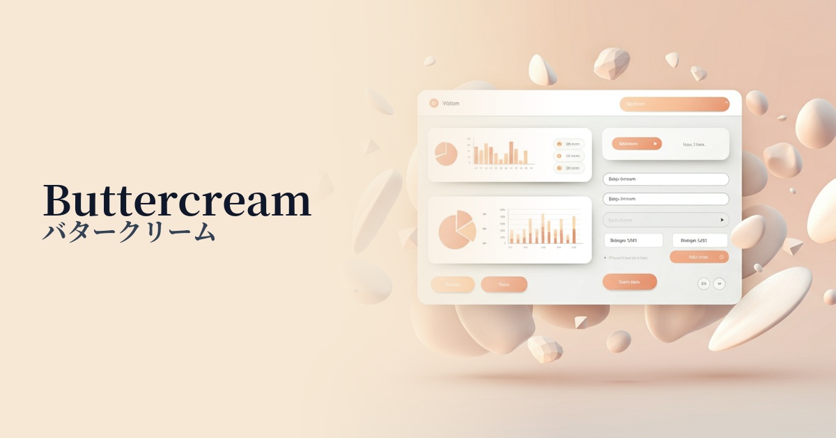
| Design Theme | Pastel & Macaron Colors |
Why is it a trend? (Background and reasons)
Recent web design trends show a shift from cold, impersonal corporate websites to more humane and approachable designs. Warm pastel colors, like peach sorbet, give users a sense of reassurance and a positive impression, and are particularly favored by wellness, beauty, and lifestyle brands.
Furthermore, as an evolution of minimalism, there is growing interest in "soft UI," which emphasizes softness and tactile sensations. Peach sorbet pairs exceptionally well with gentle shadows and smooth gradients, making it the perfect color to add a pleasant depth and softness to an interface.
This color is incredibly versatile and can be used in a wide range of applications, from main background colors to accent colors. It has the power to improve the quality of design in various contexts, such as making product pages on e-commerce sites look more vibrant or adding warmth to SaaS dashboards.
The psychological effects of design and UX
Peach sorbet is a color that combines the energy of orange with the gentleness of pink. It evokes positive emotions in users such as "warmth," "friendliness," and "happiness," lowering the psychological barriers to the brand and service.
It gives a youthful and optimistic impression. Therefore, it's effective for services aimed at young people or when you want to build a creative and playful brand image. It brightens users' moods and can be a catalyst for increased engagement.
Because of its low saturation and soft tones, it reduces visual stimulation and lessens eye strain. This creates a comfortable environment for users in web services that are expected to be used for extended periods, and in content that should be read in a relaxed manner.
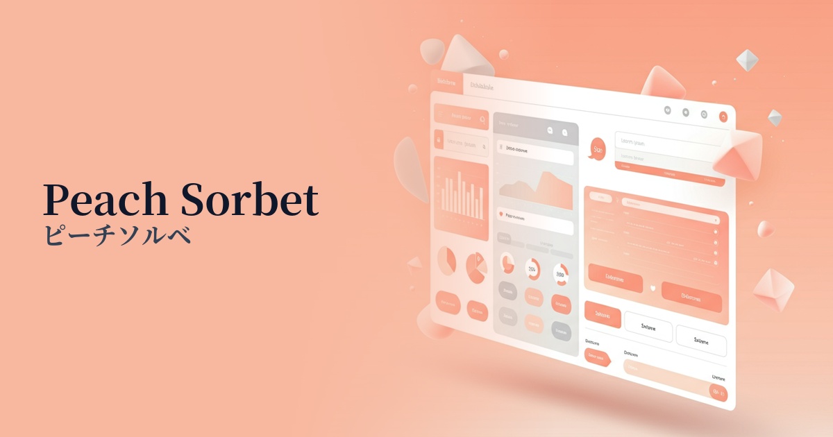
Visibility testing (UI component example)
Practical usage (best practices)
It is most effective when used as an accent color for CTA buttons, links, icons, and other elements. The gentle, understated color subtly encourages action without overwhelming the user, contributing to an increased click-through rate.
It's also recommended to use it as the background color for specific sections within your site or for UI cards. Not only does it make grouping information visually easier to understand, but it also brings rhythm and a soft atmosphere to the entire page.
Using these illustrations and loading animations to express your brand's personality can effectively convey its worldview. In particular, combining them with hand-drawn style illustrations further enhances the warm, organic impression.
On e-commerce sites, it plays an important role as a background color that enhances the appeal of products. In particular, in categories such as cosmetics, sweets, and baby products, it helps to intuitively convey the value of the product, such as its "gentleness" or "deliciousness."
Recommended color scheme suggestions
Steel Blue (#4682B4)
Combining warm-toned peach sorbet with cool-toned steel blue creates a modern and sophisticated impression. This color scheme adds an intellectual touch to approachability, making it ideal for service websites and other applications where trustworthiness is essential.
Sage Green (#9DC183)
Combining it with earthy sage green creates a very natural and calming atmosphere. It's perfect for expressing a peaceful worldview on websites themed around organic products, wellness, and the environment.
Antique White (#FAEBD7)
By combining antique whites of very similar tones, you can create a delicate and unified design. This is very effective when you want to give a minimalist yet warm, refined and elegant impression.