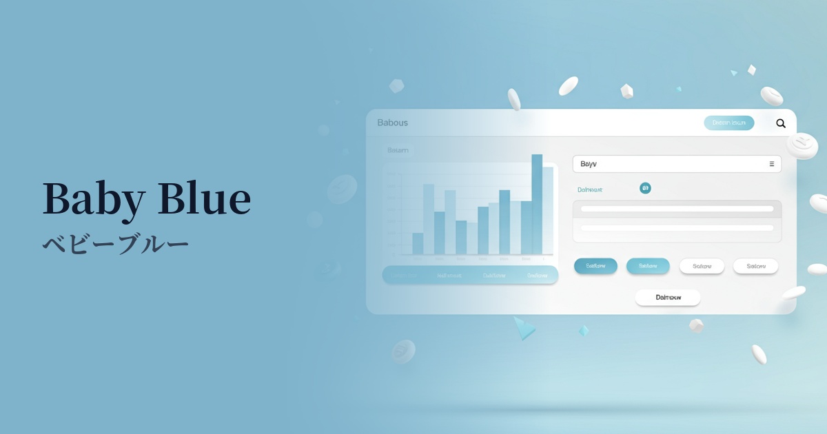
| English name | Misty Blue |
|---|---|
| Katakana | Misty Blue |
| HEX | #D6EAF8 |
| RGB | 214, 234, 248 |
| Design Theme | Pastel & Macaron Colors |
Why is it a trend? (Background and reasons)
In recent years, minimalism and clean design have become mainstream in web design, aiming to liberate us from the information-overloaded digital environment. Misty Blue, with its gentle and understated hue, pairs exceptionally well with simple and sophisticated layouts that make effective use of white space, and is a popular choice among many designers.
Furthermore, with growing interest in digital wellness, there is increasing demand for colors that provide users with a sense of security and calmness. The quiet and calming atmosphere of misty blue reduces the psychological burden on users and provides an experience that is less tiring even when looking at screens for long periods of time, making it particularly valuable for SaaS dashboards and information-heavy websites.
This color also has the aspect of being a highly versatile "neutral color" that can be used like white or gray. It harmonizes easily with other colors and blends naturally into any design style, making it very easy to use as a background or base color. Because it can convey both reliability and a modern atmosphere, its adoption is spreading to a wide range of fields, from technology companies to lifestyle brands.
The psychological effects of design and UX
Misty Blue is a color reminiscent of a misty early morning sky or a calm lake surface, giving users an impression of "stillness," "calmness," and "peace." Because it has minimal visual stimulation and a calming effect, it is effective in situations where users want to concentrate on content.
It inherits the psychological effects of blue, such as "trust" and "sincerity." However, because it has a softer and more approachable nuance than a bright blue, it can create a gentle and intelligent sense of trust without being overly formal. It is ideal for services where reliability is crucial, such as finance, healthcare, and B2B SaaS.
From a UI/UX perspective, this color is excellent as a background color. Its understated nature doesn't interfere with the readability of foreground content such as text, graphs, and images. It creates a sense of openness and cleanliness, making it a powerful choice for achieving a clean user interface.
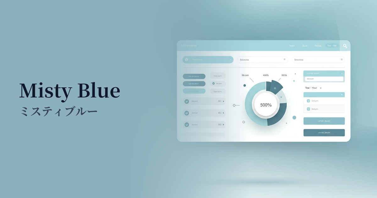
Visibility testing (UI component example)
Practical usage (best practices)
Using it as the background color for your entire website creates a spacious, open, and sophisticated atmosphere. It works especially well with minimalist designs that utilize a lot of white space.
Incorporating it as a base color into the UI of SaaS applications and management screens allows you to design an interface that is less tiring for users to use for extended periods and helps them maintain concentration.
Using this color as the background for a card-style UI where information is displayed neatly organizes each piece of content, creating a visually cohesive look. Adding a slight shadow gives it a sense of depth and makes it even easier to read.
It also works well as a backdrop for vibrant accent colors. For example, combining it with a coral pink or yellow CTA button makes the button stand out effectively against a soft background, encouraging clicks.
It's also recommended for use in hover effects for buttons and links. It provides subtle and elegant feedback to users, enhancing the quality of their interactions.
Recommended color scheme suggestions
Navajo White (#FFDEAD)
The calm and intellectual atmosphere of Misty Blue is complemented by the soft warmth of Navajo White. This combination is ideal for corporate websites that want to convey both trustworthiness and approachability, as well as for natural lifestyle media.
Charcoal (#36454F)
The deep charcoal gray adds definition to the overall design, further highlighting the sophisticated feel of the misty blue. This color scheme is a safe bet, as it achieves both high readability and a modern, intelligent impression when used for text and important UI elements.
Coral (#FF7F50)
The addition of vibrant coral accents against a calming misty blue background brings energy and fun to the design. It's ideal for limited use on CTA buttons and icons, where you want to effectively capture the user's attention.